Editorial Serif Anchor

Bloom Spring + Gorga
Anchors Bloom Spring's fluid strokes with crisp Roman proportions on wedding suites, headers and packaging.
Inspect Gorga specimenDisclosure: MakerFileHub may earn a commission from qualifying purchases via paid links on this page. How our links work.
Rounded separate playful print with unequal arches and an even weight
Bloom Spring is rounded playful print in which the letters stand separately, the arches are unequal and the weight stays even from first letter to last.
Paid link
Get this fontProject & layout blueprintsAt-a-glance maker compatibility
Weld or Unite overlapping script joins into one continuous vector path before sending to the blade.
Visual anatomy & craft review
The b opens as a tall plain stem, and the letters after it keep an easy roundness: the l is a plain tall stem, the o and the o sit slightly differently, the m holds three arches that do not match and the g drops a rounded bowl with a straight tail. Nothing connects and nothing is slanted, and the weight is a consistent medium with fully rounded ends, which is what gives the phrase its soft, unforced tone. Letter heights vary a little within the word, the baseline stays roughly level and the counters stay open, so a phrase reads at small sizes without effort. The pastel stripes, the flowers and leaves, the white sticker outline and the small caption are presentation; the lettering is the two words.
Rounded · Separate · Playful
Two-font hierarchy recipes
Tested contrast partners — pairing Bloom Spring with grounded secondary typography.
Bloom Spring + Gorga
Anchors Bloom Spring's fluid strokes with crisp Roman proportions on wedding suites, headers and packaging.
Inspect Gorga specimen
Bloom Spring + Monure
Keeps small-scale dates, URLs, nutrition facts and care instructions crisp and legible below script titles.
Inspect Monure specimenPractical applications
Concrete hierarchy, scale and production guidance tailored to Bloom Spring’s stroke geometry.
The soft round print suits a shop that sells garden things, and the separate letters stay readable at card size where a script would clot.
Hierarchy & layout recipe
Set the message at 18 pt on a 105 by 148 mm card, keep the shop name in a 7 pt sans, and leave 10 mm of margin so the rounded ends stay inside the trim.
Pre-production check
Cards with a sticker outline look best cut close; check the die against the lettering and keep 4 mm from the outlined edge.
The rounded print keeps a favour label light and seasonal, and the open letters read at the small size of a jar or a bag label.
Hierarchy & layout recipe
Set the greeting at 12 pt on a 45 mm square jar label, keep both names in a 6 pt sans beneath it, and leave 5 mm inside the die so nothing is clipped.
Pre-production check
Small labels on a roll can drift; check the second impression and confirm the arch shapes have not closed before approving.
The playful print reads at arm's length on a stall and the sticker outline lets it sit on a bag or a card without a printed border.
Hierarchy & layout recipe
Set the stall name at 22 pt on a 60 mm round sticker, keep the day and market in a 7 pt sans, and leave 6 mm inside the die so the rounded ends do not follow the cut.
Pre-production check
A white outline printed on white stock disappears; check the sticker on the intended surface and add a tinted edge instead of a wider outline.
Technical & licence verification
Confirm included OTF/TTF/WOFF formats, full glyph tables and licence coverage on the live store page before batch production.
Closest visual alternatives
Matched across letterform anatomy, stroke behaviour and craft applications.
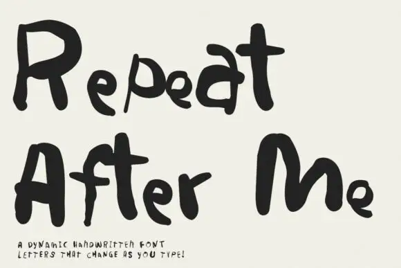
Irregular hand-lettered display
Repeat After Me is a dynamic handwritten display in black on cream: very irregular hand-drawn letters with different strokes for each character, uneven heights and a wobble that changes across a word, sold as a set whose letters vary as they are typed.
Ideas for this font
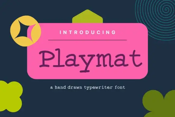
Uneven hand-drawn typewriter lettering
Playmat is a hand-drawn typewriter font in purple on a pink panel: slab serifs of uneven thickness, a wobbling baseline and round counters that make a machine face look drawn with a pen.
Ideas for this font
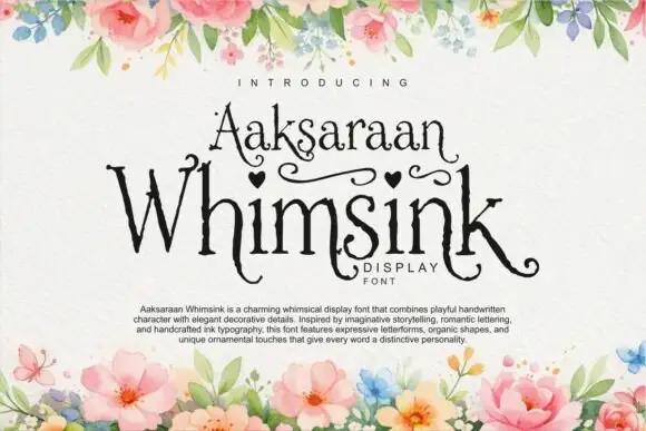
Display
Whimsink is a whimsical display script with uneven heights, looping crossbars and a hand-inked wobble; its ascenders curl into hooks, small hearts hang off the crossbars and the tails sweep out under the word.
Ideas for this font
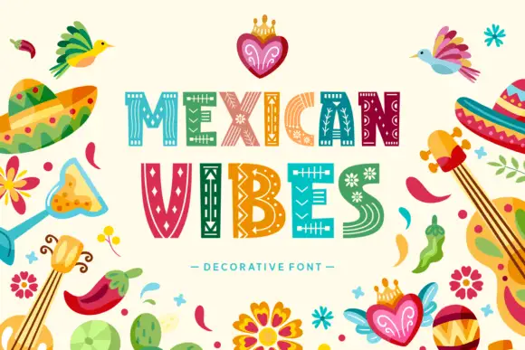
Broad block capitals filled with thin geometric tracks, diamonds and floral marks
Mexican Vibes fills wide block capitals with pale folk patterns, so MEXICAN and VIBES read as two rows of woven textile rather than as lettering painted with a brush.
Ideas for this font
Same independent foundry
Allow optional Google Analytics to measure visits and catalogue actions. Your search words and notes are not included. Privacy & storage



