Editorial Serif Anchor

Whimsink + Grandeur – Elegant Classic Serif
Anchors Whimsink's fluid strokes with crisp Roman proportions on wedding suites, headers and packaging.
Inspect Grandeur – Elegant Classic Serif specimenDisclosure: MakerFileHub may earn a commission from qualifying purchases via paid links on this page. How our links work.
Display
Whimsink is a whimsical display script with uneven heights, looping crossbars and a hand-inked wobble; its ascenders curl into hooks, small hearts hang off the crossbars and the tails sweep out under the word.
Paid link
Get this fontProject & layout blueprintsAt-a-glance maker compatibility
Weld or Unite overlapping script joins into one continuous vector path before sending to the blade.
Visual anatomy & craft review
The sample sets Aaksaraan on one line and Whimsink below in a larger size, both in near-black on a pale ground framed by painted roses at the top and bottom. The letters are tall and narrow with a calligraphic contrast that comes from a brush rather than a nib, and the joins between letters are drawn with visible pen pressure. Ornaments are built in: a spiral sits over the second a, hearts dangle from the crossbars of the h and the k, and the final k throws a long tail to the right. A credit block at the foot describes the idea behind the face. It is a title alphabet for invitations, labels and packaging, and it needs air: the swirls will tangle if letter spacing is tightened.
A whimsical display script with swirls, hearts and long tails
Two-font hierarchy recipes
Tested contrast partners — pairing Whimsink with grounded secondary typography.
Whimsink + Grandeur – Elegant Classic Serif
Anchors Whimsink's fluid strokes with crisp Roman proportions on wedding suites, headers and packaging.
Inspect Grandeur – Elegant Classic Serif specimen
Whimsink + Prime Nordic
Keeps small-scale dates, URLs, nutrition facts and care instructions crisp and legible below script titles.
Inspect Prime Nordic specimenPractical applications
Concrete hierarchy, scale and production guidance tailored to Whimsink’s stroke geometry.
The heart ornaments and the sweeping tails give a formal card warmth without a drawn wreath, and the calligraphic contrast holds the names at a modest size.
Hierarchy & layout recipe
Print a 130 by 180 mm invitation: set the names at 26 pt on one row, keep 20 mm of clear ground beneath before the venue at 9 pt, and hold 16 mm from the longest tail to the card edge.
Pre-production check
Swirls hook into the line below; print one invitation at the finished size and check the k before the suite.
The hand-inked script makes a plain bar look made in small batches, and one dark ink on a light label reproduces the fine joins better than a colour print.
Hierarchy & layout recipe
Print a 60 by 40 mm wrap label: set the scent at 12 pt on one row, keep 4 mm of clear ground beneath before the weight at 4 pt, and hold 3 mm from the lowest swirl to the edge of the wrap.
Pre-production check
Fine joins break on a small wrap; print one label, wrap a bar and check the h before the batch.
The face reads as handwriting, which suits a collection written in the first person, and a short title at cover size keeps the ornaments legible.
Hierarchy & layout recipe
Print a 129 by 198 mm cover: set the title at 42 pt across two rows, keep 20 mm of clear ground beneath before the author at 10 pt, and hold 14 mm from the tallest hook to the spine edge.
Pre-production check
Hearts and spirals can crowd a small cover; print one at the final size and check the title reads as words first.
Technical & licence verification
Confirm included OTF/TTF/WOFF formats, full glyph tables and licence coverage on the live store page before batch production.
Closest visual alternatives
Matched across letterform anatomy, stroke behaviour and craft applications.
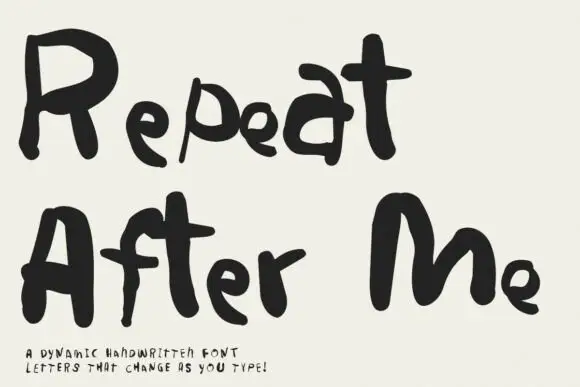
Irregular hand-lettered display
Repeat After Me is a dynamic handwritten display in black on cream: very irregular hand-drawn letters with different strokes for each character, uneven heights and a wobble that changes across a word, sold as a set whose letters vary as they are typed.
Ideas for this font
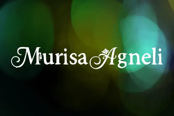
Decorative ornamented capitals
Murisa Agneli is a set of decorative serif capitals in white on a bokeh ground: high-contrast strokes, curled serifs, and small drawn ornaments set inside the counters of several letters.
Ideas for this font
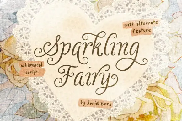
Whimsical curled fine-stroke script
Sparkling Fairy is a whimsical fine-stroke script in chestnut brown on a doily heart: curling entry loops, tall pointed ascenders and an S that swings up and over the whole word.
Ideas for this font
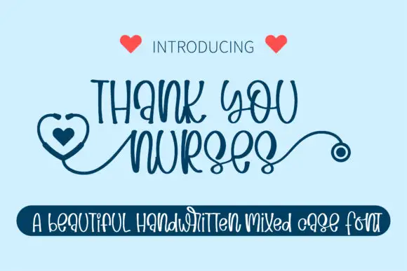
Narrow mixed-case loops with a stethoscope
Thank You Nurses is a narrow mixed-case hand-lettered face in navy, drawn so that the first letter carries a heart and a stethoscope tube that runs into the word and ends in a chest piece.
Ideas for this font
Same independent foundry
Allow optional Google Analytics to measure visits and catalogue actions. Your search words and notes are not included. Privacy & storage