Editorial Serif Anchor

Playmat + Medvilea Editorial
Anchors Playmat's fluid strokes with crisp Roman proportions on wedding suites, headers and packaging.
Inspect Medvilea Editorial specimenDisclosure: MakerFileHub may earn a commission from qualifying purchases via paid links on this page. How our links work.
Uneven hand-drawn typewriter lettering
Playmat is a hand-drawn typewriter font in purple on a pink panel: slab serifs of uneven thickness, a wobbling baseline and round counters that make a machine face look drawn with a pen.
Paid link
Get this fontProject & layout blueprintsAt-a-glance maker compatibility
Fine grain and micro-texture excel in 300 DPI print, sublimation, and screen print rather than small vinyl weeding.
Visual anatomy & craft review
The word is set in mixed case on a wide pink panel, and the face is a typewriter construction drawn by hand: the P has a slab stem and a large bowl, the l and the y carry flat feet, the a is single-storey and the m and the t keep their slab serifs, while the stems vary in width and the letters sit at slightly different heights, so a machine form reads as lettering. The stroke is medium with rounded corners, the spacing is loose and the panel behind the word is a flat colour with a small line and a tracked caption above it. Geometric shapes in lime, yellow and teal sit around the panel on a navy ground, which gives the sheet a mid-century poster feel. Playmat is a display lettering for children's material, posters, packaging and small brands that want a typed voice with warmth.
A typewriter face that wobbles like a drawing
Two-font hierarchy recipes
Tested contrast partners — pairing Playmat with grounded secondary typography.
Playmat + Medvilea Editorial
Anchors Playmat's fluid strokes with crisp Roman proportions on wedding suites, headers and packaging.
Inspect Medvilea Editorial specimen
Playmat + Taught
Keeps small-scale dates, URLs, nutrition facts and care instructions crisp and legible below script titles.
Inspect Taught specimenPractical applications
Concrete hierarchy, scale and production guidance tailored to Playmat’s stroke geometry.
A drawn typewriter face reads clearly on a small card and gives a modern wedding a typed, personal look without a script.
Hierarchy & layout recipe
Print a 90 by 60 mm table card: set the table name at 20 pt on one line, keep 6 mm of clear ground beneath before the number at 7 pt, and hold 5 mm of margin on all four sides.
Pre-production check
Uneven slab serifs at twenty points can look like a misprint; print one card at the finished size and judge the wobble before the set.
The face says what the shop does before a customer reads the name, and the drawn slab serifs still read at a small label size.
Hierarchy & layout recipe
Print a 60 by 45 mm label: set the shop name at 14 pt on one line, keep 5 mm of clear ground beneath before the address at 5.5 pt, and hold 4 mm of margin on all four sides.
Pre-production check
Thin slab serifs can break on textured stock; print one label on the real material and check the feet before the order.
A typed hand on a board looks like a sign someone made for the day, which is warmer than a printed vinyl panel on a garden table.
Hierarchy & layout recipe
Print a 400 by 250 mm board: set the greeting at 70 pt on two lines, keep 20 mm of clear ground beneath before the note at 18 pt, and hold 18 mm of border on all four sides.
Pre-production check
A wobbling baseline reads as crooked when scaled up; print one at the final size and check the level before the set.
Technical & licence verification
Confirm included OTF/TTF/WOFF formats, full glyph tables and licence coverage on the live store page before batch production.
Closest visual alternatives
Matched across letterform anatomy, stroke behaviour and craft applications.
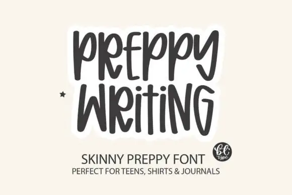
Tall skinny hand-lettered capitals
Preppy Writing is a tall skinny hand-lettering in charcoal on cream: narrow capitals with uneven stems, a small e and i, and a soft white outline that lifts the block off the ground.
Ideas for this font
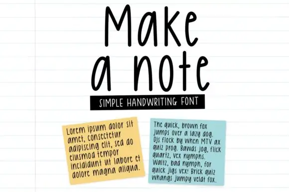
Tall neat monoline handwriting
Make a Note is a tall neat monoline handwriting in black on lined paper: high narrow letters, a small x-height, rounded terminals and an even spacing that keeps a paragraph legible at text size.
Ideas for this font
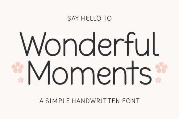
Thin rounded handwritten sans
Wonderful Moments is a thin rounded handwritten sans set in mixed caps: wide open letterforms, a light even stroke with rounded terminals and a small bounce that keeps the line from feeling ruled.
Ideas for this font
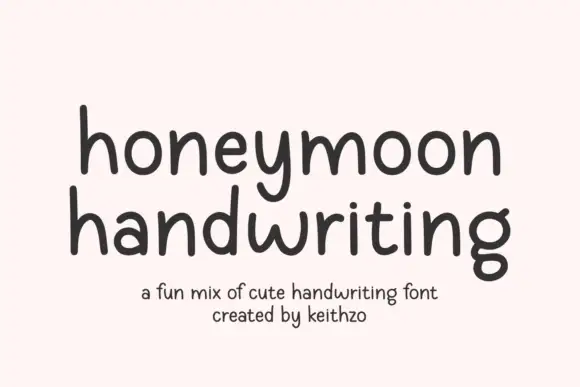
Rounded handwritten sans with tall x-height and evenly spaced letters
Honeymoon Handwriting is rounded handwritten lettering in which the x-height stays tall, the stroke holds one even weight and the letters keep a regular spacing, so a phrase reads as neat handwriting rather than a script.
Ideas for this font
Same independent foundry
Allow optional Google Analytics to measure visits and catalogue actions. Your search words and notes are not included. Privacy & storage