Neutral Sans Workhorse

Black Valor + Furion
Lets Black Valor own the focal silhouette while handling secondary copy, sizing and subheads cleanly.
Inspect Furion specimenDisclosure: MakerFileHub may earn a commission from qualifying purchases via paid links on this page. How our links work.
Broad blackletter with curved a shoulders and hooked capitals
Black Valor sets a gothic blackletter in distressed white on a black ground, with broad strokes, curled lowercase shoulders and hooked capitals whose ends finish in fine diamond points.
Paid link
Get this fontProject & layout blueprintsAt-a-glance maker compatibility
Sturdy stroke walls and open counters weed cleanly on adhesive vinyl, HTV apparel film, and cut cardstock.
Visual anatomy & craft review
The wordmark runs as one line of mixed case across a textured cover, the strokes speckled away at the edges as if printed from worn wood, a red bleed of drips behind and a skull under a crown at the top. Uppercase letters carry tall hooked finials, the lowercase a and o keep dense rounded bowls, and the x-height stays generous so the texture never eats the word. Small caps beneath the title list uppercase, lowercase, numerals and punctuation, plus multilingual support, and the foot line sums up the mood in three words. It is a heavy face for dark projects, and the distress is part of the file rather than a filter added later.
Broad blackletter with curved a shoulders and hooked capitals
Two-font hierarchy recipes
Tested contrast partners — pairing Black Valor with grounded secondary typography.
Black Valor + Furion
Lets Black Valor own the focal silhouette while handling secondary copy, sizing and subheads cleanly.
Inspect Furion specimen
Black Valor + Cronelo
Grounds bold display lettering with classic typographic authority on posters, badges and apparel.
Inspect Cronelo specimenPractical applications
Concrete hierarchy, scale and production guidance tailored to Black Valor’s stroke geometry.
The distressed blackletter gives a Halloween show the weight of a printed poster, and the broad strokes keep a short band name readable across a dark room.
Hierarchy & layout recipe
Print a 420 by 594 mm poster: set the band at 110 pt on one row, keep 34 mm of clear ground beneath before the date at 20 pt, and keep 28 mm of border so the hooked ends stay inside the sheet.
Pre-production check
The speckle bites into fine points; check the proof and avoid reversing this face out of a light stock.
The hooked capitals suit a title page that has to feel printed rather than designed, and the mixed case keeps a long anthology title from turning into a block of black.
Hierarchy & layout recipe
Print a 170 by 240 mm book page: set the title at 48 pt across two lines, keep 18 mm of clear ground beneath before the editor credit at 9 pt, and keep 16 mm of margin from the text block edge.
Pre-production check
Thin joints hold under 18 pt only on coated stock; check a proof at the final page size before the run.
The blackletter carries the sign-painter authority a tattoo shop wants, and the diamond terminals survive a small circular badge without closing up.
Hierarchy & layout recipe
Print a 90 mm round badge: set the shop name at 20 pt on one row, keep 8 mm of clear ground beneath before the street line at 6 pt, and keep 6 mm from the art to the circle edge.
Pre-production check
Hairline joints thin out on cloth; check the embroidered proof before ordering a run of patches.
Technical & licence verification
Confirm included OTF/TTF/WOFF formats, full glyph tables and licence coverage on the live store page before batch production.
Closest visual alternatives
Matched across letterform anatomy, stroke behaviour and craft applications.
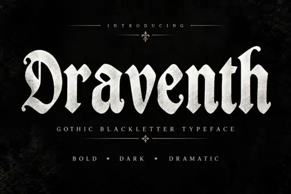
Broad rounded blackletter with curled D and pointed lower joins
Draventh is a wide gothic blackletter display face with heavy stems, sharp hooked shoulders and a weathered silver fill that reads as rubbed metal.
Ideas for this font
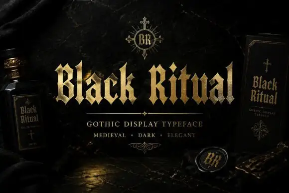
Faceted blackletter with split B and sharp diamond dots
Black Ritual sets heavy gothic capitals with diamond finials in a gold finish on a black ground, and shows the same face printed on a bottle label and a book cover so the range is visible.
Ideas for this font
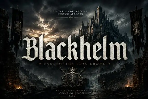
Broad blackletter with sharply peaked shoulders and forked B
Blackhelm is a bold blackletter display face with wide letters, a heavy stem weight and a surface that looks chiselled from weathered stone rather than drawn with a broad nib.
Ideas for this font
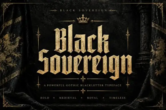
Heavy faceted blackletter with deeply notched capitals
Black Sovereign is a royal gothic blackletter with wide stems, sharp diamond spurs and a gold textured fill, framed by heraldic banners and a small crown.
Ideas for this font
Same independent foundry
Allow optional Google Analytics to measure visits and catalogue actions. Your search words and notes are not included. Privacy & storage



