Neutral Sans Workhorse

Brotheric + Bielchon
Lets Brotheric own the focal silhouette while handling secondary copy, sizing and subheads cleanly.
Inspect Bielchon specimenDisclosure: MakerFileHub may earn a commission from qualifying purchases via paid links on this page. How our links work.
Outlined blackletter with an elaborate sweeping capital B
Brotheric sets a heavy blackletter on a dark panel and lets gold flourishes grow out of the word until they fill the frame, so the lettering reads as one engraved ornament rather than a line of text.
Paid link
Get this fontProject & layout blueprintsAt-a-glance maker compatibility
Sturdy stroke walls and open counters weed cleanly on adhesive vinyl, HTV apparel film, and cut cardstock.
Visual anatomy & craft review
Brotheric runs across a teal band inside an ornate border, the letters thick and spiky, and from the B and the c spring swirls that curl over and under the word, some of them as thin as a hairline. Small labels sit in banner panels above and below, and the corners carry more scrollwork. The flourish is not a separate decoration; it belongs to the glyphs, which means the shape of the composition changes with the word you set. That is the appeal and the trap: it makes a beautiful single word and a mess at any length, and the hairlines need a large print to survive.
Outlined blackletter with an elaborate sweeping capital B
Two-font hierarchy recipes
Tested contrast partners — pairing Brotheric with grounded secondary typography.
Brotheric + Bielchon
Lets Brotheric own the focal silhouette while handling secondary copy, sizing and subheads cleanly.
Inspect Bielchon specimen
Brotheric + Flowsky Editorial
Grounds bold display lettering with classic typographic authority on posters, badges and apparel.
Inspect Flowsky Editorial specimenPractical applications
Concrete hierarchy, scale and production guidance tailored to Brotheric’s stroke geometry.
The ornament gives a seasonal evening its period voice, and one word with the flourishes fills a poster without an illustration.
Hierarchy & layout recipe
Print an A2 poster: set the title at 110 pt on one row, keep 32 mm of clear ground beneath before the date at 18 pt, and keep 30 mm of border so the curls stay inside the sheet.
Pre-production check
Hairline swirls break at small sizes; check the printed proof at final size before the order.
The lettering reads as an engraved cover plate, and a short title carries the whole design without a photograph behind it.
Hierarchy & layout recipe
Print a 152 by 229 mm cover: set the title at 60 pt on one row, keep 22 mm of clear ground beneath before the author at 12 pt, and keep 18 mm of margin from the trim on every side.
Pre-production check
Fine curls fill in on uncoated stock; check a proof on the chosen paper before the run. Test it on the real material before the run is booked.
The ornament gives a bottle a period character, and the heavy body of the letters still holds where the swirls are dropped for a small label.
Hierarchy & layout recipe
Print a 45 by 90 mm bottle label: set the release at 15 pt on one row, keep 7 mm of clear ground beneath before the strength at 5 pt, and keep 5 mm to the die edge so no curl is cut.
Pre-production check
Gold is a mock-up treatment; check the flat file before planning a foil label run. Verify the result on the printed piece, then approve.
Technical & licence verification
Confirm included OTF/TTF/WOFF formats, full glyph tables and licence coverage on the live store page before batch production.
Closest visual alternatives
Matched across letterform anatomy, stroke behaviour and craft applications.
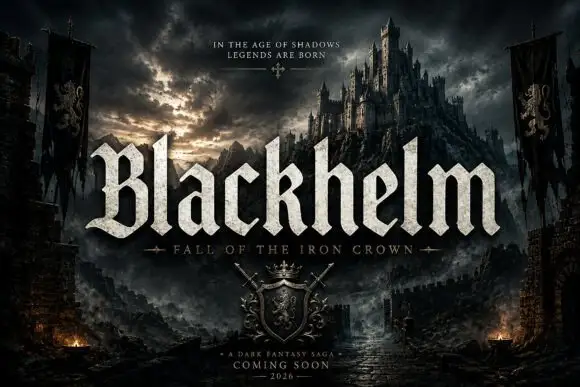
Broad blackletter with sharply peaked shoulders and forked B
Blackhelm is a bold blackletter display face with wide letters, a heavy stem weight and a surface that looks chiselled from weathered stone rather than drawn with a broad nib.
Ideas for this font
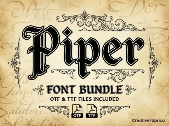
Outlined blackletter with doubled edges
Piper is an outlined blackletter in black on aged cream: a large curled P with doubled edges, narrow bodies, a diamond counter and fine inner lines, set as one large word above a scroll-flanked line that names the bundle and two format marks.
Ideas for this font
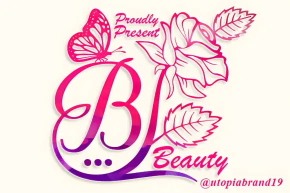
A looping contrast B initial with a large outlined flower, leaves and butterfly
Beauty Flower Monogram is a single ornate script initial with a long descending swash that turns into a line-drawn rose, two leaves and a butterfly, set in a warm pink-to-magenta gradient.
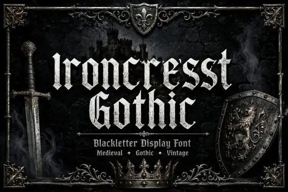
Dense angular blackletter with forked tops and textured fill
Ironcrest Gothic is a medieval display blackletter with a strong vertical stress, diamond feet and a slightly worn fill, framed by heraldic pieces: a shield, a crown, a sword and a lion.
Ideas for this font
Same independent foundry
Allow optional Google Analytics to measure visits and catalogue actions. Your search words and notes are not included. Privacy & storage