Neutral Sans Workhorse

Dark Regent + Godthem
Lets Dark Regent own the focal silhouette while handling secondary copy, sizing and subheads cleanly.
Inspect Godthem specimenDisclosure: MakerFileHub may earn a commission from qualifying purchases via paid links on this page. How our links work.
Ribbon-like blackletter with broad loops and curling lower tails
Dark Regent is a black-metal blackletter with broad hooked stems, swash tails that curl away from the baseline and a texture that reads as carved stone, framed here by a ruined castle and skulls.
Paid link
Get this fontProject & layout blueprintsAt-a-glance maker compatibility
Weld or Unite overlapping script joins into one continuous vector path before sending to the blade.
Visual anatomy & craft review
Dark Regent fills the card in white on a night scene of a ruined castle under a full moon, and the letters are wide and heavy with hooked ascenders that curl into points and feet that sweep out to one side. The swashes are attached rather than separate, so the word has a ragged silhouette, and the counters are narrow, which is right for the genre — the face is meant to be a mark rather than a text. Two captions name the studio and the style, the lower one set in small spaced caps on a dark band. The sample is a genre statement: this is the lettering of a black-metal logo, and it works at poster and cover size, in one colour, on a dark ground where a pale fill reads best.
Ribbon-like blackletter with broad loops and curling lower tails
Two-font hierarchy recipes
Tested contrast partners — pairing Dark Regent with grounded secondary typography.
Dark Regent + Godthem
Lets Dark Regent own the focal silhouette while handling secondary copy, sizing and subheads cleanly.
Inspect Godthem specimen
Dark Regent + Papillon Serif – Elegant Modern Luxury
Grounds bold display lettering with classic typographic authority on posters, badges and apparel.
Inspect Papillon Serif – Elegant Modern Luxury specimenPractical applications
Concrete hierarchy, scale and production guidance tailored to Dark Regent’s stroke geometry.
The silhouette is the genre, and a promoter can put the whole event in one line without paying for a designed logo for each band on the bill.
Hierarchy & layout recipe
Print an A2 poster: set the headliner at 120 pt on one row, keep 34 mm of clear ground beneath before the support list at 13 pt, and hold 26 mm of margin so the hooked tails are not trimmed.
Pre-production check
Hooked tails run into a bleed; print one poster and check the lowest point against the trim before the run.
The face is already a band mark, and a one-colour print on a black shirt is the cheapest way for a small band to look established.
Hierarchy & layout recipe
Print a 300 by 380 mm chest print: set the band name at 120 pt on one row, keep 30 mm of clear ground beneath before the tour line at 11 pt, and hold 26 mm from the lowest tail to the print edge.
Pre-production check
Fine points drop on a coarse screen; print one pull on the actual shirt and check a hook before the run.
The lettering gives a rulebook the look of a setting rather than a manual, which is what sells a game line at a shelf glance.
Hierarchy & layout recipe
Print a 216 by 279 mm cover: set the title at 70 pt across two rows, keep 26 mm of clear ground beneath before the system line at 11 pt, and hold 20 mm from the widest letter to the spine edge.
Pre-production check
Pale on dark needs an opaque base ink; print one cover in the real process and check the fill before the run.
Technical & licence verification
Confirm included OTF/TTF/WOFF formats, full glyph tables and licence coverage on the live store page before batch production.
Closest visual alternatives
Matched across letterform anatomy, stroke behaviour and craft applications.
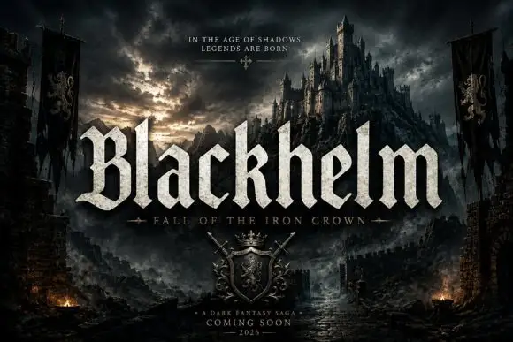
Broad blackletter with sharply peaked shoulders and forked B
Blackhelm is a bold blackletter display face with wide letters, a heavy stem weight and a surface that looks chiselled from weathered stone rather than drawn with a broad nib.
Ideas for this font
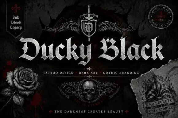
Wide blackletter with sweeping D and a densely split B
Ducky Black is a tattoo and dark-art blackletter with wide stems, sharp spurs and a distressed silver fill, framed by drawn roses, a skull and a fleur.
Ideas for this font
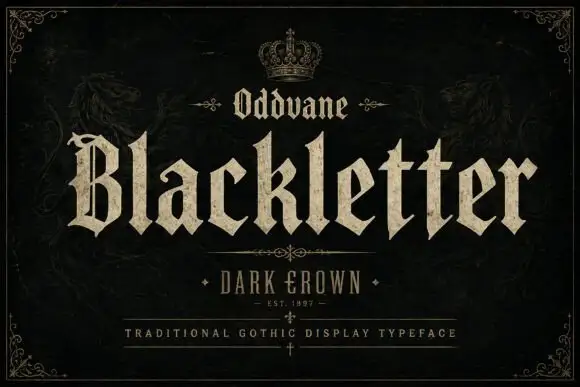
Angular gothic display
Oddvane is an angular gothic display in cream on black: narrow broken strokes with sharp spurs, a split B, broad notched feet and a small crown above the title, with a boxed line beneath naming the collection and a ruled line under that.
Ideas for this font
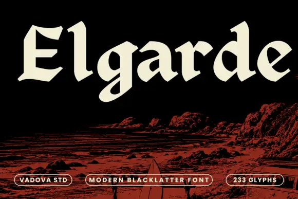
Heavy open blackletter with sloping cuts and a rounded g tail
Elgarde uses broad cream letters above a red coastal scene, where the E has sharply clipped horizontal ends, the lowercase a and d enclose large sloping counters and a rounded low g tail interrupts an otherwise firm baseline, with relatively open interiors for such heavy strokes.
Ideas for this font
Same independent foundry
Allow optional Google Analytics to measure visits and catalogue actions. Your search words and notes are not included. Privacy & storage