Neutral Sans Workhorse

Ducky Black + Base Edge
Lets Ducky Black own the focal silhouette while handling secondary copy, sizing and subheads cleanly.
Inspect Base Edge specimenDisclosure: MakerFileHub may earn a commission from qualifying purchases via paid links on this page. How our links work.
Wide blackletter with sweeping D and a densely split B
Ducky Black is a tattoo and dark-art blackletter with wide stems, sharp spurs and a distressed silver fill, framed by drawn roses, a skull and a fleur.
Paid link
Get this fontProject & layout blueprintsAt-a-glance maker compatibility
Sturdy stroke walls and open counters weed cleanly on adhesive vinyl, HTV apparel film, and cut cardstock.
Visual anatomy & craft review
DUCKY BLACK fills the upper half of the card in a distressed pale silver on a dark ground, and the letters are wide with heavy stems, hooked shoulders and diamond feet, drawn in the tattoo-flash manner rather than as a printed textura. Around the words the card is dressed with the pieces of the style: an ink-red cross at the upper left, a drawn rose at the lower left, a skull inside a fleuron at the centre and a torn paper corner at the right with a fleur on it. Three small captions name the uses in spaced caps, and a line at the foot carries a phrase. The fill is textured, which gives the letters the look of a rubbed print, and the whole composition is built for tattoo studios, merch and dark editorial.
Wide blackletter with sweeping D and a densely split B
Two-font hierarchy recipes
Tested contrast partners — pairing Ducky Black with grounded secondary typography.
Ducky Black + Base Edge
Lets Ducky Black own the focal silhouette while handling secondary copy, sizing and subheads cleanly.
Inspect Base Edge specimen
Ducky Black + Stanza
Grounds bold display lettering with classic typographic authority on posters, badges and apparel.
Inspect Stanza specimenPractical applications
Concrete hierarchy, scale and production guidance tailored to Ducky Black’s stroke geometry.
The lettering speaks the language of the studio, and the distressed fill gives a poster the look of a rubbed print rather than a clean vector.
Hierarchy & layout recipe
Print an A2 poster: set the event name at 110 pt across two rows, keep 30 mm of clear ground beneath before the date at 13 pt, and hold 26 mm of margin so the drawn corners stay whole.
Pre-production check
The distressed fill fills in on cheap stock; print one poster at the final size and check the surface before the run.
The face is a one-colour mark that suits fabric, and the tattoo references make it read as the studio's own voice rather than a borrowed gothic.
Hierarchy & layout recipe
Print a 280 by 380 mm chest print: set the studio name at 130 pt on one row, keep 34 mm of clear ground beneath before the city at 11 pt, and hold 28 mm from the lowest spur to the print edge.
Pre-production check
Coarse mesh closes the fine spurs; print one pull on the actual shirt and check the points before the run.
The lettering and the flash ornaments sit together, so a cover can be built from type and small drawings without a photograph.
Hierarchy & layout recipe
Print a 210 by 280 mm cover: set the title at 80 pt across two rows, keep 24 mm of clear ground beneath before the author at 11 pt, and hold 18 mm from the widest letter to the trim.
Pre-production check
Pale ink on a dark cover needs an opaque base; print one cover in the real process and check the fill first.
Technical & licence verification
Confirm included OTF/TTF/WOFF formats, full glyph tables and licence coverage on the live store page before batch production.
Closest visual alternatives
Matched across letterform anatomy, stroke behaviour and craft applications.
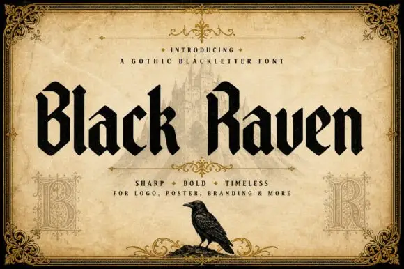
Solid blackletter with angular B and R bowls and pointed feet
Black Raven is a bold blackletter display face with wide stems, tight spacing and a flat black contour, drawn to print solid at large sizes on a light ground.
Ideas for this font
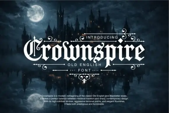
Pointed blackletter with a split ornate C and descending p
Crownspire is an old English display face with long entry and exit flourishes, sharp spurs and a heavy lower stem weight, framed here by a symmetrical ornament of curls and diamonds.
Ideas for this font
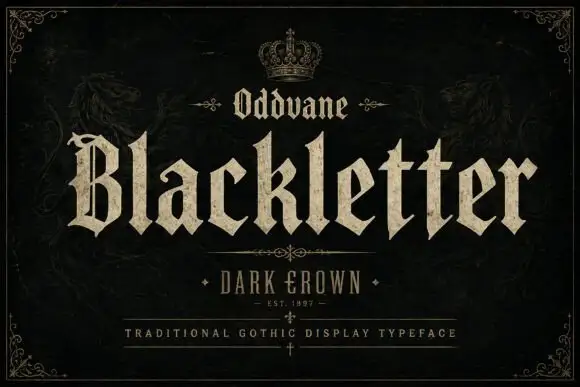
Angular gothic display
Oddvane is an angular gothic display in cream on black: narrow broken strokes with sharp spurs, a split B, broad notched feet and a small crown above the title, with a boxed line beneath naming the collection and a ruled line under that.
Ideas for this font
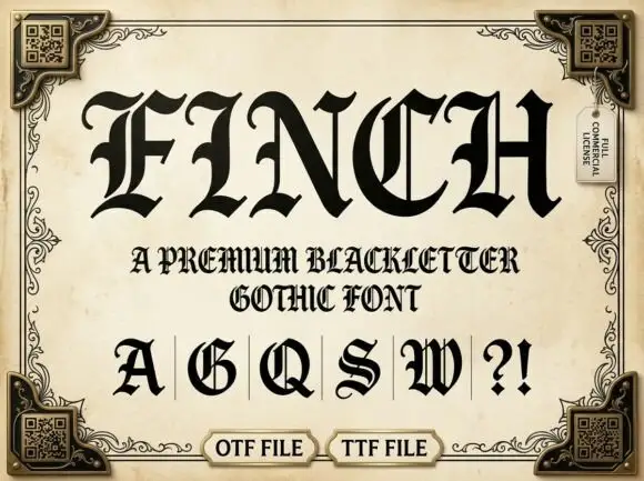
Ornate Gothic capitals with split interiors and curled upper tips
Finch sets a heavy blackletter in black on aged parchment, its stems broad, its finials drawn to diamonds and a few letters carrying fine parallel stripes inside the stroke.
Ideas for this font
Same independent foundry
Allow optional Google Analytics to measure visits and catalogue actions. Your search words and notes are not included. Privacy & storage



