Editorial Serif Anchor

Big Adventure + Svara
Anchors Big Adventure's fluid strokes with crisp Roman proportions on wedding suites, headers and packaging.
Inspect Svara specimenDisclosure: MakerFileHub may earn a commission from qualifying purchases via paid links on this page. How our links work.
Tall handwritten capitals
Big Adventure shows tall separate capitals with narrow bowls and an angular A, where the G, T and R stand above an uneven baseline and a mountain illustration sits behind the lettering.
Paid link
Get this fontProject & layout blueprintsAt-a-glance maker compatibility
Weld or Unite overlapping script joins into one continuous vector path before sending to the blade.
Visual anatomy & craft review
The letters never join, the bowls stay narrow, the heights vary and the A breaks into a sharp peak. That uneven set is the character: the word looks lettered by hand for an outdoor poster rather than typed, which is why the sample keeps one row over a simple landscape. The mountain is illustration and not part of the alphabet, so test your own wording for spacing and keep 30 pt before the narrow bowls pinch shut. The narrow bowls are the failure point: at 24 pt the B and the R pinch shut and the row reads as a picket fence, so keep 30 pt and space the letters yourself because nothing joins.
Tall caps · Unjoined · Uneven baseline
Two-font hierarchy recipes
Tested contrast partners — pairing Big Adventure with grounded secondary typography.
Big Adventure + Svara
Anchors Big Adventure's fluid strokes with crisp Roman proportions on wedding suites, headers and packaging.
Inspect Svara specimen
Big Adventure + Homies
Keeps small-scale dates, URLs, nutrition facts and care instructions crisp and legible below script titles.
Inspect Homies specimenPractical applications
Concrete hierarchy, scale and production guidance tailored to Big Adventure’s stroke geometry.
The tall unjoined caps suit an outdoor sign, and the narrow bowls hold a short name at 50 pt on a printed board, with the uneven heights left as drawn.
Hierarchy & layout recipe
Print a 500 by 250 mm board: set the name at 50 pt on one row, keep 22 mm of clear ground beneath before the distance list at 13 pt, and keep 22 mm of border so the tallest letter stays inside.
Pre-production check
An uneven baseline printed next to a straight rule looks misaligned; check the board and keep the second line in a plain sans.
The uneven caps give a party card energy, and the angular A holds a short greeting at 30 pt on an A6 sheet, where the tall letters still fit the margin.
Hierarchy & layout recipe
Print an A6 card: set the greeting at 30 pt on one row, keep 16 mm of clear ground beneath for the details at 11 pt, and keep 14 mm of margin so the tall letterforms are not cropped.
Pre-production check
Tall narrow caps at 18 pt read as sticks; check the proof and hold the greeting at 26 pt or above.
The hand-lettered caps suit a club poster, and the varied heights hold a two-word title at 44 pt on an A4 sheet, readable from across a hall.
Hierarchy & layout recipe
Print an A4 poster: set the title at 44 pt on one row, keep 20 mm of clear ground beneath before the meeting point at 12 pt, and keep 18 mm of margin all round so the tall letters stay whole.
Pre-production check
Two uneven rows stacked compete; check the poster and set the second line in a plain face.
Technical & licence verification
Confirm included OTF/TTF/WOFF formats, full glyph tables and licence coverage on the live store page before batch production.
Closest visual alternatives
Matched across letterform anatomy, stroke behaviour and craft applications.
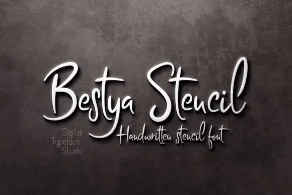
Narrow upright handwritten script with stencil bridges and fine joins
Bestya Stencil is narrow upright handwriting in which the letters stay slim, the joins stay fine and small bridges interrupt the strokes, so the word reads as a stencil cut from a written hand.
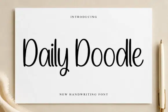
Narrow upright handwriting with tall ascenders and a soft even stroke
Daily Doodle is narrow upright handwriting in which the ascenders run tall, the stroke stays soft and even, and the letters stand apart at a gentle rhythm.
Ideas for this font
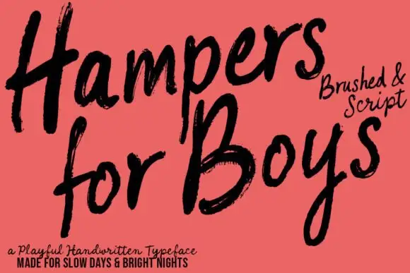
Loose brushed handwriting with slanted bodies and dry swept ends
Hampers for Boys is loose brushed handwriting in which the letters lean forward, the strokes sweep through each letter and the ends lift dry off the page.
Ideas for this font
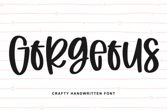
Heavy narrow handwriting with tight counters
Gorgeous is a heavy narrow handwriting that keeps a tall x-height and nearly closed counters, so a single word reads as a dense band with a lively, uneven baseline running under it.
Ideas for this font
Same independent foundry
Allow optional Google Analytics to measure visits and catalogue actions. Your search words and notes are not included. Privacy & storage