Editorial Serif Anchor

Bestya Stencil + The Avenue Editorial
Anchors Bestya Stencil's fluid strokes with crisp Roman proportions on wedding suites, headers and packaging.
Inspect The Avenue Editorial specimenDisclosure: MakerFileHub may earn a commission from qualifying purchases via paid links on this page. How our links work.
Narrow upright handwritten script with stencil bridges and fine joins
Bestya Stencil is narrow upright handwriting in which the letters stay slim, the joins stay fine and small bridges interrupt the strokes, so the word reads as a stencil cut from a written hand.
Paid link
Get this fontProject & layout blueprintsAt-a-glance maker compatibility
Open counter bridges hold interior islands intact on laser-cut wood, acrylic, and mylar stencils.
Visual anatomy & craft review
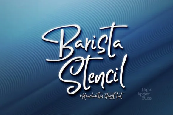
The capital B keeps a tall narrow frame and the lowercase runs slim: the e loops back high, the s reverses through two tight curves, the t crosses with a single bar and the y drops a straight tail. The defining feature is the bridge: short gaps break the stems and joins at a consistent angle, which is what makes the face cuttable while keeping the written rhythm. Because the gaps are small, the face needs 22 pt minimum on print and a cutter blade that can hold the detail. The upright angle means it stacks cleanly under a printed line without fighting the baseline. The grey textured wall, the white lettering with its soft shadow and the two credit lines are presentation; the script is the two words.
Stencil · Narrow · Written
Two-font hierarchy recipes
Tested contrast partners — pairing Bestya Stencil with grounded secondary typography.
Bestya Stencil + The Avenue Editorial
Anchors Bestya Stencil's fluid strokes with crisp Roman proportions on wedding suites, headers and packaging.
Inspect The Avenue Editorial specimen
Bestya Stencil + Modern Limited
Keeps small-scale dates, URLs, nutrition facts and care instructions crisp and legible below script titles.
Inspect Modern Limited specimenPractical applications
Concrete hierarchy, scale and production guidance tailored to Bestya Stencil’s stroke geometry.
The bridges are drawn for a blade, and the narrow hand reads at 60 mm painted or sprayed onto a crate where a normal script would need a mask per letter.
Hierarchy & layout recipe
Cut a 300 by 100 mm mylar stencil: set the name at 60 mm, keep every bridge at 4 mm minimum, and leave 8 mm of mask around each letter so the spray does not creep under the edge.
Pre-production check
A bridge under 3 mm tears when the mask is lifted; check the cut file at full size and widen the bridges rather than the letters.
The stencil construction gives a printed sign the look of an industrial crate mark, and the narrow hand still reads at 25 mm on a small panel.
Hierarchy & layout recipe
Print a 400 by 250 mm panel: set the roastery name at 25 mm, set the roast in a 8 mm caps sans beneath, and keep 25 mm of border so the bridges remain visible against the panel edge.
Pre-production check
A stencil pattern printed at 25 mm can look like damage; check the panel and keep the face above 30 mm on paper.
The narrow hand fits a small shipping tag at 12 pt, and the bridges keep the look of a stamped crate mark on a lightweight card.
Hierarchy & layout recipe
Print an 80 by 40 mm shipping tag: set the shop name at 12 pt, set the order number in a 6 pt sans beneath, and keep 10 mm at one end clear so the tie does not cross a bridge.
Pre-production check
A tag tied through the punch pulls the card; check a tied sample and keep 8 mm of card between the hole and the nearest letter.
Technical & licence verification
Confirm included OTF/TTF/WOFF formats, full glyph tables and licence coverage on the live store page before batch production.
Closest visual alternatives
Matched across letterform anatomy, stroke behaviour and craft applications.
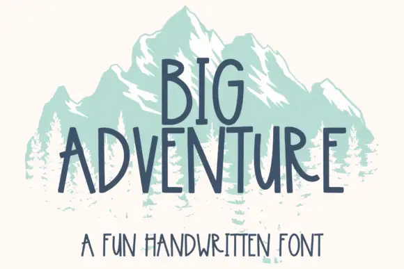
Tall handwritten capitals
Big Adventure shows tall separate capitals with narrow bowls and an angular A, where the G, T and R stand above an uneven baseline and a mountain illustration sits behind the lettering.
Ideas for this font
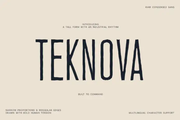
Raw condensed drawn sans
Teknova is a tall condensed sans in navy on a warm off-white sheet: narrow capitals with uneven straight stems, polygonal O corners and slightly irregular edges, set as one large word with a small line above and four tracked notes at the corners.
Ideas for this font
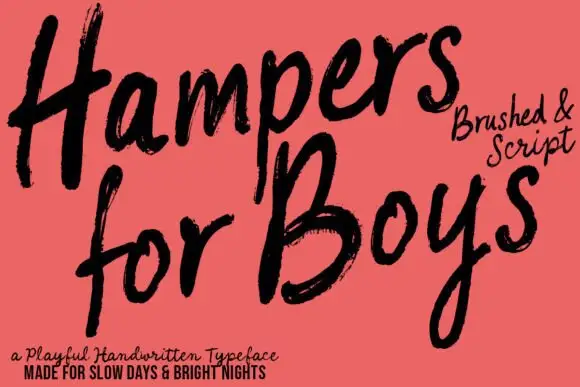
Loose brushed handwriting with slanted bodies and dry swept ends
Hampers for Boys is loose brushed handwriting in which the letters lean forward, the strokes sweep through each letter and the ends lift dry off the page.
Ideas for this font
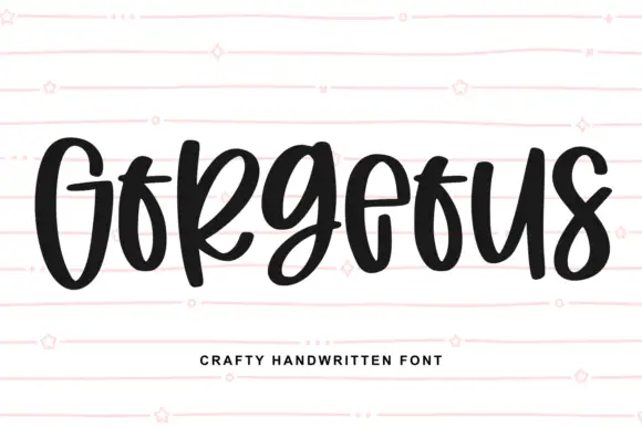
Heavy narrow handwriting with tight counters
Gorgeous is a heavy narrow handwriting that keeps a tall x-height and nearly closed counters, so a single word reads as a dense band with a lively, uneven baseline running under it.
Ideas for this font
Same independent foundry
Allow optional Google Analytics to measure visits and catalogue actions. Your search words and notes are not included. Privacy & storage