High-Contrast Display Serif

Sunshine & Lemons + Marquis - Elegant Modern Serif
Pairs sculptural editorial warmth with Sunshine & Lemons's clean modern geometry.
Inspect Marquis - Elegant Modern Serif specimenDisclosure: MakerFileHub may earn a commission from qualifying purchases via paid links on this page. How our links work.
Rounded script over tall narrow capitals
Sunshine and Lemons is a two-part display in navy on cream: a rounded monoline script for the first line with an ampersand, and very tall narrow capitals for the second, with a drawn lemon branch laid over the words and pale dots across the ground.
Paid link
Get this fontProject & layout blueprintsAt-a-glance maker compatibility
Weld or Unite overlapping script joins into one continuous vector path before sending to the blade.
Visual anatomy & craft review
The sample pairs two related hands in one colour: the first line is a monoline script with round bowls, tall loops and a wide looped ampersand, while the second is a set of very tall narrow capitals whose stems are straight and whose counters are long slots, drawn with the same even stroke so the two lines belong together. The contrast is in width and case rather than in weight, which is what lets a script and a block line sit on one page without one dominating the other. A drawn branch with two lemons and several leaves runs across the join between the lines, and pale dots are scattered evenly over the cream ground. The palette is navy with two yellows and a green for the illustration. Sunshine and Lemons is a pair for labels, menus, cards, packaging and signage with a fresh, summery tone, and it needs short words with room around the illustration.
Soft, narrow, paired
Two-font hierarchy recipes
Tested contrast partners — pairing Sunshine & Lemons with grounded secondary typography.
Sunshine & Lemons + Marquis - Elegant Modern Serif
Pairs sculptural editorial warmth with Sunshine & Lemons's clean modern geometry.
Inspect Marquis - Elegant Modern Serif specimen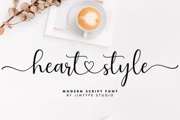
Sunshine & Lemons + Heart Style
Introduces organic movement on pull-quotes, signatures and gift tags.
Inspect Heart Style specimenPractical applications
Concrete hierarchy, scale and production guidance tailored to Sunshine & Lemons’s stroke geometry.
The pair gives a bottle a script brand and a tall block flavour line in one colour, and the drawn fruit can be dropped when the label is small.
Hierarchy & layout recipe
Print a 55 by 90 mm label: set the script at 16 pt, set the capitals at 18 pt in the same ink with 6 mm of clear ground, and hold 4 mm of margin on all four sides.
Pre-production check
Tall narrow capitals at eighteen points can look thin on a curved label; print one on the real bottle and check the stems.
Two hands in one colour keep a shopfront sign coherent, and the tall capitals fill a wide fascia that a script alone would leave empty.
Hierarchy & layout recipe
Print a 900 by 300 mm fascia: set the script at 90 pt, set the capitals at 110 pt with 30 mm of clear ground, and hold 28 mm of margin on all four sides.
Pre-production check
A script above a tall block changes the optical centre; proof one panel and look at it from the far pavement.
The pair covers a title and a standfirst on one spread, and the drawn branch gives the page an illustration without a photograph.
Hierarchy & layout recipe
Print a 240 by 300 mm spread: set the script at 54 pt, set the capitals at 40 pt with 20 mm of clear ground, and hold 20 mm of margin on the outer edges.
Pre-production check
An illustration laid over type can hide a letter; check the overlap on the final artwork before sending to press.
Technical & licence verification
Confirm included OTF/TTF/WOFF formats, full glyph tables and licence coverage on the live store page before batch production.
Closest visual alternatives
Matched across letterform anatomy, stroke behaviour and craft applications.
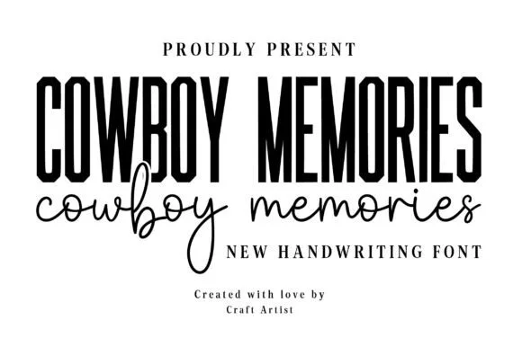
Bold condensed Western-poster sans + natural signature script duo
Cowboy Memories is a clean modern-country font duo pairing a tall, punchy condensed headline sans with an airy monoline handwritten script.
Ideas for this font
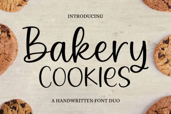
2-font farmhouse bakery duo: Bouncy script + tall rounded print sans!
Bakery Cookies is actually a complete 2-font farmhouse duo (NOT a single script!) pairing a bouncy monoline cursive with a tall rounded all-caps sans!
Ideas for this font
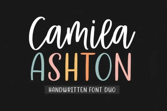
Bouncy crafter brush script + tall pastel farmhouse sans duo
Camila Ashton is a clean, crafter-ready handwritten font duo pairing a thick, smooth upright brush script with a tall rounded print sans!
Ideas for this font
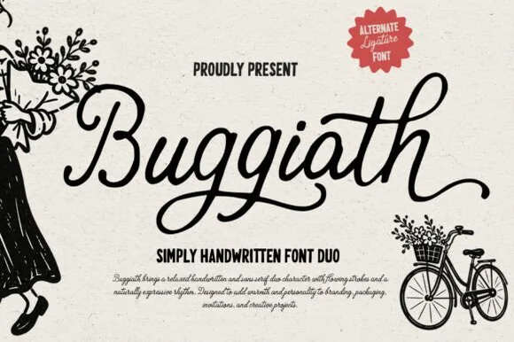
Plump monoline cord script + bold condensed sans duo (Alternates & ligatures)
Buggiath is a friendly flower-market font duo pairing a thick, rounded monoline cord script (with ligatures & alternates) and a punchy condensed sans!
Ideas for this font
Same independent foundry
Allow optional Google Analytics to measure visits and catalogue actions. Your search words and notes are not included. Privacy & storage