Editorial Serif Anchor

Someone Special + Papillon Serif – Elegant Modern Luxury
Anchors Someone Special's fluid strokes with crisp Roman proportions on wedding suites, headers and packaging.
Inspect Papillon Serif – Elegant Modern Luxury specimenDisclosure: MakerFileHub may earn a commission from qualifying purchases via paid links on this page. How our links work.
Elegant brush script
Someone Special is an elegant brush script in navy on peach: thick downstrokes with a visible brush entry, thin upstrokes, wide looping capitals on the S, and a joined lowercase whose final l lifts into a loop, with pale hearts scattered across the ground.
Paid link
Get this fontProject & layout blueprintsAt-a-glance maker compatibility
Weld or Unite overlapping script joins into one continuous vector path before sending to the blade.
Visual anatomy & craft review
The two words are stacked and the drawing is a relaxed brush lettering rather than a formal script: the entries are broad and slightly textured, the upstrokes are fine, and the letters join with short links that keep the word readable at small sizes. The capitals S are the widest forms, drawn with an open upper loop and a full lower bowl, and the lowercase keeps a generous x-height, which is what makes the pair feel friendly rather than ornate. The final l of the second word curls into a loop that lifts above the baseline, closing the phrase with a flourish. The ground is a flat peach field scattered with pale hearts, and the caption beneath is set in the same script at a much smaller size, which shows how far the face can be reduced before the brush texture disappears.
Elegant, brushy, flowing, romantic
Two-font hierarchy recipes
Tested contrast partners — pairing Someone Special with grounded secondary typography.
Someone Special + Papillon Serif – Elegant Modern Luxury
Anchors Someone Special's fluid strokes with crisp Roman proportions on wedding suites, headers and packaging.
Inspect Papillon Serif – Elegant Modern Luxury specimen
Someone Special + Montreal
Keeps small-scale dates, URLs, nutrition facts and care instructions crisp and legible below script titles.
Inspect Montreal specimenPractical applications
Concrete hierarchy, scale and production guidance tailored to Someone Special’s stroke geometry.
A romantic brush script sets the tone of a February card without the heavy pink clichés, and the generous x-height keeps the phrase readable for older recipients.
Hierarchy & layout recipe
A6 card: the phrase at 30 pt, the offer in a 9 pt sans beneath, and a few pale hearts at the corners. Keep 12 mm margins and print one ink on a cream stock so the brush entries read as ink rather than as texture.
Pre-production check
Check the 30 pt phrase on the card, where the thin upstrokes can break; proof one card. Confirm the 9 pt offer keeps a 4.5:1 contrast and that the final loop of the l clears the trim by 6 mm.
A brush script reads as hand-painted romance, and the relaxed construction suits an outdoor or garden ceremony better than a formal calligraphy.
Hierarchy & layout recipe
A5 portrait: the names at 28 pt, the details in a 9 pt serif, and the date at 8 pt caps. Keep 20 mm margins and print one ink on a textured cream stock so the brush texture matches the paper.
Pre-production check
Check the names at 28 pt on the textured stock, where the brush edges can look worn; proof a sheet. Confirm the 8 pt date keeps a 4.5:1 contrast and that the wide S loops stay inside the margin.
A soft brush label signals a handmade product, and the generous weight keeps the brand legible on a small bottle where a hairline script would lose detail.
Hierarchy & layout recipe
Print a 50 by 70 mm label: the brand at 16 pt, the scent in a 7 pt sans, and the volume in 6 pt. Keep 4 mm of clear label inside the die so the looped l is never cut, and print one ink on a cream stock.
Pre-production check
Check the 16 pt brand on the bottle, where the joins can close; open the spacing slightly for the label. Confirm the 6 pt volume reads on the curved glass and that the descenders stay inside the die.
Technical & licence verification
Confirm included OTF/TTF/WOFF formats, full glyph tables and licence coverage on the live store page before batch production.
Closest visual alternatives
Matched across letterform anatomy, stroke behaviour and craft applications.
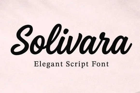
Bold upright thick-and-thin script
Solivara is an elegant bold script in black on a warm off-white ground: upright letters with pronounced thick-and-thin contrast, rounded terminals that curl back into the stroke, and tight joins, so the word reads as a confident retro script rather than a formal calligraphy.
Ideas for this font
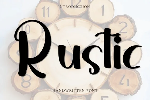
Handmade brush display with curls
Rustic is a handmade brush display in black over a wood-slice clock mockup: mixed-case letters with thick uneven strokes, curls on the R and the s, and a descender on the t, so the word reads as lettering painted on a rustic sign.
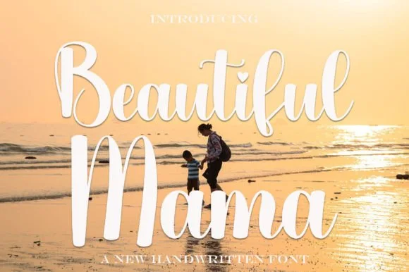
Bold bouncy sunset-beach brush calligraphy script
Beautiful Mama is a warm, thick-stroked brush calligraphy script (not a block display) featuring tall upright loops and sturdy vinyl-ready curves.
Ideas for this font
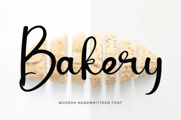
Tall lively modern brush calligraphy script
Bakery (by pinkmeca) is a tall, lively modern brush calligraphy script pairing a big rounded 'B' with energetic thick-and-thin cursive loops.
Ideas for this font
Same independent foundry
Allow optional Google Analytics to measure visits and catalogue actions. Your search words and notes are not included. Privacy & storage