Editorial Serif Anchor

Rebel Marks + Things
Anchors Rebel Marks's fluid strokes with crisp Roman proportions on wedding suites, headers and packaging.
Inspect Things specimenDisclosure: MakerFileHub may earn a commission from qualifying purchases via paid links on this page. How our links work.
Angular brush capitals with split ends
Rebel Marks is an angular brush face in red and white on black: bold capital letters brushed with flat angled strokes, ragged split ends and a tilted baseline, surrounded by scribbles, badges and a stencil mark.
Paid link
Get this fontProject & layout blueprintsAt-a-glance maker compatibility
Weld or Unite overlapping script joins into one continuous vector path before sending to the blade.
Visual anatomy & craft review
The two words are set on separate lines and tilted against each other, and the face is a brush lettering rather than a script: the strokes are flat and wide like a loaded brush dragged at speed, the ends split into dry parallel lines, the corners are cut at an angle, and the R and the E break their strokes where the brush lifts, so the letterforms look struck rather than drawn. The first word is in a warm red and the second in white, both on a black ground that is crowded with scribbles, drips, small badges, a drawn crown and a barcode sticker with a red cross over it, which is the mood the sample sells. The letters lean and the baseline rises toward the right, giving the block its momentum. Rebel Marks is a display face for posters, apparel, skate and music graphics, and it needs two or three short words at a large size on a dark, busy ground.
Angular, brushed, ragged
Two-font hierarchy recipes
Tested contrast partners — pairing Rebel Marks with grounded secondary typography.
Rebel Marks + Things
Anchors Rebel Marks's fluid strokes with crisp Roman proportions on wedding suites, headers and packaging.
Inspect Things specimen
Rebel Marks + Homies
Keeps small-scale dates, URLs, nutrition facts and care instructions crisp and legible below script titles.
Inspect Homies specimenPractical applications
Concrete hierarchy, scale and production guidance tailored to Rebel Marks’s stroke geometry.
A brushed, ragged face signals student work that is meant to look rough, and heavy strokes survive being printed on cheap poster stock.
Hierarchy & layout recipe
Print a 420 by 594 mm poster: set the title at 120 pt over two lines, keep 40 mm of clear ground beneath before the dates at 22 pt, and hold 26 mm of margin on all four sides.
Pre-production check
A tilted baseline on a large sheet can look like a crooked print; keep the tilt deliberate and proof one sheet flat before the run.
A brush face gives a release a hand-struck look that a clean sans cannot, and the split ends read as texture at sleeve size.
Hierarchy & layout recipe
Print a 300 mm record sleeve: set the label name at 60 pt on one line, keep 30 mm of clear ground beneath before the catalogue number at 10 pt, and hold 22 mm of margin on all four sides.
Pre-production check
Dry-brush ends can fill in when printed small; check the sleeve flat at the final size before approving the press proof.
A ragged brush block sets an editorial tone that is loud without illustration, and two colours let the cover carry a title and a standfirst on one page.
Hierarchy & layout recipe
Print a 230 by 300 mm cover: set the masthead at 100 pt on one line, keep 26 mm of clear ground beneath before the coverlines at 11 pt, and hold 18 mm of margin on all four sides.
Pre-production check
Busy brush textures behind coverlines can hide them; keep the lower third of the cover clear of the block and proof the page.
Technical & licence verification
Confirm included OTF/TTF/WOFF formats, full glyph tables and licence coverage on the live store page before batch production.
Closest visual alternatives
Matched across letterform anatomy, stroke behaviour and craft applications.
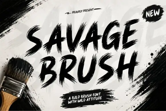
Heavy dry-brush textured script
Savage Brush is a heavy dry-brush script in black on a whitewashed wall: very thick strokes with torn, split edges, short loops and a hard forward lean, printed beside a house brush on the sheet.
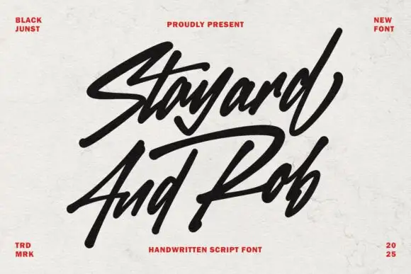
Angular marker script with sharp terminals
Stayard and Rob is a bold marker script in black on off-white paper: angled strokes, sharp cut terminals and a fast forward lean, with small red caps in the corners as the only decoration.
Ideas for this font

Rough slanted brush capitals with dry edges and a heavy lean
Black Ink Brush is rough slanted brush lettering in which the strokes stay heavy through the middle and fray at the ends, and the whole phrase leans hard to the right.
Ideas for this font
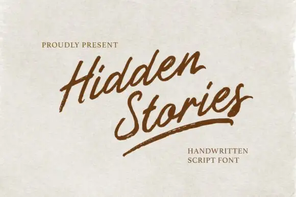
Angled brush script with dry-brushed edges and an underline swash
Hidden Stories is a dry brush script that leans hard to the right, its strokes ragged at the edges and broken where the brush lifted, with a single long underline swash finishing the second word.
Ideas for this font
Same independent foundry
Allow optional Google Analytics to measure visits and catalogue actions. Your search words and notes are not included. Privacy & storage