Modern Grotesque Body

Sporty Tee Outlined + Modern Heritage
Creates crisp high-hierarchy contrast beneath Sporty Tee Outlined headlines across menus, websites and labels.
Inspect Modern Heritage specimenDisclosure: MakerFileHub may earn a commission from qualifying purchases via paid links on this page. How our links work.
Varsity slab with outline and two-colour alphabet
Sporty Tee Outlined is a varsity slab in dark grey with a light outline: heavy square serifs, wide flat-topped caps, counters cut as rectangles, and an inline gap that separates the fill from the outline, sold with a two-colour SVG alphabet for the same job.
Paid link
Get this fontProject & layout blueprintsAt-a-glance maker compatibility
Weld or Unite overlapping script joins into one continuous vector path before sending to the blade.
Visual anatomy & craft review
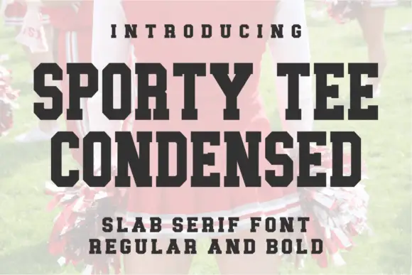
The word is set in three stacked lines and the drawing is a college slab: the serifs are as heavy as the stems, the tops of the letters are flat, and the curves of the O and the S are squared off, which is the shape a school jersey implies. The outline treatment is a thin contour separated from the fill by a gap, so the letters read as an appliqué patch rather than as outlined type, and the gap is even on every letter, which is what makes it usable as a cut file. Because the outlines are thin, the face holds best at large sizes, and the specimen sets everything big against a blurred photograph of a football and grass. The caption beneath lists the format plainly, in the same slab, which is the language of a sports-wear product rather than a type specimen.
Varsity, outlined, sporty, bold
Two-font hierarchy recipes
Tested contrast partners — pairing Sporty Tee Outlined with grounded secondary typography.
Sporty Tee Outlined + Modern Heritage
Creates crisp high-hierarchy contrast beneath Sporty Tee Outlined headlines across menus, websites and labels.
Inspect Modern Heritage specimen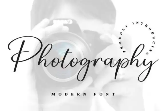
Sporty Tee Outlined + Photography Font
Adds a warm human signature touch for 1-to-3-word callouts without competing against structured serif capitals.
Inspect Photography Font specimenPractical applications
Concrete hierarchy, scale and production guidance tailored to Sporty Tee Outlined’s stroke geometry.
A varsity slab with an inline outline is what a school team shirt actually uses, and the even gap makes the lettering cut cleanly in heat-transfer vinyl without a manual tracing pass.
Hierarchy & layout recipe
Print a 260 mm chest graphic: the team name at 60 mm cap height, the number in a 40 mm slab, and two inks. Keep the inline gap at least 2 mm so the vinyl holds its shape and keep the graphic 80 mm below the collar.
Pre-production check
Check the vinyl at actual size, where a gap under 1.5 mm tears on weeding; widen it. Wash-test one shirt and confirm the 40 mm number keeps its edges after five cycles.
A varsity outline reads as a club badge rather than a brand, and the inline gap gives a small club a mark that works on a shirt, a flag and a sticker without redrawing.
Hierarchy & layout recipe
Set the mark at 40 mm wide on a pennant, 25 mm on a sticker, and 120 mm on a banner. Keep the gap proportional at each size and build a one-colour version without the inline for embroidery.
Pre-production check
Check the 25 mm sticker, where the gap can close; test the one-colour version below 30 mm. Confirm the pennant mark reads from the touchline and that the embroidery file holds the serifs at 40 mm.
A varsity slab sets the theme in one line, and the inline outline makes the invitation look like a ticket rather than a card, which is the detail a sports-mad child notices.
Hierarchy & layout recipe
A6 card: the headline at 30 pt, the details in a 9 pt sans, and a 4 mm border. Keep 12 mm margins and print two colours on a white card so the inline gap stays open at card size.
Pre-production check
Check the 30 pt headline, where the inline can close; keep the size above 26 pt for this treatment. Confirm the 9 pt details keep a 4.5:1 contrast and that the border does not crowd the serifs.
Technical & licence verification
Confirm included OTF/TTF/WOFF formats, full glyph tables and licence coverage on the live store page before batch production.
Closest visual alternatives
Matched across letterform anatomy, stroke behaviour and craft applications.
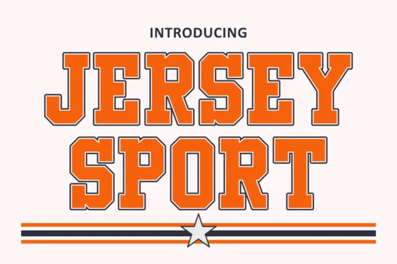
Outlined collegiate sports slab with a flat fill and a thin keyline
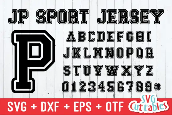
Jersey Sport is a collegiate slab alphabet drawn as an outline with a flat fill inside it, so a word reads as a printed athletic front where the keyline does the work and the fill carries the colour.
Ideas for this font
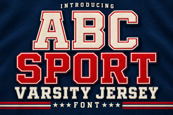
Layered varsity jersey capitals with fill, keyline and offset shadow
ABC Sport is a layered varsity capital alphabet in which each letter carries a fill, a narrow keyline and an offset shadow, so a name reads as the appliqué on a college jersey.
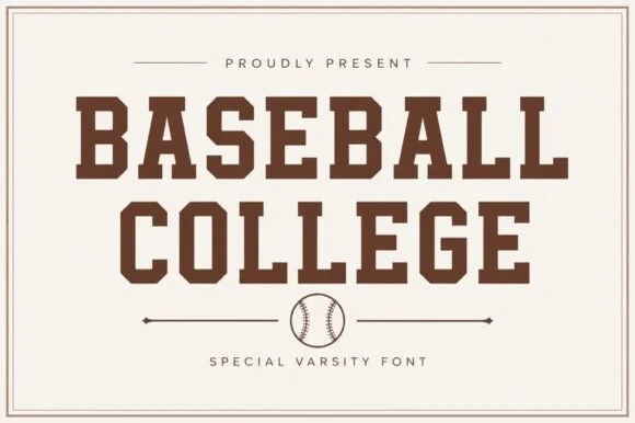
Clean solid collegiate & vintage baseball slab serif
Baseball College is a clean, solid-filled American varsity slab serif built with sturdy rectangular blocks and chamfered athletic corners.
Ideas for this font
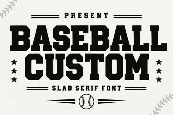
Heavy condensed baseball slab with solid square serifs
Baseball Custom is a heavy condensed slab alphabet in which the stems stay wide, the serifs turn square and the fit runs tight, so a two-word title reads as the lettering on a team jacket.
Same independent foundry
Allow optional Google Analytics to measure visits and catalogue actions. Your search words and notes are not included. Privacy & storage