High-Contrast Display Serif

Base Spark + Amor Hadena
Pairs sculptural editorial warmth with Base Spark's clean modern geometry.
Inspect Amor Hadena specimenDisclosure: MakerFileHub may earn a commission from qualifying purchases via paid links on this page. How our links work.
Heavy condensed sans letters with squared curves and abrupt flat ends
Base Spark is a condensed sans with tall stems, a light overall weight, flat terminals and a narrow set of counters that keep a long word inside a small width.
Paid link
Get this fontProject & layout blueprintsAt-a-glance maker compatibility
Sturdy stroke walls and open counters weed cleanly on adhesive vinyl, HTV apparel film, and cut cardstock.
Visual anatomy & craft review
Base Spark sits across the middle of the card in a warm cream over a dark wooden surface lit by a hard diagonal light, set in mixed case at a size where the proportions are clear. The letters are narrow and slightly condensed, the bowls of the a and the e are small, and every stroke ends flat, so the word looks engineered rather than written. The contrast is low to moderate, which keeps the line even and lets the face work at both display and text sizes. A tracked caption above introduces the face and one below names the style. The composition is quiet: a dark ground, a phone standing in the shadow, one word and two captions, which is how a condensed sans is best shown, because its character lives in proportion rather than in detail.
Heavy condensed sans letters with squared curves and abrupt flat ends
Two-font hierarchy recipes
Tested contrast partners — pairing Base Spark with grounded secondary typography.
Base Spark + Amor Hadena
Pairs sculptural editorial warmth with Base Spark's clean modern geometry.
Inspect Amor Hadena specimen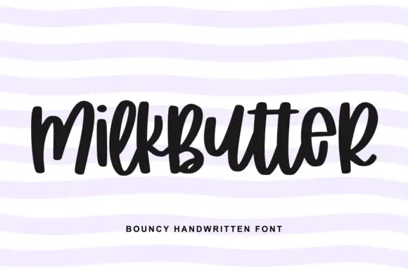
Base Spark + Milkbutter
Introduces organic movement on pull-quotes, signatures and gift tags.
Inspect Milkbutter specimenPractical applications
Concrete hierarchy, scale and production guidance tailored to Base Spark’s stroke geometry.
The narrow proportions read as technical without a stencil, and the flat terminals hold up when the mark is reduced to a stamp or a plate.
Hierarchy & layout recipe
Print a 60 mm brand block: set the studio name at 17 pt on one row, keep 6 mm of clear ground beneath before the descriptor at 4.5 pt, and hold 5 mm from the widest letter to the block edge.
Pre-production check
Small reproductions close the narrow counters; print one block at 20 mm wide and check the a and the e before the stationery.
The condensed width fits a long subhead into a narrow column, and the flat terminals keep the line crisp at eleven points on uncoated paper.
Hierarchy & layout recipe
Print a 210 by 297 mm page: set the subhead at 12 pt with 1.5 mm of tracking, keep 9 mm of clear ground beneath before the body at 9.5 pt, and hold 7 mm between the subhead and the column rule.
Pre-production check
Condensed type at small sizes thickens on absorbent stock; print one page on the real paper and check the counters.
The narrow letters fit a long course title into one line of a handout, and the plain weight survives a photocopy for a full class.
Hierarchy & layout recipe
Print an A4 handout: set the course title at 30 pt on one row, keep 14 mm of clear ground beneath before the first heading at 11 pt, and hold 15 mm of margin at both sides of the sheet.
Pre-production check
Photocopiers close narrow counters into bars; copy one sheet on the machine the class uses and check the letters.
Technical & licence verification
Confirm included OTF/TTF/WOFF formats, full glyph tables and licence coverage on the live store page before batch production.
Closest visual alternatives
Matched across letterform anatomy, stroke behaviour and craft applications.
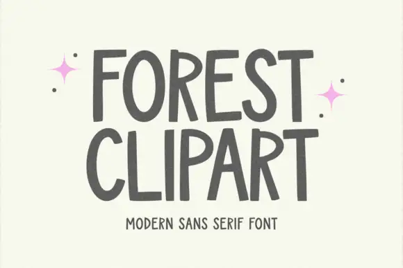
Tall hand-shaped capitals with uneven stroke edges and angled R legs
Forest Clipart draws tall hand-lettered capitals with a deliberately unsteady stroke, keeps the widths uneven, and sets two stacked words on a plain cream ground with small sparkles in the margins.
Ideas for this font
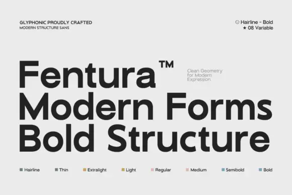
Substantial plain mixed case with broad bowls and open horizontal e bars
Fentura presents three black lines on light grey, the name above Modern Forms and Bold Structure, where straight substantial stems meet broad rounded bowls, the e opens wide, the a keeps a double storey and the crossbars stay flat and plain.
Ideas for this font
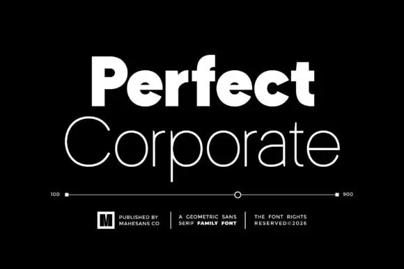
Heavy and thin geometric pair
Perfect Corporate is a geometric sans pair in white on black: a very heavy mixed-case word above a thin, wide mixed-case line, with a weight scale between them running from 100 to 900, three small credits beneath and a boxed mark at the left.
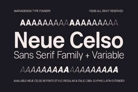
Neutral sans family with variable weights
Neue Celso is a neutral sans family shown in pale cream on charcoal: a title line in mixed case with open e bowls, a subtitle in a lighter cut, and above and below it two rows of A samples that step through the weights, with small notes in the corners that state the count, the styles and the glyph set.
Ideas for this font
Same independent foundry
Allow optional Google Analytics to measure visits and catalogue actions. Your search words and notes are not included. Privacy & storage