Editorial Serif Anchor

Balica + Augler
Anchors Balica's fluid strokes with crisp Roman proportions on wedding suites, headers and packaging.
Inspect Augler specimenDisclosure: MakerFileHub may earn a commission from qualifying purchases via paid links on this page. How our links work.
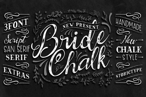
Broad slanted brush lettering with open counters and a light connective stroke
Balica is broad slanted brush lettering in which the strokes are wide and open, the joins are light, and the letters lean together without losing their separate counters.
Paid link
Get this fontProject & layout blueprintsAt-a-glance maker compatibility
Sturdy stroke walls and open counters weed cleanly on adhesive vinyl, HTV apparel film, and cut cardstock.
Visual anatomy & craft review
The capital B opens with a broad diagonal entry that rises from below the baseline into a tall stem, and its two lobes are wide enough to leave visible air inside. The following letters keep that breadth: the a and the c open their counters widely, the l rises into a tall light stem, the i carries a round dot, and the final a exits in a light upward stroke. Pressure varies between broad stems and light joins, which is what produces the brushed look without any texture, and the slope stays constant across the word. There is no taper at the ends; they stop blunt with a slight rounding. The dark leaf photograph behind the white lettering and the tracked caption beneath are presentation; the brush lettering is the word.
Broad · Slanted · Open
Two-font hierarchy recipes
Tested contrast partners — pairing Balica with grounded secondary typography.
Balica + Augler
Anchors Balica's fluid strokes with crisp Roman proportions on wedding suites, headers and packaging.
Inspect Augler specimen
Balica + Mango Dream
Keeps small-scale dates, URLs, nutrition facts and care instructions crisp and legible below script titles.
Inspect Mango Dream specimenPractical applications
Concrete hierarchy, scale and production guidance tailored to Balica’s stroke geometry.
Open counters keep the name legible even when the mark is set over a busy background like foliage, and the broad stems hold up on a painted sign.
Hierarchy & layout recipe
Set the garden centre's name at 24 cm on a 2 m timber board, keep the opening times in a clean sans at 6 cm, and hold 15 cm of margin so the broad entry stroke is not cut by the frame.
Pre-production check
Lettering over a photographed background loses contrast; check the proof as printed and add a plain panel behind the word if the open counters start to fill.
The open counters and light joins suit a setting with trees and dappled light, where a dense script would read as a smudge from the aisle.
Hierarchy & layout recipe
Set both names at 14 cm on a 600 by 800 mm board, keep the date in the same face at 4 cm, and leave 10 cm below so the final stroke has space above the stand.
Pre-production check
A stand or easel covers the lower edge of a board; check the mounting against the artwork and keep the exit stroke above the covered area.
The broad brush strokes read warmly at card size, and because the counters stay open the greeting survives being printed at 16 pt on textured stock.
Hierarchy & layout recipe
Set the greeting at 16 pt at the head of a 105 by 148 mm card, keep the shop name in a 6 pt sans, and hold 8 mm above so the capital's entry stroke stays clear of the card edge.
Pre-production check
Textured card breaks a light join; print one card on the actual stock and raise the size to 18 pt if the joins look furry.
Technical & licence verification
Confirm included OTF/TTF/WOFF formats, full glyph tables and licence coverage on the live store page before batch production.
Closest visual alternatives
Matched across letterform anatomy, stroke behaviour and craft applications.
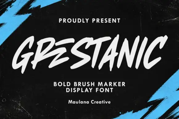
Sharp slanted marker capitals
Grestanic sets narrow marker capitals at a hard slant, with terminals that taper to sharp points, uneven tops and edges that break rather than curve.
Ideas for this font
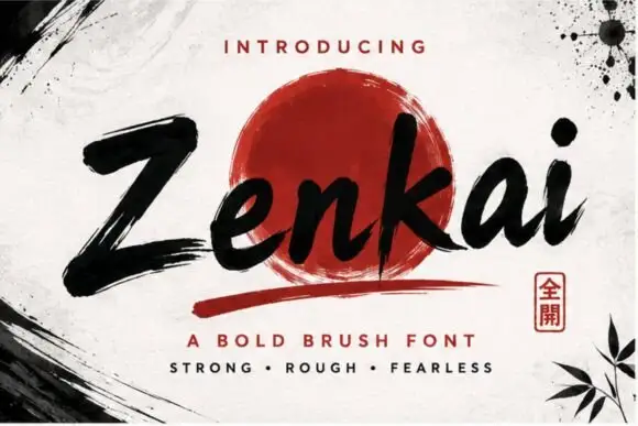
Extended spectral display sans
Zenkai is an extended display sans in dark ink on a pale ground: wide letters with squared bowls, slashed details cut through several strokes, a high waist and even spacing, set in two lines with small tracked labels at the corners and a fine rule at the foot.
Ideas for this font
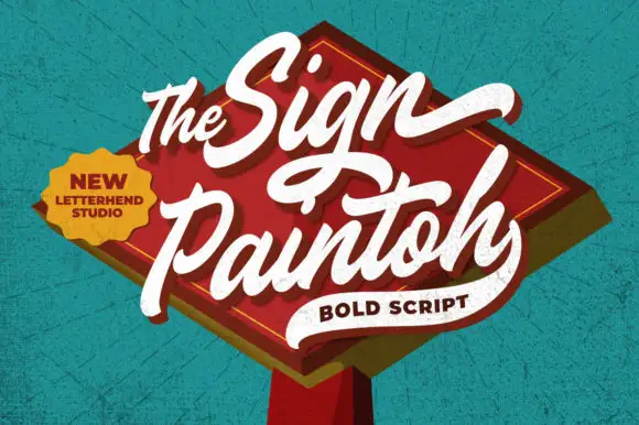
Bold rising sign-painter script
The Sign Paintoh is a bold brush script in cream on a red painted diamond: thick swelled strokes, spiral terminals and a rising baseline, presented as a hanging shop sign against a teal wall.
Ideas for this font
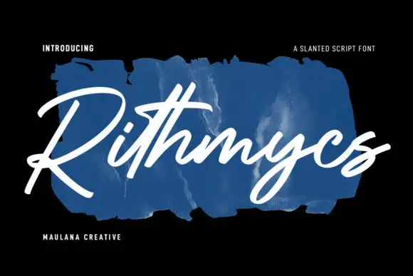
Fast slanted connected brush strokes
Rithmycs is a fast slanted brush script in white over a smear of blue paint: thick connected strokes, tight loops and a forward lean that makes a seven-letter word look signed rather than set.
Ideas for this font
Same independent foundry
Allow optional Google Analytics to measure visits and catalogue actions. Your search words and notes are not included. Privacy & storage