Editorial Serif Anchor

Rithmycs Script Font + Svara
Anchors Rithmycs Script Font's fluid strokes with crisp Roman proportions on wedding suites, headers and packaging.
Inspect Svara specimenDisclosure: MakerFileHub may earn a commission from qualifying purchases via paid links on this page. How our links work.
Fast slanted connected brush strokes
Rithmycs is a fast slanted brush script in white over a smear of blue paint: thick connected strokes, tight loops and a forward lean that makes a seven-letter word look signed rather than set.
Paid link
Get this fontProject & layout blueprintsAt-a-glance maker compatibility
Sturdy stroke walls and open counters weed cleanly on adhesive vinyl, HTV apparel film, and cut cardstock.
Visual anatomy & craft review
The word runs the full width, and the face is a brush script: the R opens with a broad entry, the i and the t are short, the h rises into a loop, the m and the y are round and the final s runs out into a long flat tail that ends in a dry edge, while the whole line leans forward as if written in one movement. The stroke is heavy with a visible swell and taper, the joins are tight and the letters touch, so the word reads as a single gesture. The ground is a blue paint smear laid over black, with tracked capitals at the corners naming the face as a slanted script and the foundry. Rithmycs is a brush script for covers, packaging, signage and apparel: it needs a wide measure, a large size and a short word to keep the gesture intact.
A quick brush script on a wet blue ground
Two-font hierarchy recipes
Tested contrast partners — pairing Rithmycs Script Font with grounded secondary typography.
Rithmycs Script Font + Svara
Anchors Rithmycs Script Font's fluid strokes with crisp Roman proportions on wedding suites, headers and packaging.
Inspect Svara specimen
Rithmycs Script Font + Prime Nordic
Keeps small-scale dates, URLs, nutrition facts and care instructions crisp and legible below script titles.
Inspect Prime Nordic specimenPractical applications
Concrete hierarchy, scale and production guidance tailored to Rithmycs Script Font’s stroke geometry.
A quick brush script reads as a sign painted in an afternoon, and the heavy stroke holds at a distance across a crowded room.
Hierarchy & layout recipe
Print a 500 by 300 mm board: set the word at 110 pt on one line, keep 22 mm of clear ground beneath before the drinks list at 22 pt, and hold 20 mm of border on all four sides.
Pre-production check
A dry brush end can look like a faded edge; print one board at the final size and judge the taper before the set.
A brush script gives a cover movement, and the heavy stroke survives a photographic ground where a hairline face would drop out.
Hierarchy & layout recipe
Print a 230 by 300 mm cover: set the cover word at 96 pt on one line, keep 24 mm of clear ground beneath before the cover lines at 11 pt, and hold 22 mm of margin on all four sides.
Pre-production check
A white brush stroke over a pale image loses contrast; print one cover and check every letter separates before the run.
A brush word sets a human tone on a profile opener, and the slant gives a plain page a direction without a decorative border.
Hierarchy & layout recipe
Print a 230 by 300 mm opener: set the title at 80 pt on one line, keep 26 mm of clear ground beneath before the standfirst at 11 pt, and hold 22 mm of margin on both sides.
Pre-production check
The tail of the last letter can run into the margin; print one opener at the finished size and check the fitting before the issue.
Technical & licence verification
Confirm included OTF/TTF/WOFF formats, full glyph tables and licence coverage on the live store page before batch production.
Closest visual alternatives
Matched across letterform anatomy, stroke behaviour and craft applications.
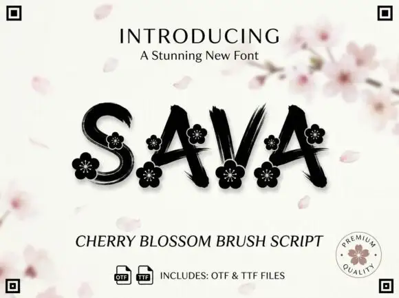
Dry-brush capitals with flowers
Sava is a black brush script on a pale ground: capitals with dry streaks, uneven joins and small flower ornaments set into the wide strokes, with a cherry blossom branch blurred behind, a lined introducing line above and a script descriptor and file note beneath.
Ideas for this font
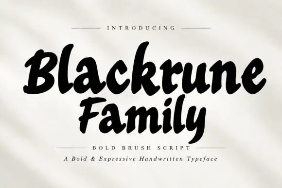
Heavy rounded brush lettering with loose fit and a soft forward lean
Blackrune Family is heavy rounded brush lettering with a soft forward lean, thick strokes that swell through the middle and a fit loose enough to keep each letter distinct.
Ideas for this font
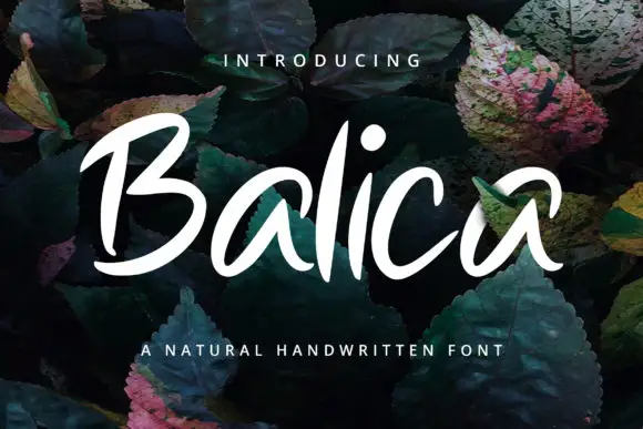
Broad slanted brush lettering with open counters and a light connective stroke
Balica is broad slanted brush lettering in which the strokes are wide and open, the joins are light, and the letters lean together without losing their separate counters.
Ideas for this font
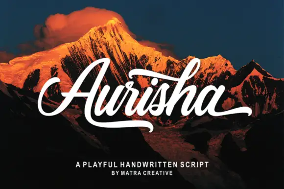
Bold slanted brush script with a heavy underline and open terminals
Aurisha Script is a bold slanted brush script whose strokes swell on the downstroke, whose joins stay heavy, and whose final letter throws a long heavy underline that finishes the word.
Ideas for this font
Same independent foundry
Allow optional Google Analytics to measure visits and catalogue actions. Your search words and notes are not included. Privacy & storage