Editorial Serif Anchor

Caffle + Auretha
Anchors Caffle's fluid strokes with crisp Roman proportions on wedding suites, headers and packaging.
Inspect Auretha specimenDisclosure: MakerFileHub may earn a commission from qualifying purchases via paid links on this page. How our links work.
Heavy slanted retro script with flat-cut terminals
Caffle sets a heavy slanted script in solid pink on a black slab, with a wide capital leaning across the word and lowercase letters packed so tight they nearly touch, so the line reads as one painted shape instead of a string of joined letters.
Paid link
Get this fontProject & layout blueprintsAt-a-glance maker compatibility
Weld or Unite overlapping script joins into one continuous vector path before sending to the blade.
Visual anatomy & craft review
The capital C opens with a thick bowl that begins above the cap line and swings out to the left of the stem, and its lower end is cut flat instead of tapering, which is the detail that makes the word look painted with a sign brush rather than drawn with a nib. The lowercase letters keep upright shapes but lean a full 12 degrees with the line, and their bowls are close to ascender height, so the middle of the word carries as much weight as the top. The double f rises in two tall parallel strokes with a single crossbar, and that pair is the only place the silhouette breaks the rectangle. Nothing is connected: the joins are spaced tight enough to close at display size, and every stroke ends blunt and rounded. The pink fill, the black slab behind it and the tracked label below are presentation; the typeface is the one word.
Heavy · Slanted · Retro
Two-font hierarchy recipes
Tested contrast partners — pairing Caffle with grounded secondary typography.
Caffle + Auretha
Anchors Caffle's fluid strokes with crisp Roman proportions on wedding suites, headers and packaging.
Inspect Auretha specimen
Caffle + Prime Nordic
Keeps small-scale dates, URLs, nutrition facts and care instructions crisp and legible below script titles.
Inspect Prime Nordic specimenPractical applications
Concrete hierarchy, scale and production guidance tailored to Caffle’s stroke geometry.
A heavy retro script survives being scaled into a shopfront fascia and a paper bag at the same time, which most thin scripts cannot do, and the flat stroke ends mean the router gets a clean cut instead of a taper that burns at the tip.
Hierarchy & layout recipe
Set the name at 42 cm cap height on a 3.2 m fascia, give it 15 cm clearance either side inside the panel, and keep the roast date in a plain condensed sans at 6 cm along the bottom rail.
Pre-production check
At 42 cm the letterspacing that looked tight on the card will read as a gap; proof the fascia at full size on paper first and close the tracking until the word sits as one block.
A slanted display script in one heavy weight gives a feature about a 1975 recording scene a period voice without the fake aged paper that usually goes with it, and it holds up when the art director sets it over a photograph at half a page.
Hierarchy & layout recipe
Set the standfirst at 28 pt over the full measure of an A4 page, place it on a solid black plate so the pink keeps its edge over the photo, and keep the body copy in a neutral serif at 9.5 pt with 13 pt leading.
Pre-production check
Pink on black inverts to mud on uncoated stock; print one proof sheet and check that the thin gap inside the a and the e is still open at 28 pt before the run.
The 12-degree lean and the tight, closed joins are legible from three metres away, which is the distance a poster on a courtyard wall is actually read from, and the heavy weight holds up when the print is a cheap one-colour run.
Hierarchy & layout recipe
Set the film title at 14 cm across an A2 sheet, stack the date beneath in the same face at 4 cm, and leave the bottom eighth of the sheet empty for the sponsor strip in a plain sans at 1 cm.
Pre-production check
One-colour printing flattens the counters of the a and o; check a laser proof at A3 and go one weight heavier if the letters start to fill in.
Technical & licence verification
Confirm included OTF/TTF/WOFF formats, full glyph tables and licence coverage on the live store page before batch production.
Closest visual alternatives
Matched across letterform anatomy, stroke behaviour and craft applications.
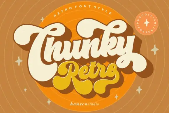
Heavy retro script with fat curled terminals and tight connected loops
Chunky Retro is a heavy script in which the strokes stay thick through every join, the loops close tight and the terminals curl into fat hooks that read as seventies packaging.
Ideas for this font

Neon-style outline script
Sunflower is a tall looping script drawn as a neon tube: a white core inside a golden outline with a soft glow, set over a photograph of a sunflower field at sunset.
Ideas for this font
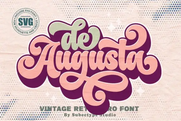
Ornate retro script with heavy joins and broad returning loops
De Augusta is an ornate retro script in which the letters stay heavy and connected, the entry strokes curl wide and a long loop leaves the word, passes beneath it and returns across, so a short name reads as a seventies badge.
Ideas for this font
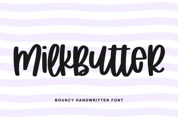
Bouncy fat handwriting with a tall waist
Milkbutter is a bouncy handwritten face in black on white: fat rounded letters with a tall waist, stems that lean and lift, and a baseline that rises and falls across the word, shown over soft lilac wavy bands.
Ideas for this font
Same independent foundry
Allow optional Google Analytics to measure visits and catalogue actions. Your search words and notes are not included. Privacy & storage