Neutral Sans Workhorse

Anisera + Taught
Lets Anisera own the focal silhouette while handling secondary copy, sizing and subheads cleanly.
Inspect Taught specimenDisclosure: MakerFileHub may earn a commission from qualifying purchases via paid links on this page. How our links work.
Tall rounded capitals with long slots and extended baseline arms
Anisera draws a very tall condensed sans, its shoulders squared, its tops flat and its counters reduced to narrow slots, and sets it over a perspective grid on black.
Paid link
Get this fontProject & layout blueprintsAt-a-glance maker compatibility
Sturdy stroke walls and open counters weed cleanly on adhesive vinyl, HTV apparel film, and cut cardstock.
Visual anatomy & craft review
The name fills the width in cream, each letter stretched vertically until the strokes look like columns, the S cut into flat segments and the E carrying three long bars. Spacing is tight and even, so the row reads as a fence rather than a word, and that is the effect the face is selling. Two small captions name the studio and the style, and the grid behind gives the sample its depth. The narrow proportions make it a natural fit for tall signage, narrow labels and fashion covers, and they make it a poor choice for anything that has to be read quickly at a small size.
Tall rounded capitals with long slots and extended baseline arms
Two-font hierarchy recipes
Tested contrast partners — pairing Anisera with grounded secondary typography.
Anisera + Taught
Lets Anisera own the focal silhouette while handling secondary copy, sizing and subheads cleanly.
Inspect Taught specimen
Anisera + Augler
Grounds bold display lettering with classic typographic authority on posters, badges and apparel.
Inspect Augler specimenPractical applications
Concrete hierarchy, scale and production guidance tailored to Anisera’s stroke geometry.
The tall letters fill a masthead with one word and read at street distance, and the narrow shapes leave the photograph visible around them.
Hierarchy & layout recipe
Print a 210 by 280 mm cover: set the masthead at 110 pt on one row, keep 24 mm of clear ground beneath before the issue line at 10 pt, and keep 18 mm of margin from the trim on all sides.
Pre-production check
Narrow counters can fill at 30 pt; check the printed cover before the print order. Order one sample before committing to the run.
The condensed proportions fit a fascia where nothing else would, and the flat tops cut cleanly in vinyl at full sign scale.
Hierarchy & layout recipe
Print a 900 by 220 mm panel: set the shop name at 80 mm on one row, keep 20 mm of clear ground beneath before the number at 14 mm, and keep 26 mm of border so the letters are not cut at the ends.
Pre-production check
Tall thin letters bridge in cut vinyl; check a weeding test before the panel is made. Test it on the real material before the run is booked.
The column-like letters suit a cold, formal announcement, and the cream on black reads in the low light of a winter afternoon.
Hierarchy & layout recipe
Print an A2 poster: set the title at 130 pt across one row, keep 30 mm of clear ground beneath before the date at 18 pt, and keep 28 mm of border so the tall forms stay inside the sheet.
Pre-production check
Long rows need exact tracking; check the layout at final size before the poster is approved.
Technical & licence verification
Confirm included OTF/TTF/WOFF formats, full glyph tables and licence coverage on the live store page before batch production.
Closest visual alternatives
Matched across letterform anatomy, stroke behaviour and craft applications.
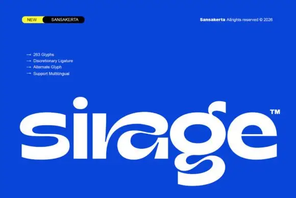
Wide display lowercase with flowing joints
Sirage is a wide display in white on a saturated blue: lowercase with a flowing a construction that sweeps through the bowl, an extended double-bowl g, thick even strokes and round terminals, set as one large word with a small badge at the top left and a list of features beside it.
Ideas for this font
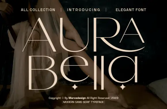
Fine contrast capitals and rounded lowercase with an extended sweeping R leg
Aura Bella draws an extremely light display sans, its strokes reduced to hairlines with a few heavy flares, its capitals tall, wide-spaced and set over a dark photograph.
Ideas for this font
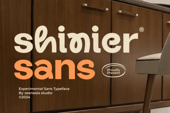
Experimental looped display
Shinier is an experimental display in cream and orange on a walnut cabinet: rounded mixed case in which tall loops are threaded through the letters, an interlocked final n and r, and a registered mark at the shoulder, with a plain sans caption at the foot.
Ideas for this font
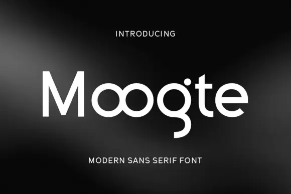
Joined circular display
Moogte is a joined circular display in white on a black ground: mixed case built from near-perfect circles, with the two o bowls fused into a single loop, a curling g descender and a cut on the t, set as one word with a small tracked line above and beneath.
Ideas for this font
Same independent foundry
Allow optional Google Analytics to measure visits and catalogue actions. Your search words and notes are not included. Privacy & storage