Neutral Sans Workhorse

Moogte + Modern Limited
Lets Moogte own the focal silhouette while handling secondary copy, sizing and subheads cleanly.
Inspect Modern Limited specimenDisclosure: MakerFileHub may earn a commission from qualifying purchases via paid links on this page. How our links work.
Joined circular display
Moogte is a joined circular display in white on a black ground: mixed case built from near-perfect circles, with the two o bowls fused into a single loop, a curling g descender and a cut on the t, set as one word with a small tracked line above and beneath.
Paid link
Get this fontProject & layout blueprintsAt-a-glance maker compatibility
Sturdy stroke walls and open counters weed cleanly on adhesive vinyl, HTV apparel film, and cut cardstock.
Visual anatomy & craft review
The word sits centred with plenty of black around it, and the drawing is a geometric display built from circles: the o and the second o are fused, the g drops into a curl, and the t is cut, so the word reads as a continuous shape rather than as separate letters. That construction sets a large size floor, because the fused bowls and the curl need room, and the plate sets the word large enough that the join is unmistakable. The black ground is staging that makes the white crisp, and the two tracked lines above and beneath are plain caps. Because the letters are joined and geometric, the face suits a logo, a poster and a cover line rather than a heading in running text, and a buyer should check the fused pairs before setting a long word.
Display, geometric, joined, modern
Two-font hierarchy recipes
Tested contrast partners — pairing Moogte with grounded secondary typography.
Moogte + Modern Limited
Lets Moogte own the focal silhouette while handling secondary copy, sizing and subheads cleanly.
Inspect Modern Limited specimen
Moogte + Mewah
Grounds bold display lettering with classic typographic authority on posters, badges and apparel.
Inspect Mewah specimenPractical applications
Concrete hierarchy, scale and production guidance tailored to Moogte’s stroke geometry.
A joined circular mark reads as a logo, and the fused bowls give a short name a single continuous shape. A fusion reads as a mark, not as a word.
Hierarchy & layout recipe
Set the mark at 22 pt on a card, 100 mm on a wall and 14 pt on a bag, keeping the fusion only above 24 pt. Keep one colour and clear space equal to half the mark height.
Pre-production check
Check the 14 pt bag mark, where the fused bowls can close; separate them at that size. Confirm the wall mark reads at eight metres and that the curl stays open in vinyl.
A circular display gives a cover a single shape, and the joins hold against a dark ground at thumbnail size. A single shape survives a thumbnail on a shelf.
Hierarchy & layout recipe
Set the title at 90 mm cap height across 180 mm, the subtitle in a 9 pt sans, and the year at 8 pt. Print one ink on a matte stock and keep 22 mm margins.
Pre-production check
Check the title at 90 mm, where a join can clot; keep the gaps open. Confirm the 8 pt year survives lamination and that the title clears the trim.
A joined display makes a launch card feel designed, and the single shape carries the name without a second element. A launch card should feel made, not templated.
Hierarchy & layout recipe
A6 card: the name at 26 pt, the details in a 9 pt sans, and the date at 8 pt. Keep 15 mm margins and print two colours on a dark card. Leave 14 mm at the foot for the venue line.
Pre-production check
Check the 26 pt name, where a fused bowl can close at that size; keep the fusion only above 30 pt. Confirm the 9 pt details keep a 4.5:1 contrast and that the card folds flat.
Technical & licence verification
Confirm included OTF/TTF/WOFF formats, full glyph tables and licence coverage on the live store page before batch production.
Closest visual alternatives
Matched across letterform anatomy, stroke behaviour and craft applications.
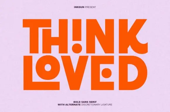
Bold sans with ligature alternates
Think Loved is a bold sans in orange on a pale ground: wide geometric caps with flat terminals, a very high waist and tight spacing, with a ligature that fuses two letters into a single drawn shape, set in two lines with a small tracked note beneath naming the alternate.
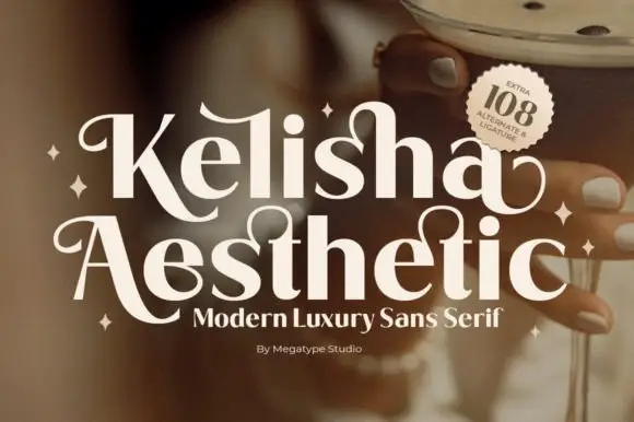
Heavy contrast mixed case with looped entry strokes and long curling capital legs
Kelisha Aesthetic is a modern luxury sans with high stroke contrast, tall narrow letters and a set of alternates in which an arm or an ascender curls into a loop.
Ideas for this font
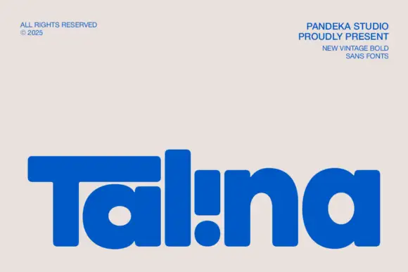
Heavy rounded logo display
Talina is a heavy rounded display in royal blue on a pale sheet: a short name set in very heavy rounded letters with an extended T arm, wide round bowls and an inverted dot-and-stem i that reads as a cut counter, with three small credits in the corners.
Ideas for this font
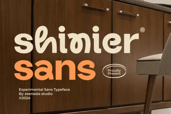
Experimental looped display
Shinier is an experimental display in cream and orange on a walnut cabinet: rounded mixed case in which tall loops are threaded through the letters, an interlocked final n and r, and a registered mark at the shoulder, with a plain sans caption at the foot.
Ideas for this font
Same independent foundry
Allow optional Google Analytics to measure visits and catalogue actions. Your search words and notes are not included. Privacy & storage