Neutral Sans Workhorse

Blink Blink + Montreal
Lets Blink Blink own the focal silhouette while handling secondary copy, sizing and subheads cleanly.
Inspect Montreal specimenDisclosure: MakerFileHub may earn a commission from qualifying purchases via paid links on this page. How our links work.
Soft rounded letters with dashed inner borders and small star-shaped openings
Blink Blink stacks two rounded words in pastel colour, traces each letter with a dotty inner line and sprinkles small stars on the fills, with dashed swirls and cartoon flowers around the block.
Paid link
Get this fontProject & layout blueprintsAt-a-glance maker compatibility
Sturdy stroke walls and open counters weed cleanly on adhesive vinyl, HTV apparel film, and cut cardstock.
Visual anatomy & craft review
BLINK runs twice on white, the letters fat and friendly, each one a different pastel and each outlined with a fine dotted line rather than a solid one. Stars sit inside the strokes and the surrounding page carries dashed spirals, rainbows, flowers and a small title above. The colours stay in one soft range, so the rows read as a single cheerful object. It is a colour font with light interiors, which means the word survives a shrink better than a texture-heavy face, but the dots and stars are the first detail to go if the setting is small.
Soft rounded letters with dashed inner borders and small star-shaped openings
Two-font hierarchy recipes
Tested contrast partners — pairing Blink Blink with grounded secondary typography.
Blink Blink + Montreal
Lets Blink Blink own the focal silhouette while handling secondary copy, sizing and subheads cleanly.
Inspect Montreal specimen
Blink Blink + Marquis - Elegant Modern Serif
Grounds bold display lettering with classic typographic authority on posters, badges and apparel.
Inspect Marquis - Elegant Modern Serif specimenPractical applications
Concrete hierarchy, scale and production guidance tailored to Blink Blink’s stroke geometry.
The pastel dots and stars suit a small child's card, and the fat letters stay legible at a size a parent can print at home.
Hierarchy & layout recipe
Print a 105 by 148 mm invitation: set the name at 34 pt across two rows, keep 14 mm of clear ground beneath before the time at 9 pt, and keep 12 mm of margin so the dashed swirls stay inside the card.
Pre-production check
Home printers band pastel fills; check one card on your own printer before the batch. Ask the printer for a sample at the finished size.
The friendly letters make a name label easy for a child to find, and the shapes stay clear at the small size a cubby label uses.
Hierarchy & layout recipe
Print a 70 by 30 mm label: set the name at 16 pt on one row, keep 4 mm of clear ground beneath, and keep 4 mm of margin so the rounded ends stay inside the label edge.
Pre-production check
Dotted outlines close below 14 pt; check the printed label before producing a full set. Confirm it on a printed sample, not on screen.
The pastels keep a summer fair light, and the chunky letters read across a field from the entrance gate of the field on a bright summer day.
Hierarchy & layout recipe
Print a 600 by 400 mm board: set the fair name at 70 pt across two rows, keep 22 mm of clear ground beneath before the date at 16 pt, and keep 24 mm of border so no letter is clipped.
Pre-production check
Pastel inks fade in direct sun; check where the sign will hang before the print order. Have the printer send a physical sample first.
Technical & licence verification
Confirm included OTF/TTF/WOFF formats, full glyph tables and licence coverage on the live store page before batch production.
Closest visual alternatives
Matched across letterform anatomy, stroke behaviour and craft applications.
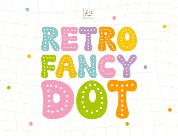
Dotted puffy display
Retro Fancy Dot is a puffy display in coral, teal, orange, pink and violet on a pale ruled ground: irregular fat capitals with small pale dots following the strokes inside each letter, set in three staggered lines with a small studio mark above and dots scattered around.
Ideas for this font
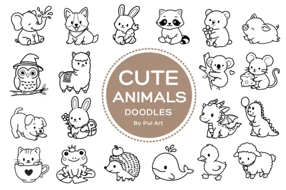
Rounded black outline animal dingbats with simple expressions and props
Cute Animals Doodles is a typable collection of about two dozen animals — elephant, corgi, bunny, raccoon, bear, owl, alpaca, koala, mouse, hedgehog, whale, duck, sheep, a small dragon — each drawn in one even black line.
Ideas for this font
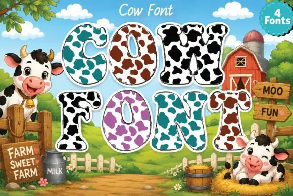
Broad rounded slab capitals carrying contrasting cow-like patches
Cow Font draws heavy rounded capitals and fills each with a cow print: a pale ground spotted with large irregular patches, available in four colourways from turquoise to purple.
Ideas for this font
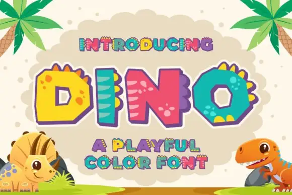
Chunky multicolour capitals with ridges and skin-like marks
Dino is a playful colour font in which each capital is drawn as a chunky rounded letter with dinosaur features: a row of spikes along the top, spots on the bowl or stripes across the stem, in bright primaries.
Ideas for this font
Same independent foundry
Allow optional Google Analytics to measure visits and catalogue actions. Your search words and notes are not included. Privacy & storage