Neutral Sans Workhorse

Christmas Santa + Corven
Lets Christmas Santa own the focal silhouette while handling secondary copy, sizing and subheads cleanly.
Inspect Corven specimenDisclosure: MakerFileHub may earn a commission from qualifying purchases via paid links on this page. How our links work.
Red Santa-suit capitals with black belts and white lower trim
Christmas Santa shows broad red capitals, where a black belt with a gold-like buckle crosses each body, irregular white trim runs along the bottoms and the letters keep a solid block silhouette with the costume applied inside the stroke.
Paid link
Get this fontProject & layout blueprintsAt-a-glance maker compatibility
Sturdy stroke walls and open counters weed cleanly on adhesive vinyl, HTV apparel film, and cut cardstock.
Visual anatomy & craft review
The bodies stay broad and even, the belt crosses at the waist, the trim runs along the base and the buckle adds a small metallic accent. That belt line is the character: a word reads as a row of Santa suits, which is why the sample keeps one short word in red. The belt and trim are graphic rather than a cloth construction, so confirm the actual letters you need, use a short heading, keep any date or name in plain type and check the trim at print size.
Red Santa-suit capitals with black belts and white lower trim
Two-font hierarchy recipes
Tested contrast partners — pairing Christmas Santa with grounded secondary typography.
Christmas Santa + Corven
Lets Christmas Santa own the focal silhouette while handling secondary copy, sizing and subheads cleanly.
Inspect Corven specimen
Christmas Santa + The Avenue Editorial
Grounds bold display lettering with classic typographic authority on posters, badges and apparel.
Inspect The Avenue Editorial specimenPractical applications
Concrete hierarchy, scale and production guidance tailored to Christmas Santa’s stroke geometry.
The suited caps give a card its theme, and the broad forms hold a short word at 36 pt on an A6 sheet, where the belt and trim read at arm's length.
Hierarchy & layout recipe
Print an A6 card: set the greeting at 36 pt on one row, keep 16 mm of clear ground beneath before the family names at 11 pt, and keep the names in a plain sans so the costume stays the only theme.
Pre-production check
White trim printed on cream card disappears; check the proof and keep the card white, since a bright board holds the contrast.
The costume letters read at a doorway, and the heavy forms hold a two-word sign at 54 mm on a printed board, where the belt line stays visible from a queue.
Hierarchy & layout recipe
Print a 600 by 300 mm board: set the sign at 54 mm on one row, keep 24 mm of clear ground beneath before the times at 15 pt, and keep 24 mm of border so the trim is not cut.
Pre-production check
The buckle accent may need a second ink; check the artwork before quoting a two-colour run.
The suited letters give a tag character, and the broad bodies hold an initial at 30 pt on a 45 by 70 mm tag, where the belt survives the punch.
Hierarchy & layout recipe
Print a 45 by 70 mm tag: set one initial at 30 pt in the upper half, keep 12 mm of clear ground beneath before the name at 9 pt, and keep 7 mm to the punch hole so the trim is not cut.
Pre-production check
A date set in this face becomes unreadable; check the tag and keep numerals in a plain sans.
Technical & licence verification
Confirm included OTF/TTF/WOFF formats, full glyph tables and licence coverage on the live store page before batch production.
Closest visual alternatives
Matched across letterform anatomy, stroke behaviour and craft applications.
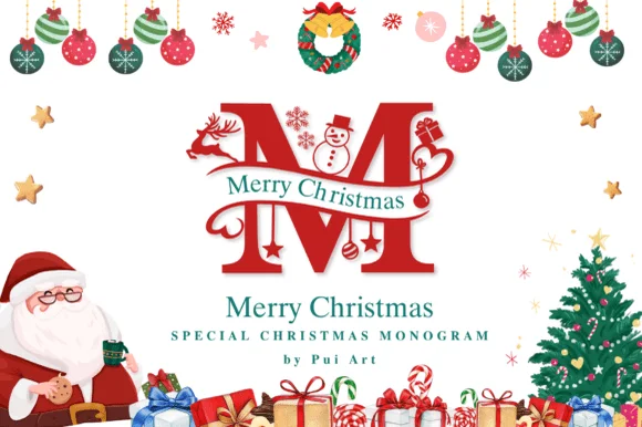
Ornate Christmas monogram with inset figures
Merry Christmas Monogram is a red ornamental initial in which a deer, a snowman and a pair of skates are drawn inside the letterforms: a heavy didone-style M with fine hairline accents, a green banner of serif capitals crossing it, and a page full of baubles, a wreath, a Santa and a tree.
Ideas for this font
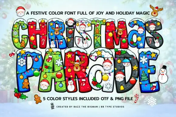
Snow-topped Christmas blocks filled with bright miniature ornaments
Christmas Parade sets fat layered capitals in five bright holiday styles, each letter filled with a pattern and topped with snow, baubles, a Santa face or a gingerbread man.
Ideas for this font
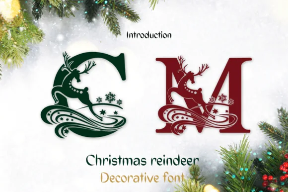
Reindeer-illustrated holiday monogram
Christmas Reindeer turns capital letters into festive monogram emblems, where leaping reindeer silhouettes and swirling winter ribbons wrap each letter, and the creator describes the set as an illustrated monogram alphabet rather than a body font, with each uppercase letter acting as a standalone seasonal ornament.
Ideas for this font
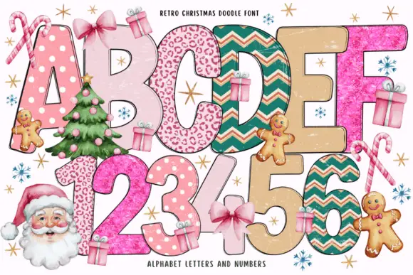
Patterned holiday block bundle
Retro Christmas Doodle is a colour bundle on a white ground: tall rounded holiday blocks in two rows, each filled with a different pattern — dots, spots, chevrons, glitter and plain cream — with small gifts, gingerbread figures, candy canes and a Santa at the sides, and a small note at the head naming the set.
Ideas for this font
Same independent foundry
Allow optional Google Analytics to measure visits and catalogue actions. Your search words and notes are not included. Privacy & storage