High-Contrast Display Serif

Fjorden + Majestic Letters
Pairs sculptural editorial warmth with Fjorden's clean modern geometry.
Inspect Majestic Letters specimenDisclosure: MakerFileHub may earn a commission from qualifying purchases via paid links on this page. How our links work.
Broad rounded capitals with inward curved arms and a low hooked descender
Fjorden is a duo of broad rounded capitals in which several arms curve inward and the J drops into a low hook, shown with a regular weight that carries the explanatory lines.
Paid link
Get this fontProject & layout blueprintsAt-a-glance maker compatibility
Sturdy stroke walls and open counters weed cleanly on adhesive vinyl, HTV apparel film, and cut cardstock.
Visual anatomy & craft review
The capitals are wide and soft: the F holds two arms that curve slightly inward, the O closes almost circular, the R carries a soft leg and the J drops below the baseline into a hooked descender that is the widest gesture in the word. The stroke is a rounded monoline with fully rounded terminals, so the face reads as friendly geometry rather than as a grotesque, and the letterfit is generous enough that a long word holds one line at large sizes. The second half of the duo is a regular weight used for the supporting lines in the sample, which is how the pairing is meant to work: a display line and an explanatory line from one family. The dark green ground, the cream ink, the orange and line-art stars are presentation; the duo is the lettering.
Rounded · Broad · Geometric
Two-font hierarchy recipes
Tested contrast partners — pairing Fjorden with grounded secondary typography.
Fjorden + Majestic Letters
Pairs sculptural editorial warmth with Fjorden's clean modern geometry.
Inspect Majestic Letters specimen
Fjorden + Easy Handwriting
Introduces organic movement on pull-quotes, signatures and gift tags.
Inspect Easy Handwriting specimenPractical applications
Concrete hierarchy, scale and production guidance tailored to Fjorden’s stroke geometry.
The rounded broad capitals read as a modern fascia, and the regular weight carries the opening hours so one family covers the whole sign.
Hierarchy & layout recipe
Set the café name at 22 cm on the fascia, set the opening hours in the regular weight at 5 cm, and hold 15 cm of margin so the hooked J stays on the panel.
Pre-production check
A hooked descender near the bottom edge gets cut; check the layout at full size and raise the word rather than shortening the hook.
The wide rounded capitals fill a poster header with few letters, and the regular weight keeps the details readable at body size.
Hierarchy & layout recipe
Set the header at 100 pt on an A2 poster, set the date and venue in the regular weight at 22 pt, and hold 30 mm between the header and the first detail line.
Pre-production check
A wide header at 100 pt on A2 can run past the margin; check the artwork at full size and reduce the tracking rather than the cap height.
The rounded geometry gives a contemporary wedding its signage, and the regular weight supplies the details without a second family.
Hierarchy & layout recipe
Set the greeting at 10 cm on a 500 by 700 mm board, set the names in the regular weight at 4 cm beneath, and leave 10 cm of margin so the wide letters stay inside the board.
Pre-production check
A soft rounded face in a formal setting can read as casual; check the board at full size and keep the details tight and small to hold the tone.
Technical & licence verification
Confirm included OTF/TTF/WOFF formats, full glyph tables and licence coverage on the live store page before batch production.
Closest visual alternatives
Matched across letterform anatomy, stroke behaviour and craft applications.
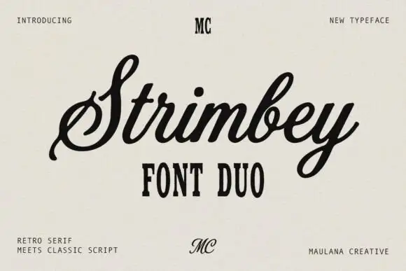
Retro serif with a classic script
Strimbey is a duo on warm cream: a retro condensed serif in small capitals with tall flat-topped letters, and a classic script with fine contrast that flows above it, with small monogram marks at the top and foot of the sheet.
Ideas for this font
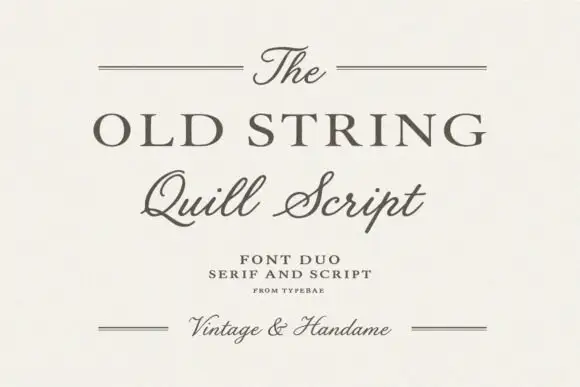
Serif and quill script duo
The Old String is a duo in soft grey-brown on cream: a wide classical serif in caps for the main line, a quill script with fine hairlines and long tails for the second, and small tracked notes between hairline rules, with the script repeated at the foot in a smaller size.
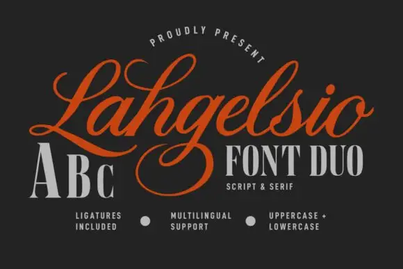
Flourished formal script paired with a tall contrast serif
Lahgelsio is a duo: an ornate script with tall loops and a mirrored flourish, and a tall high-contrast serif with fine hairlines, made to be stacked on the same card.
Ideas for this font
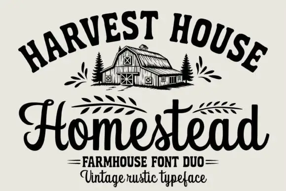
Arched rustic caps paired with a heavy farmhouse script
Homestead is a duo of an arched rustic capital alphabet and a heavy farmhouse script with curled terminals, drawn so a stacked sign reads as a hand-painted barn board.
Ideas for this font
Same independent foundry
Allow optional Google Analytics to measure visits and catalogue actions. Your search words and notes are not included. Privacy & storage