Neutral Sans Workhorse

Classic Tattoo + Mansory
Lets Classic Tattoo own the focal silhouette while handling secondary copy, sizing and subheads cleanly.
Inspect Mansory specimenDisclosure: MakerFileHub may earn a commission from qualifying purchases via paid links on this page. How our links work.
Decorative tattoo-style capitals with fine internal stripes
Classic Tattoo sets capitals in the old flash style: a heavy outline, a flat shadow on one side, and a light interior line that makes each letter look filled with ink and then outlined again.
Paid link
Get this fontProject & layout blueprintsAt-a-glance maker compatibility
Sturdy stroke walls and open counters weed cleanly on adhesive vinyl, HTV apparel film, and cut cardstock.
Visual anatomy & craft review
CLASSIC TATTOO is set on a shallow curve across the top of the card in a black outline with a white fill and a pale inner line, the letters wide and slightly irregular the way a hand-painted flash sheet is. Beneath the arc a drawn scene fills the middle: a tattooed woman and an artist at work, a pair of swallows in the corners, and two banner ribbons carrying a year. Under that, two lines of the same lettering spell out the style in smaller capitals, and the whole card sits inside a rough hand-drawn border that looks like a page from a sketchbook. The face is built on a slab skeleton with clipped corners, which keeps it readable while the outline and inner line do the decorating. It suits tattoo studios, barber shops, motorcycle clubs and any poster that wants a vintage flash look.
Decorative tattoo-style capitals with fine internal stripes
Two-font hierarchy recipes
Tested contrast partners — pairing Classic Tattoo with grounded secondary typography.
Classic Tattoo + Mansory
Lets Classic Tattoo own the focal silhouette while handling secondary copy, sizing and subheads cleanly.
Inspect Mansory specimen
Classic Tattoo + Things
Grounds bold display lettering with classic typographic authority on posters, badges and apparel.
Inspect Things specimenPractical applications
Concrete hierarchy, scale and production guidance tailored to Classic Tattoo’s stroke geometry.
The lettering is the studio's own visual language, so a sign in this face reads as an authentic shopfront instead of a borrowed style.
Hierarchy & layout recipe
Print a 900 by 350 mm sign: set the studio name at 120 pt on one row, keep 26 mm of clear ground beneath before the street number at 18 pt, and hold 30 mm at each end so the outlined edges stay inside the panel.
Pre-production check
The inner line disappears when a sign is routed; print one panel with the real process and check before the second copy.
The style turns a poster into something a customer would take home, and the outlined letters hold up against a dark background without extra decoration.
Hierarchy & layout recipe
Print a 420 by 594 mm poster: set the event title at 110 pt on a shallow arc, keep 30 mm of clear ground beneath before the date at 14 pt, and hold 28 mm of margin so the arc does not touch the poster edge.
Pre-production check
Curved setting needs manual spacing; print one poster and check the gaps between letters at the ends of the arc before the run.
The flash look marks the issue as part of a scene, and the heavy outline keeps a long cover line readable at newsstand size where a light face would break up.
Hierarchy & layout recipe
Print a 210 by 297 mm cover: set the cover line at 74 pt across two rows, keep 22 mm of clear ground beneath before the issue number at 10 pt, and hold 16 mm from the outlined edge to the trim on all sides.
Pre-production check
Two-line outlines blur when the cover is printed small; print one copy at the final size and check the inner line before the run.
Technical & licence verification
Confirm included OTF/TTF/WOFF formats, full glyph tables and licence coverage on the live store page before batch production.
Closest visual alternatives
Matched across letterform anatomy, stroke behaviour and craft applications.

Narrow Gothic strokes with curled descenders and split terminals
Kingsbridge sets silver-blackletter capitals on a dark heraldic scene, the strokes tall and angular, the K throwing a long entry swash and the g closing in a hooked tail that curls under the word.
Ideas for this font
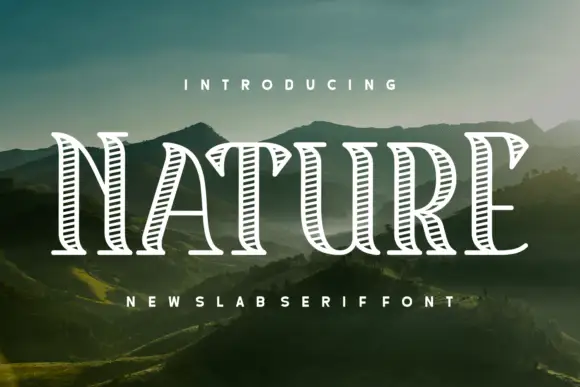
Hatched outdoor slab
Nature Reserve is a hatched slab display in white over a mountain landscape: tall caps with heavy bracketed serifs, a high waist, and an interior filled with fine parallel hatch lines that follow the stroke direction, with a tracked subtitle beneath in the same construction.
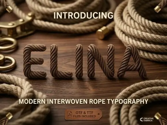
Rounded capitals rendered as thick twisted rope with visible braided surface strands
Elina shows five brown rope-like capitals standing on a wooden surface, where broad rounded strokes carry closely twisted diagonal strands and darker grooves with small fibre-like edges, the E keeps softly rounded arms and the A holds a large triangular opening while loose coils and metal-ended ropes lie around the name.
Ideas for this font
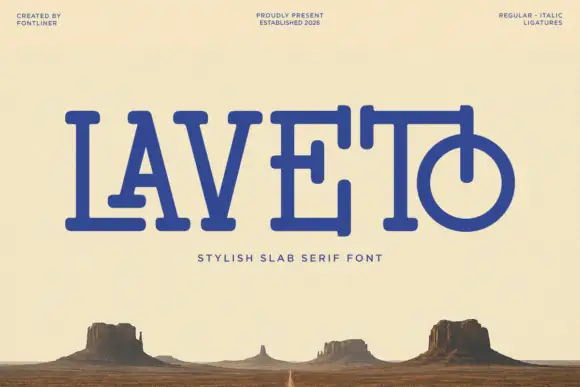
Rounded slab with overlapping bars
Laveto is a rounded slab display in ultramarine on a bleached desert landscape: wide capitals with long overlapping horizontal bars, rounded stroke ends and a final letter drawn as a circular bowl pierced by a stem, with a tracked line beneath and three small credits in the corners.
Same independent foundry
Allow optional Google Analytics to measure visits and catalogue actions. Your search words and notes are not included. Privacy & storage