Modern Grotesque Body

Rusted Grunge + Prime Nordic
Creates crisp high-hierarchy contrast beneath Rusted Grunge headlines across menus, websites and labels.
Inspect Prime Nordic specimenDisclosure: MakerFileHub may earn a commission from qualifying purchases via paid links on this page. How our links work.
Distressed contrasting serif
Rusted Grunge is a broad contrasting serif in cream on a near-black ground: heavy stems with sharp serifs and irregular cracked gaps that run through the strokes and along the serifs, set on two lines with a tracked line above and a caption beneath.
Paid link
Get this fontProject & layout blueprintsAt-a-glance maker compatibility
Fine grain and micro-texture excel in 300 DPI print, sublimation, and screen print rather than small vinyl weeding.
Visual anatomy & craft review
The two words are stacked and the drawing is a broad serif at a heavy weight whose wear is cut into the letters: the cracks are gaps rather than a speckled overlay, so the face reproduces as a single ink with no texture layer on top. That construction is why it works on a shirt and on a poster, and the plate sets the block large enough that the cracks read as damage rather than as noise. The high contrast between the thick stems and the thin joins survives the wear because the hairlines are only cracked, not broken, and the cream on near-black gives maximum contrast. The tracked line above and the caption beneath are set in a plain serif at a fraction of the size, which keeps the worn face as the only textured element.
Serif, distressed, vintage, bold
Two-font hierarchy recipes
Tested contrast partners — pairing Rusted Grunge with grounded secondary typography.
Rusted Grunge + Prime Nordic
Creates crisp high-hierarchy contrast beneath Rusted Grunge headlines across menus, websites and labels.
Inspect Prime Nordic specimen
Rusted Grunge + Handmade Calligraphy
Adds a warm human signature touch for 1-to-3-word callouts without competing against structured serif capitals.
Inspect Handmade Calligraphy specimenPractical applications
Concrete hierarchy, scale and production guidance tailored to Rusted Grunge’s stroke geometry.
A cracked serif reads as a weathered bill, and the gaps print in one pass without a separate texture layer or a second screen.
Hierarchy & layout recipe
A2 poster: the event at 100 mm cap height, the dates in a 22 mm serif, and the address at 10 mm. Keep 28 mm margins and print one colour on a dark stock.
Pre-production check
Check the poster at five metres, where the cracks can read as missing ink; keep the gaps even. Confirm the 10 mm address reads at three metres and that the title clears the trim.
A distressed serif suits a shop selling old objects, and the cracked fill looks intentional rather than worn out on a painted board.
Hierarchy & layout recipe
Paint a 1,100 by 380 mm board: the shop at 120 mm cap height, the hours in a 24 mm serif, and a 5 mm border. Keep 25 mm margins and paint two colours on a primed board.
Pre-production check
Check the board at five metres, where the cracks can look like peeling paint; keep the wear consistent. Confirm the 24 mm hours read at three metres and that the border survives weather.
A cracked serif prints as one screen and looks aged from the first wear, which suits a themed party where a clean face would look wrong.
Hierarchy & layout recipe
Print a 240 mm chest graphic: the slogan at 60 mm cap height, the year at 30 mm, and one ink on a mid-toned shirt. Keep the narrowest stem at 4 mm and place the graphic 80 mm below the collar.
Pre-production check
Check the screen at actual mesh, where a 4 mm stem can fill; thicken it. Wash-test one shirt and confirm the cracks stay open after five cycles.
Technical & licence verification
Confirm included OTF/TTF/WOFF formats, full glyph tables and licence coverage on the live store page before batch production.
Closest visual alternatives
Matched across letterform anatomy, stroke behaviour and craft applications.
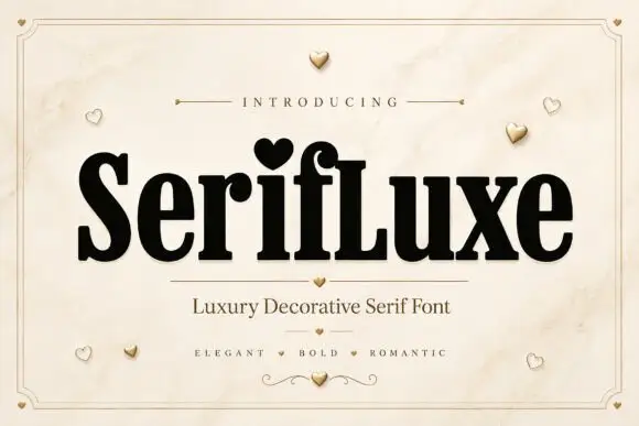
Heavy narrow serif with heart dot
Serifluxe is a heavy narrow serif in black on a marble panel: thick stems with fine joins, a heart-shaped dot over the i, tight counters and a small flourish at the foot, with a tracked line above and two lines of description beneath, framed by a thin double rule with gold hearts scattered across the sheet.
Ideas for this font
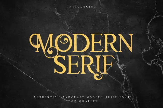
Display serif with ornate curled details
Modern Serif is a display serif in gold on dark marble: heavy letters with curled hairlines growing out of the stems, small flourishes at the feet and a moderate contrast, set as two stacked words with a tracked line beneath.
Ideas for this font
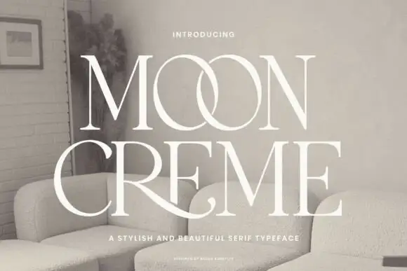
Fine contrasting capitals with overlapping circular bowls
Moon Creme shows tall white serif capitals with fine hairlines and broad round O forms on a muted interior photograph, where the two O letters overlap into a single linked shape and the R leg of the lower row sweeps beneath the following letters before curling away.
Ideas for this font
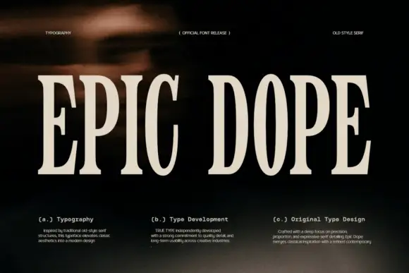
Condensed old-style serif with tall narrow letterspaced capitals
Epic Dope is a condensed old-style serif in which the capitals stretch tall, the serifs finish in small balls and the fit runs narrow, so a two-word title reads as a film credit card rather than as a headline.
Ideas for this font
Same independent foundry
Allow optional Google Analytics to measure visits and catalogue actions. Your search words and notes are not included. Privacy & storage