High-Contrast Display Serif

Teravox + Cronelo
Pairs sculptural editorial warmth with Teravox's clean modern geometry.
Inspect Cronelo specimenDisclosure: MakerFileHub may earn a commission from qualifying purchases via paid links on this page. How our links work.
Futuristic mecha display
Teravox is a bold futuristic display in white on a mecha illustration: wide caps with cut corners, split strokes, small circular counter details and an X with a square notch, set across the plate with three tracked lines beneath listing the glyph count, the language support and the formats.
Paid link
Get this fontProject & layout blueprintsAt-a-glance maker compatibility
Sturdy stroke walls and open counters weed cleanly on adhesive vinyl, HTV apparel film, and cut cardstock.
Visual anatomy & craft review
The word is set once, wide, and the drawing is a technical display: the corners are cut, the strokes break into segments, and several letters carry small circular details that read as machinery rather than ornament. The details sit inside the stroke, so the letter keeps its outline and stays legible at a distance, which is the discipline this kind of face depends on. The three tracked lines beneath are set in a light rounded face and give the practical specification — glyph count, language support, formats — which is what a buyer of a technical display actually checks. The palette is white and cyan on a dark illustration, and the plate keeps the type over the darkest part so the segments read.
Futuristic, technical, bold, angular
Two-font hierarchy recipes
Tested contrast partners — pairing Teravox with grounded secondary typography.
Teravox + Cronelo
Pairs sculptural editorial warmth with Teravox's clean modern geometry.
Inspect Cronelo specimen
Teravox + Handwritten
Introduces organic movement on pull-quotes, signatures and gift tags.
Inspect Handwritten specimenPractical applications
Concrete hierarchy, scale and production guidance tailored to Teravox’s stroke geometry.
A technical display signals the subject before the copy is read, and the segmented letters hold at distance on a poster where a plain sans would look generic.
Hierarchy & layout recipe
A2 portrait: the event at 130 mm cap height, the schedule in a 14 mm sans, and the venue at 12 mm. Keep 30 mm margins and print two colours on a dark ground.
Pre-production check
Check the poster at five metres, where a segment gap can read as damage; keep the gaps consistent. Confirm the 14 mm schedule reads at two metres and that the venue clears the block.
A technical face prints as two screens and reads as team kit, and the cut corners survive a wash where a fine outline would break up.
Hierarchy & layout recipe
Print a 260 mm chest graphic: the team at 55 mm cap height, the number at 70 mm, and two inks on a dark shirt. Keep the thinnest stroke at 4 mm and place the graphic 80 mm below the collar.
Pre-production check
Check the screen at actual mesh, where a 4 mm stroke fills; thicken it. Wash-test one shirt and confirm the number stays legible after five cycles.
A futuristic display frames a science-fiction cover as a technical interface, and the single-colour version keeps the print cost down.
Hierarchy & layout recipe
Set the title at 100 mm cap height across 220 mm, the subtitle in a 12 pt sans, and the author at 8 pt. Print two colours on a dark matte stock and keep the title in the upper half.
Pre-production check
Check the title at thumbnail size, where the segment gaps can disappear; keep them coarse. Confirm the 8 pt author survives lamination and that the title clears the trim by 12 mm.
Technical & licence verification
Confirm included OTF/TTF/WOFF formats, full glyph tables and licence coverage on the live store page before batch production.
Closest visual alternatives
Matched across letterform anatomy, stroke behaviour and craft applications.
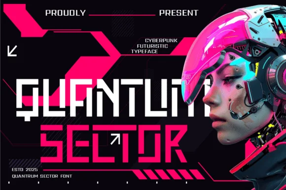
Modular stencil-cut cyberpunk & HUD techno display
Quantum Sector is a square-jawed cyberpunk techno sans featuring futuristic stencil cuts, directional arrow accents, and HUD geometry.
Ideas for this font
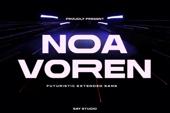
Wide extended futuristic & aerospace display grotesk
Noa Voren is a bold, wide-stance extended sans serif featuring stretched horizontal proportions and subtle speed-sliced diagonal cuts.
Ideas for this font
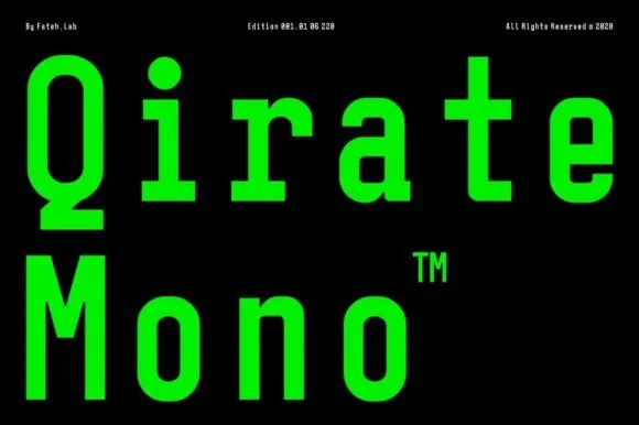
Condensed monospaced sans with square terminals
Qirate Mono is a condensed monospaced sans in neon green on black: tall narrow letters of even width, square terminals and short counters, set as two stacked words with small tracked credits in the corners.
Ideas for this font
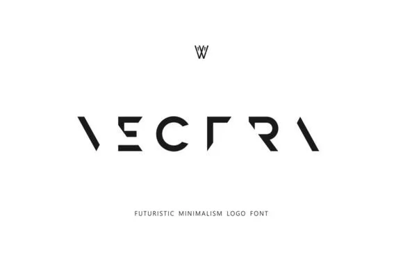
Deconstructed minimalist stencil & puzzle logo font
Vectra is an experimental futuristic logo font that strips each capital down to minimalist geometric strokes and negative-space angles.
Ideas for this font
Same independent foundry
Allow optional Google Analytics to measure visits and catalogue actions. Your search words and notes are not included. Privacy & storage