Modern Grotesque Body

Waiting Friends + Memoir Slang
Creates crisp high-hierarchy contrast beneath Waiting Friends headlines across menus, websites and labels.
Inspect Memoir Slang specimenDisclosure: MakerFileHub may earn a commission from qualifying purchases via paid links on this page. How our links work.
Wide scratched athletic slab
Waiting Friends is a wide athletic slab in cream on a dark scuffed ground: heavy capitals with thick square serifs, flat terminals and fine horizontal scratches across the fill, set in two lines between an arced line above and a tracked line beneath.
Paid link
Get this fontProject & layout blueprintsAt-a-glance maker compatibility
Sturdy stroke walls and open counters weed cleanly on adhesive vinyl, HTV apparel film, and cut cardstock.
Visual anatomy & craft review
The two words are stacked and the drawing is an athletic slab at a wide setting: the serifs are thick and square, the letters are broad, and the wear is a fine horizontal scratching rather than a heavy distress, so the block reads as printed and handled rather than as damaged. That construction sets a moderate size floor, and the plate sets the block large enough that the scratches register as texture. The dark scuffed ground is staging that matches the wear, and the arced line above and the tracked line beneath are plain caps. Because the letters are heavy and wide, the face suits a banner, a shirt and a poster, and the wide setting means a long name takes a lot of width, which is the trade a buyer makes for presence.
Slab, wide, worn, athletic
Two-font hierarchy recipes
Tested contrast partners — pairing Waiting Friends with grounded secondary typography.
Waiting Friends + Memoir Slang
Creates crisp high-hierarchy contrast beneath Waiting Friends headlines across menus, websites and labels.
Inspect Memoir Slang specimen
Waiting Friends + Hailey
Adds a warm human signature touch for 1-to-3-word callouts without competing against structured serif capitals.
Inspect Hailey specimenPractical applications
Concrete hierarchy, scale and production guidance tailored to Waiting Friends’s stroke geometry.
A wide slab reads as team kit, and the scratched fill makes a plain name look printed rather than typed on a banner. Scratches make a name look worn in, not new.
Hierarchy & layout recipe
Print 1,300 by 480 mm: the team at 150 mm cap height, the year in a 32 mm slab, and one colour on light vinyl. Keep 30 mm margins and keep the wear above 3 mm.
Pre-production check
Check the banner at ten metres, where the scratches can look like dirt; keep them fine and even. Confirm the 32 mm year reads at five metres and that the eyelets clear the block.
A scratched slab prints in one screen and looks broken in from the first wear, which suits a casual supporters' shirt. It prints in one screen with no gradient.
Hierarchy & layout recipe
Print a 250 mm chest graphic: the slogan at 60 mm cap height, the year at 28 mm, and one ink on a light shirt. Keep the narrowest counter at 4 mm and place the graphic 80 mm below the collar.
Pre-production check
Check the screen at actual mesh, where a 4 mm counter can fill; open the spacing. Wash-test one shirt and confirm the scratches stay visible after five cycles.
A worn slab reads as a venue with history, and the heavy strokes hold on a board that faces the street in all weather. A bar with history reads better than a new one.
Hierarchy & layout recipe
Paint a 1,000 by 380 mm board: the bar at 110 mm cap height, the fixtures in a 22 mm slab, and a 5 mm rule. Keep 25 mm margins and paint two colours on a primed board.
Pre-production check
Check the board at five metres, where the wear can look like peeling paint; keep it even. Confirm the 22 mm fixtures read at two metres and that the rule survives a wet season.
Technical & licence verification
Confirm included OTF/TTF/WOFF formats, full glyph tables and licence coverage on the live store page before batch production.
Closest visual alternatives
Matched across letterform anatomy, stroke behaviour and craft applications.
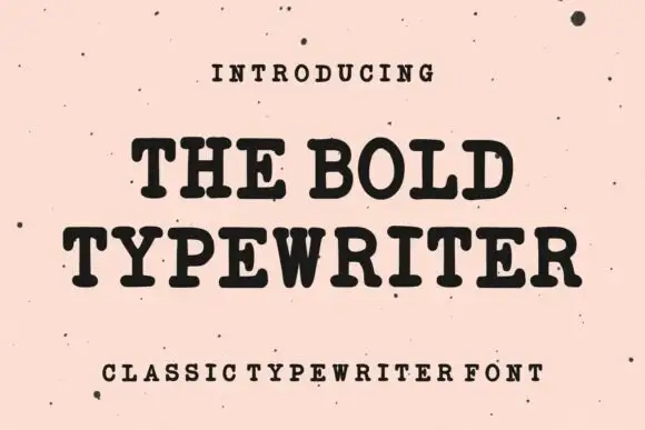
Bold typewriter serif with rounded slabs
The Bold Typewriter is a heavy typewriter serif in black on speckled pink paper: rounded slab serifs, a thick even stroke, tight fitting and a single sentence set across two lines with a tracked caption below.
Ideas for this font
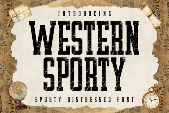
Very condensed distressed slab
Western Sporty is a very condensed square slab in black on a torn paper sheet: tall caps with heavy square slabs, scratched irregular fill and rough edges, set on two lines with a tracked line above and a caption beneath, over a ground of aged newspaper and travel props.
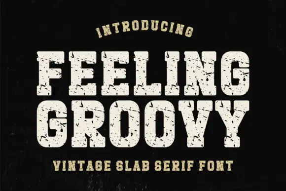
Heavy rounded athletic slabs with scattered scratches and pits
Feeling Groovy uses pale block capitals on black, where the bowls are rounded with softened corners, thick square feet keep the rows dense, and small dark pits and short scratches break the fill across the letters.
Ideas for this font
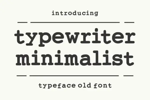
Heavy rounded typewriter slab
Typewriter Minimalist is a heavy rounded typewriter slab in charcoal on cream: thick lowercase with blunt typewriter feet, a large x-height and short ascenders, set over two lines between two rules with a tracked line above and a caption beneath.
Same independent foundry
Allow optional Google Analytics to measure visits and catalogue actions. Your search words and notes are not included. Privacy & storage