Modern Grotesque Body

Feeling Groovy + Modern Heritage
Creates crisp high-hierarchy contrast beneath Feeling Groovy headlines across menus, websites and labels.
Inspect Modern Heritage specimenDisclosure: MakerFileHub may earn a commission from qualifying purchases via paid links on this page. How our links work.
Heavy rounded athletic slabs with scattered scratches and pits
Feeling Groovy uses pale block capitals on black, where the bowls are rounded with softened corners, thick square feet keep the rows dense, and small dark pits and short scratches break the fill across the letters.
Paid link
Get this fontProject & layout blueprintsAt-a-glance maker compatibility
Fine grain and micro-texture excel in 300 DPI print, sublimation, and screen print rather than small vinyl weeding.
Visual anatomy & craft review
The stems stay heavy, the bowl corners soften, the feet stay square and the wear scatters unevenly. That pitting is the character: a collegiate slab gains a worn surface without losing its athletic structure, which is why the sample keeps pale letters on black. The curved introduction and dark ground are composition, so check the actual word shapes, keep 40 pt so the pits do not read as damage and test a solid variant if you need one. The pits are the risk in print: under about 30 pt they read as dirt on the plate rather than wear, so keep 40 pt and ask for a solid variant if the word has to be small.
Heavy rounded athletic slabs with scattered scratches and pits
Two-font hierarchy recipes
Tested contrast partners — pairing Feeling Groovy with grounded secondary typography.
Feeling Groovy + Modern Heritage
Creates crisp high-hierarchy contrast beneath Feeling Groovy headlines across menus, websites and labels.
Inspect Modern Heritage specimen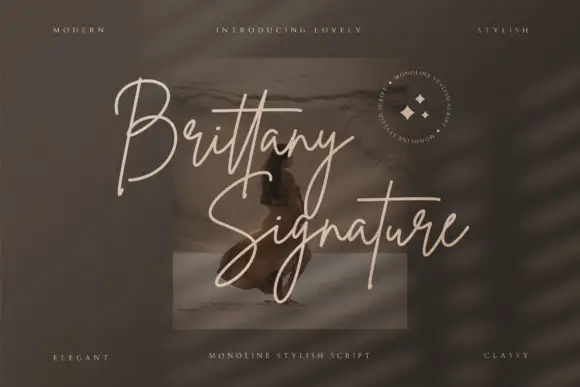
Feeling Groovy + Brittany Signature Script
Adds a warm human signature touch for 1-to-3-word callouts without competing against structured serif capitals.
Inspect Brittany Signature Script specimenPractical applications
Concrete hierarchy, scale and production guidance tailored to Feeling Groovy’s stroke geometry.
The athletic slabs suit a shirt, and the square feet hold a team name at 65 mm across a printed panel, where the pitting stays subtle in one pale ink.
Hierarchy & layout recipe
Print a 280 mm back panel: set the team name at 65 mm on one row, keep 12 mm between letters so the rounded corners stay separate, and keep 18 mm of margin from the side seams.
Pre-production check
Pits finer than 1 mm read as dirt on fabric; check the transfer proof and hold the name at 55 mm.
The heavy slabs read at a door, and the dense rows hold a short name at 52 mm on a painted panel, where the square feet stay visible from the car park.
Hierarchy & layout recipe
Paint a 600 by 300 mm panel: set the gym name at 52 mm on one row, keep 22 mm of clear ground beneath before the hours at 14 pt, and keep 24 mm of border so the feet stay whole.
Pre-production check
The scratched surface can look like a printing fault on a large panel; check the mask artwork first.
The worn slabs give a bottle character, and the rounded bowls hold a two-word name at 22 pt on a 55 by 70 mm label, where the pits read as age on a dark ground.
Hierarchy & layout recipe
Print a 55 by 70 mm label: set the name at 22 pt on one row, keep 10 mm of clear ground beneath before the strength at 6 pt, and keep the ground dark so the pale letters separate.
Pre-production check
The name says nothing about a retro alternate; check the file before promising one, and hold the label at 20 pt on a dark ground.
Technical & licence verification
Confirm included OTF/TTF/WOFF formats, full glyph tables and licence coverage on the live store page before batch production.
Closest visual alternatives
Matched across letterform anatomy, stroke behaviour and craft applications.
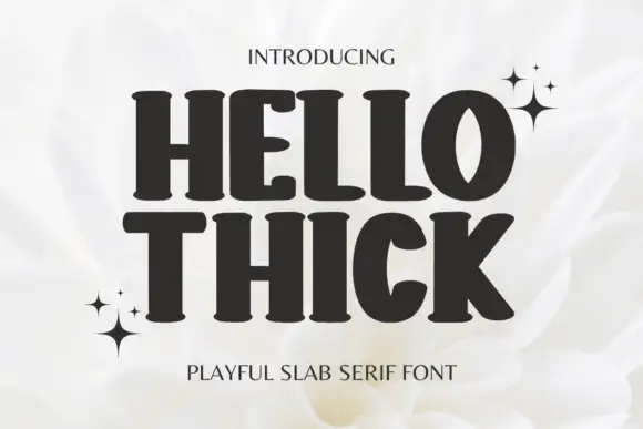
Heavy soft slabs with broad curved bowls and rounded feet
Hello Thick sets a heavy slab in squat capitals, its serifs swollen into bulbs and its counters small, so a two-word heading looks pressed into the page rather than typeset.
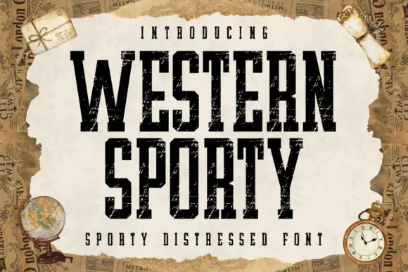
Very condensed distressed slab
Western Sporty is a very condensed square slab in black on a torn paper sheet: tall caps with heavy square slabs, scratched irregular fill and rough edges, set on two lines with a tracked line above and a caption beneath, over a ground of aged newspaper and travel props.
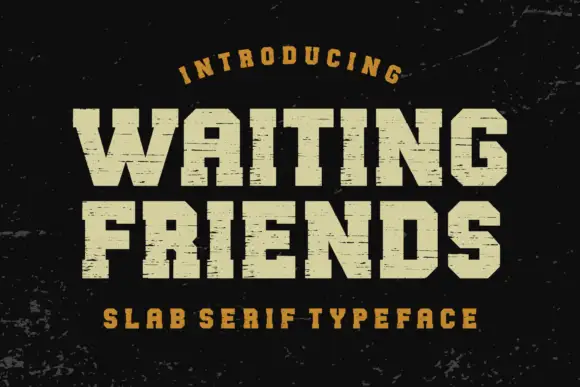
Wide scratched athletic slab
Waiting Friends is a wide athletic slab in cream on a dark scuffed ground: heavy capitals with thick square serifs, flat terminals and fine horizontal scratches across the fill, set in two lines between an arced line above and a tracked line beneath.
Ideas for this font
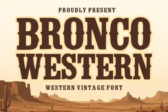
Broad Western slabs with pinched mid-stroke notches
Bronco Western uses heavy brown capitals with broad feet and inward pinches at mid-height, where the narrow O counter changes width around its centre to reinforce the Western sign character.
Same independent foundry
Allow optional Google Analytics to measure visits and catalogue actions. Your search words and notes are not included. Privacy & storage