Modern Grotesque Body

Typewriter Minimalist + Helina
Creates crisp high-hierarchy contrast beneath Typewriter Minimalist headlines across menus, websites and labels.
Inspect Helina specimenDisclosure: MakerFileHub may earn a commission from qualifying purchases via paid links on this page. How our links work.
Heavy rounded typewriter slab
Typewriter Minimalist is a heavy rounded typewriter slab in charcoal on cream: thick lowercase with blunt typewriter feet, a large x-height and short ascenders, set over two lines between two rules with a tracked line above and a caption beneath.
Paid link
Get this fontProject & layout blueprintsAt-a-glance maker compatibility
Fine grain and micro-texture excel in 300 DPI print, sublimation, and screen print rather than small vinyl weeding.
Visual anatomy & craft review
The two words are set in lowercase, which is the right choice for a face whose weight only makes sense at a large size in mixed case: the blunt feet, the rounded terminals and the tight spacing are all visible here in a way that caps would hide. The drawing is a typewriter slab at a heavy weight, so the feet stay blunt rather than flaring, and the strokes are thick enough to read as a poster face rather than a document face. The two rules above and below are drawn with gaps, which is period detail, and the tracked line above and the caption beneath are set in the same family at a fraction of the size. Because the weight is heavy, the face works at display sizes and on a label, and the cream ground keeps the charcoal warm.
Slab, typewriter, heavy, warm
Two-font hierarchy recipes
Tested contrast partners — pairing Typewriter Minimalist with grounded secondary typography.
Typewriter Minimalist + Helina
Creates crisp high-hierarchy contrast beneath Typewriter Minimalist headlines across menus, websites and labels.
Inspect Helina specimen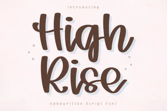
Typewriter Minimalist + High Rise
Adds a warm human signature touch for 1-to-3-word callouts without competing against structured serif capitals.
Inspect High Rise specimenPractical applications
Concrete hierarchy, scale and production guidance tailored to Typewriter Minimalist’s stroke geometry.
A heavy typewriter slab reads as a stamped name, and the blunt feet survive on a small label where a high-contrast serif would fill.
Hierarchy & layout recipe
Print a 60 by 80 mm label: the brand at 14 pt, the origin at 8 pt, and the weight at 6 pt. Keep 4 mm inside the die and print one ink on a cream stock with a matte finish.
Pre-production check
Check the 14 pt brand on a curved bag, where the outer letters distort; reduce the width. Confirm the 6 pt weight reads on the shelf and that the ink holds on a kraft closure.
A heavy typewriter face gives a reader a documentary cover, and the thick strokes hold at thumbnail size where a light slab would disappear.
Hierarchy & layout recipe
Set the title at 80 mm cap height across 195 mm, the subtitle in a 12 pt slab, and the editor at 9 pt. Print one ink on a cream stock and keep the title between the rules.
Pre-production check
Check the title at thumbnail size, where the blunt feet can merge with the next letter; open the spacing. Confirm the 9 pt editor survives lamination and that the rules clear the trim.
A heavy slab prints as one screen and reads as a work shirt, which suits a team or a workshop better than a decorative face.
Hierarchy & layout recipe
Print a 220 mm chest graphic: the word at 55 mm cap height, the year at 28 mm, and one ink on a light shirt. Keep the thinnest stroke at 4 mm and place the graphic 80 mm below the collar.
Pre-production check
Check the screen at actual mesh, where a 4 mm foot can fill; thicken it. Wash-test one shirt and confirm the letters stay legible after five cycles.
Technical & licence verification
Confirm included OTF/TTF/WOFF formats, full glyph tables and licence coverage on the live store page before batch production.
Closest visual alternatives
Matched across letterform anatomy, stroke behaviour and craft applications.
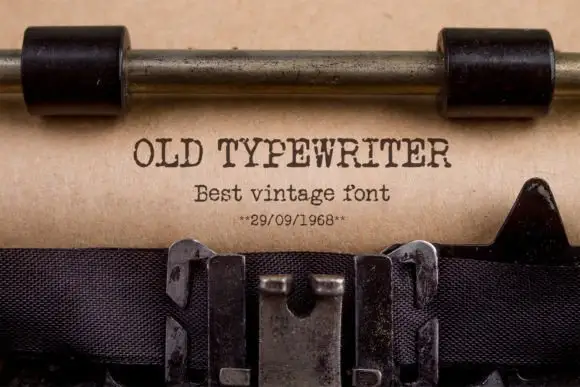
Typewriter slab
Old Typewriter is a typewriter slab in dark ink on a kraft sheet: light uniform strokes, blunt slab serifs, a fixed advance and slightly uneven impressions, set as one line with a smaller line beneath and a dated note under that, with the carriage and the ribbon visible above and below.
Ideas for this font
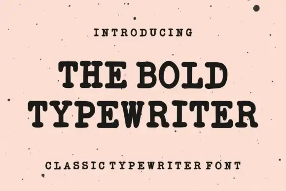
Bold typewriter serif with rounded slabs
The Bold Typewriter is a heavy typewriter serif in black on speckled pink paper: rounded slab serifs, a thick even stroke, tight fitting and a single sentence set across two lines with a tracked caption below.
Ideas for this font
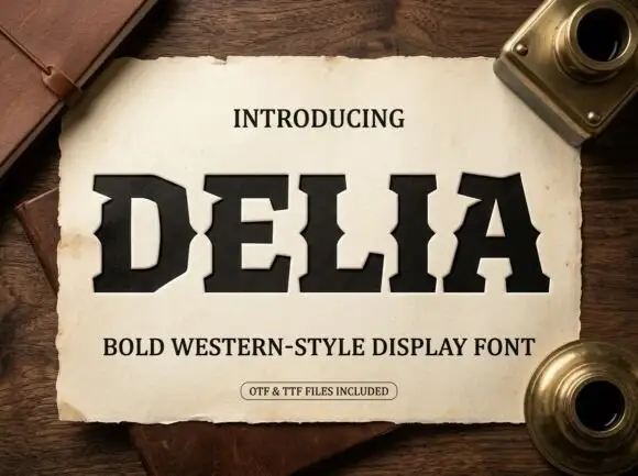
Heavy western-style capitals with clipped corners and inward mid-stem notches
Delia shows thick dark capitals with broad square feet and sharply clipped corners, where small inward notches cut into the sides of the D, E and L around mid-height and the A keeps a narrow opening, while the parchment, notebook and inkwells around it are presentation scenery.
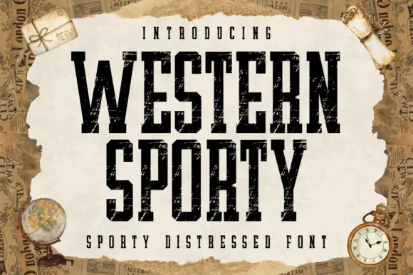
Very condensed distressed slab
Western Sporty is a very condensed square slab in black on a torn paper sheet: tall caps with heavy square slabs, scratched irregular fill and rough edges, set on two lines with a tracked line above and a caption beneath, over a ground of aged newspaper and travel props.
Same independent foundry
Allow optional Google Analytics to measure visits and catalogue actions. Your search words and notes are not included. Privacy & storage