Modern Grotesque Body

The Bold Typewriter + Corven
Creates crisp high-hierarchy contrast beneath The Bold Typewriter headlines across menus, websites and labels.
Inspect Corven specimenDisclosure: MakerFileHub may earn a commission from qualifying purchases via paid links on this page. How our links work.
Bold typewriter serif with rounded slabs
The Bold Typewriter is a heavy typewriter serif in black on speckled pink paper: rounded slab serifs, a thick even stroke, tight fitting and a single sentence set across two lines with a tracked caption below.
Paid link
Get this fontProject & layout blueprintsAt-a-glance maker compatibility
Fine grain and micro-texture excel in 300 DPI print, sublimation, and screen print rather than small vinyl weeding.
Visual anatomy & craft review
Two words are stacked and the face is a typewriter serif at a heavy weight: the stems are thick, the serifs are rounded slabs rather than sharp blocks, the a keeps a single-storey bowl, the e is wide and open and the S closes with a soft shoulder. The weight is the point here, since most typewriter faces are light: at this weight the face holds up as a headline while still looking like something struck on a ribbon, and the rounded serifs keep it from feeling mechanical. The letters are fitted closely enough that each word reads as a band, and a tracked capital caption sits beneath in the same face at a much smaller size, which shows the weight holds when reduced. The ground is a pale pink sheet speckled with dark dots, and two small dots sit in the upper corners. The Bold Typewriter is a serif for posters, packaging, editorial headings and any layout that wants a strong typed voice, and it works best at display sizes on a light ground.
Bold, rounded, typed
Two-font hierarchy recipes
Tested contrast partners — pairing The Bold Typewriter with grounded secondary typography.
The Bold Typewriter + Corven
Creates crisp high-hierarchy contrast beneath The Bold Typewriter headlines across menus, websites and labels.
Inspect Corven specimen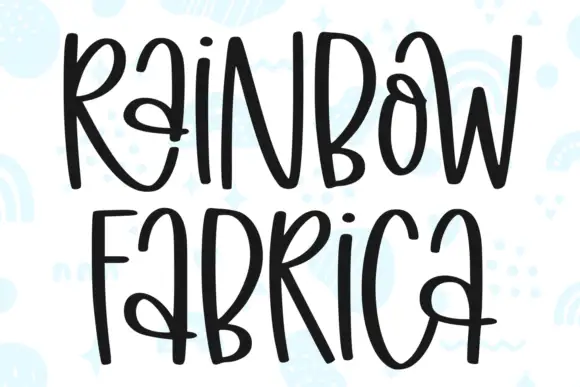
The Bold Typewriter + Rainbow Fabrica
Adds a warm human signature touch for 1-to-3-word callouts without competing against structured serif capitals.
Inspect Rainbow Fabrica specimenPractical applications
Concrete hierarchy, scale and production guidance tailored to The Bold Typewriter’s stroke geometry.
A heavy typewriter face gives a heading presence without the polish of a modern sans, and the rounded slabs keep it warm.
Hierarchy & layout recipe
Print a 210 by 280 mm page: set the heading at 44 pt over two lines, keep 16 mm of clear ground beneath before the standfirst at 11 pt, and hold 20 mm of margin on all four sides.
Pre-production check
A heavy face at forty-four points can close its counters; print one page and check the letter gaps before the run.
A bold typed label reads at arm's length on a bottle, and the rounded slabs fill a narrow label without extra decoration.
Hierarchy & layout recipe
Print a 55 by 90 mm label: set the brand at 16 pt over two lines, keep 6 mm of clear ground beneath before the style at 5.5 pt, and hold 4 mm of margin on all four sides.
Pre-production check
A heavy face on a curved label will distort at the edges; print one on the real bottle and check the ends.
A bold typed heading is loud enough for a noticeboard and still looks like a document, which suits a workshop about writing.
Hierarchy & layout recipe
Print an A3 poster at 297 by 420 mm: set the title at 90 pt over two lines, keep 30 mm of clear ground beneath before the time at 18 pt, and hold 24 mm of margin on all four sides.
Pre-production check
A noticeboard is read from a metre away; print one sheet and check the letters from that distance before the run.
Technical & licence verification
Confirm included OTF/TTF/WOFF formats, full glyph tables and licence coverage on the live store page before batch production.
Closest visual alternatives
Matched across letterform anatomy, stroke behaviour and craft applications.
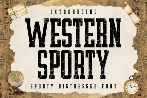
Very condensed distressed slab
Western Sporty is a very condensed square slab in black on a torn paper sheet: tall caps with heavy square slabs, scratched irregular fill and rough edges, set on two lines with a tracked line above and a caption beneath, over a ground of aged newspaper and travel props.
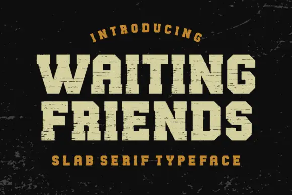
Wide scratched athletic slab
Waiting Friends is a wide athletic slab in cream on a dark scuffed ground: heavy capitals with thick square serifs, flat terminals and fine horizontal scratches across the fill, set in two lines between an arced line above and a tracked line beneath.
Ideas for this font
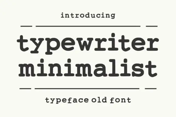
Heavy rounded typewriter slab
Typewriter Minimalist is a heavy rounded typewriter slab in charcoal on cream: thick lowercase with blunt typewriter feet, a large x-height and short ascenders, set over two lines between two rules with a tracked line above and a caption beneath.
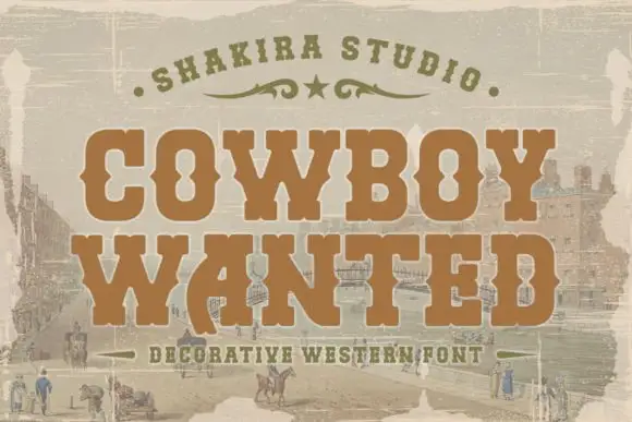
Heavy western-style capitals with squared feet and pinched ornamental sides
Cowboy Wanted sets a heavy western slab in warm brown on a sepia landscape, its serifs bracketed, its corners spurred and its strokes slightly worn at the edges.
Same independent foundry
Allow optional Google Analytics to measure visits and catalogue actions. Your search words and notes are not included. Privacy & storage