Modern Grotesque Body

Rough Cowboy + Nyxar
Creates crisp high-hierarchy contrast beneath Rough Cowboy headlines across menus, websites and labels.
Inspect Nyxar specimenDisclosure: MakerFileHub may earn a commission from qualifying purchases via paid links on this page. How our links work.
Distressed western slab in two tones
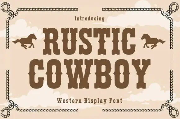
Rough Cowboy is a distressed western slab in brown and beige on cream: heavy capitals with thick flat serifs and a worn texture, printed in two tones so each letter reads as a stencil, with boots, hats, cacti and watercolour clouds around them.
Paid link
Get this fontProject & layout blueprintsAt-a-glance maker compatibility
Fine grain and micro-texture excel in 300 DPI print, sublimation, and screen print rather than small vinyl weeding.
Visual anatomy & craft review
Two words are stacked and the face is a western slab with a hard wear: the stems are heavy, the serifs are thick flats, the A and the V come to flat apexes, the R has a straight leg and the S closes into square shoulders, while the edges are bitten away in small pale patches that repeat across the letters evenly enough to stay readable. The two tones are used as a fill and a shadow, so each word reads as a stencil cut from board rather than a flat line of type, and the letter pairing is tight enough that a word reads as one object. Around the block a light watercolour ground carries a hat, a pair of boots, two cacti and soft clouds, and a banner line at the foot names the style. Rough Cowboy is a display face for posters, apparel, packaging and signage with a western theme, and it needs capitals at a large size and a warm, open ground.
Weathered, western, warm
Two-font hierarchy recipes
Tested contrast partners — pairing Rough Cowboy with grounded secondary typography.
Rough Cowboy + Nyxar
Creates crisp high-hierarchy contrast beneath Rough Cowboy headlines across menus, websites and labels.
Inspect Nyxar specimen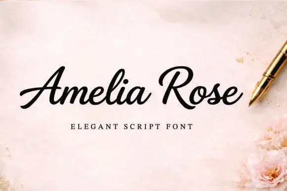
Rough Cowboy + Amelia Rose
Adds a warm human signature touch for 1-to-3-word callouts without competing against structured serif capitals.
Inspect Amelia Rose specimenPractical applications
Concrete hierarchy, scale and production guidance tailored to Rough Cowboy’s stroke geometry.
A weathered western face suits a seasonal sign photographed by visitors, and the two-tone fill gives depth without a second plate.
Hierarchy & layout recipe
Print a 600 by 900 mm board: set the name at 150 pt over two lines, keep 36 mm of clear ground beneath before the dates at 28 pt, and hold 26 mm of margin on all four sides.
Pre-production check
A worn texture on a large board can look like damage; view one printed board from a few metres before the run.
A cowboy slab gives a small bottle a rustic identity, and the heavy letters stay readable at the scale of a shelf label.
Hierarchy & layout recipe
Print a 50 by 80 mm label: set the brand at 16 pt on one line, keep 6 mm of clear ground beneath before the heat level at 5 pt, and hold 4 mm of margin on all four sides.
Pre-production check
Two tones on a small label can merge; print one on the real stock and check the contrast before the order.
A distressed slab names a book with the look of a painted sign, and the two-tone treatment gives a cover depth without a photograph.
Hierarchy & layout recipe
Print a 152 by 229 mm cover: set the title at 50 pt over two lines, keep 20 mm of clear ground beneath before the author at 11 pt, and hold 14 mm of margin on all four sides.
Pre-production check
Heavy wear on a small cover can look like a printing fault; proof one cover and reduce the texture if needed.
Technical & licence verification
Confirm included OTF/TTF/WOFF formats, full glyph tables and licence coverage on the live store page before batch production.
Closest visual alternatives
Matched across letterform anatomy, stroke behaviour and craft applications.
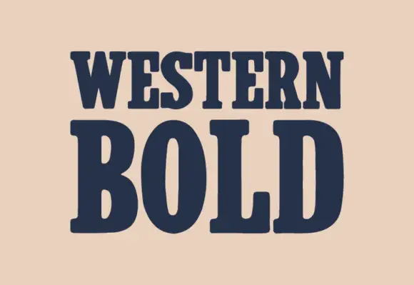
Heavy western slab
Western Bold is a heavy slab shown in navy on a warm sand ground: two lines of capitals with broad rounded brackets, narrow vertical counters in the O, blunt serifs and a heavy even stroke, with no ornament on the sheet at all.
Ideas for this font
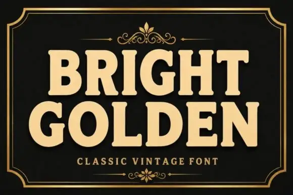
Heavy rounded slab capitals with softened corners
Bright Golden shows broad softly rounded slab capitals in a gold treatment on black, where the G opens a wide mouth and the R leg kicks outward so the dense words never settle into a plain rectangle.
Ideas for this font
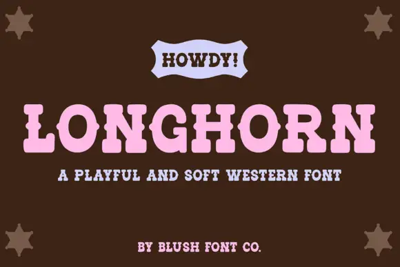
Soft rounded western slab with a light serif line
Longhorn Western is a soft western display in pink on brown: fat rounded slab capitals with eased corners, a wide fit, and a small ribbon banner above carrying a greeting in a lighter slab.
Ideas for this font
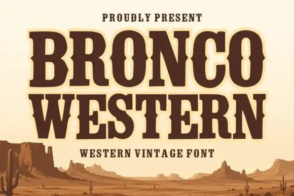
Broad Western slabs with pinched mid-stroke notches
Bronco Western uses heavy brown capitals with broad feet and inward pinches at mid-height, where the narrow O counter changes width around its centre to reinforce the Western sign character.
Same independent foundry
Allow optional Google Analytics to measure visits and catalogue actions. Your search words and notes are not included. Privacy & storage