Modern Grotesque Body

Vintage Journal + Sailors
Creates crisp high-hierarchy contrast beneath Vintage Journal headlines across menus, websites and labels.
Inspect Sailors specimenDisclosure: MakerFileHub may earn a commission from qualifying purchases via paid links on this page. How our links work.
Vintage journal serif
Vintage Journal is a vintage serif in near-black on aged paper: moderate contrast, rounded serifs, a large x-height and slightly uneven stems, set in two lines with an ornamental rule beneath and a tracked block of notes below that, beside a pen, a wax seal and a pressed flower.
Paid link
Get this fontProject & layout blueprintsAt-a-glance maker compatibility
Sturdy stroke walls and open counters weed cleanly on adhesive vinyl, HTV apparel film, and cut cardstock.
Visual anatomy & craft review
The two words are stacked and the drawing is a warm old-style serif: the contrast is moderate, the serifs are rounded rather than sharp, and the stems waver by a hair, which gives the face the look of a book printed from worn type. That choice matters for the use case, because a journal or a letterpress card wants a face that reads as ink on paper rather than as a screen font. The ornamental rule and the tracked notes beneath are period furniture, and the props around the sheet — a pen, a seal, a dried flower — set the context honestly. Because the contrast is moderate, the face works at text sizes as well as at display, which the note block demonstrates.
Serif, vintage, editorial, warm
Two-font hierarchy recipes
Tested contrast partners — pairing Vintage Journal with grounded secondary typography.
Vintage Journal + Sailors
Creates crisp high-hierarchy contrast beneath Vintage Journal headlines across menus, websites and labels.
Inspect Sailors specimen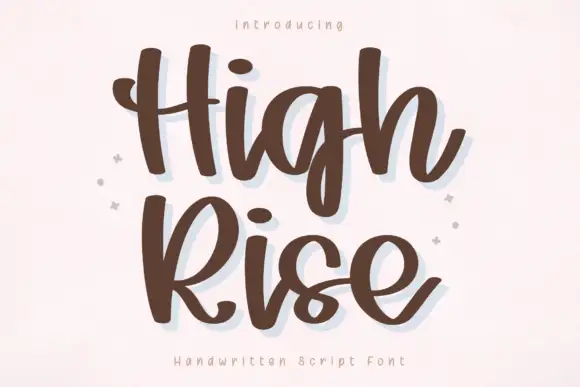
Vintage Journal + High Rise
Adds a warm human signature touch for 1-to-3-word callouts without competing against structured serif capitals.
Inspect High Rise specimenPractical applications
Concrete hierarchy, scale and production guidance tailored to Vintage Journal’s stroke geometry.
A vintage serif at moderate contrast stays readable through a whole diary, and the rounded serifs keep long paragraphs from looking severe.
Hierarchy & layout recipe
A5 journal: the body at 10 pt with 15 pt leading, the headings at 18 pt, and a 16 mm margin. Print one ink on a cream stock and keep the measure near sixty-five characters.
Pre-production check
Check the 10 pt body on cream stock, where rounded serifs can fill; test a page on the actual paper. Confirm the leading holds the column and that the headings stay distinct from the text.
A vintage serif reads as a printed edition, and the large x-height keeps a title and an imprint legible on a small sticker.
Hierarchy & layout recipe
Print a 60 by 40 mm label: the title at 11 pt, the author at 8 pt, and the price at 6 pt. Keep 3 mm inside the die and print one ink on a textured stock.
Pre-production check
Check the 11 pt title on a textured label, where a rounded serif can fill; keep the size above 9 pt. Confirm the 6 pt price reads at arm's length and that the label peels cleanly.
A vintage serif suits a couple who want print rather than calligraphy, and the moderate contrast survives a home print run on card.
Hierarchy & layout recipe
A5 invitation: the names at 24 pt, the request in a 10 pt serif at 14.5 pt leading, and the date at 9 pt caps. Keep 22 mm margins and print one ink on a cream card.
Pre-production check
Check the 24 pt names at home-print resolution, where a rounded serif can fill; keep the counters above 0.5 mm. Confirm the 10 pt request reads at arm's length and that the rule stays level.
Technical & licence verification
Confirm included OTF/TTF/WOFF formats, full glyph tables and licence coverage on the live store page before batch production.
Closest visual alternatives
Matched across letterform anatomy, stroke behaviour and craft applications.
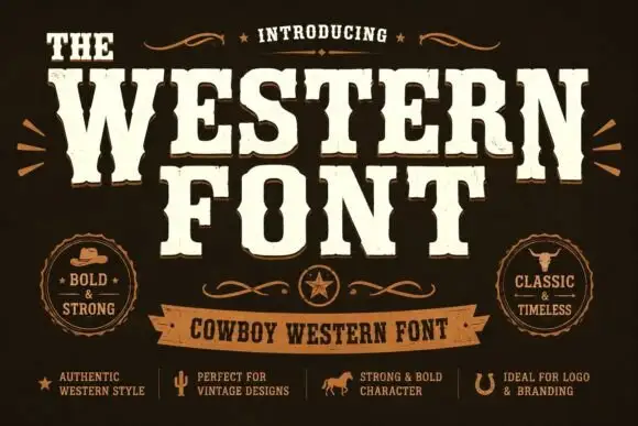
Heavy western capitals with pinched sides
The Western is a heavy western display in cream on dark brown: tall capitals with pinched waists, wedge serifs and a rough printed edge, laid out with a ribbon banner and two round badges.
Ideas for this font
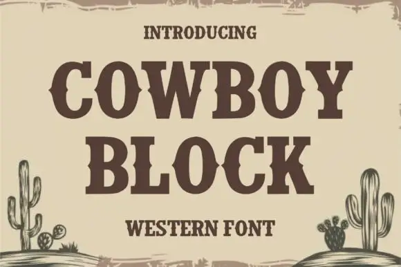
Heavy western serif capitals with middle notches and square slabs
Cowboy Block is a heavy western capital alphabet whose stems and slabs carry small notches cut through the middle, so a word reads like a carved saloon sign rather than a plain slab.
Ideas for this font
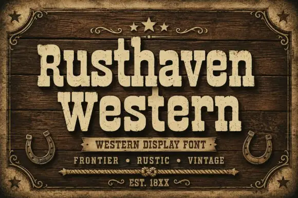
Weathered western slab display
Rusthaven Western is a weathered western slab in cream on dark timber: heavy slabs with softened corners, a chipped edge and a speckled fill, set in two lines with a ribbon banner, stars and horseshoes, so the pair reads as a brand burned into a barn door.
Ideas for this font
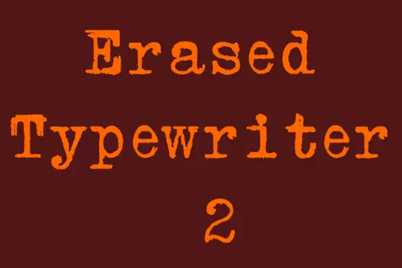
Rough typewriter serif with broken rounded feet and uneven contours
Erased Typewriter 2 is a distressed typewriter serif in which the rounded slab feet break at the edges, small patches go missing from the bowls and the contours stay uneven, so a line reads as an old typed impression rather than a clean slab.
Ideas for this font
Same independent foundry
Allow optional Google Analytics to measure visits and catalogue actions. Your search words and notes are not included. Privacy & storage



