Neutral Sans Workhorse

Vintage Horror + Olline
Lets Vintage Horror own the focal silhouette while handling secondary copy, sizing and subheads cleanly.
Inspect Olline specimenDisclosure: MakerFileHub may earn a commission from qualifying purchases via paid links on this page. How our links work.
Tall dripping horror caps
Vintage Horror is a tall condensed horror display in bone white with blood-red drips on a moonlit graveyard: narrow heavy caps, chipped edges, and a wet red run from the bottom of every letter, so the pair reads as a film title rather than as a seasonally decorated sans.
Paid link
Get this fontProject & layout blueprintsAt-a-glance maker compatibility
Fine grain and micro-texture excel in 300 DPI print, sublimation, and screen print rather than small vinyl weeding.
Visual anatomy & craft review
The two words are stacked and the drawing is a condensed display with the melt built in: the stems are heavy and straight, the counters are narrow, and the letters end in long runs of red that hang below the baseline at different lengths. The white upper halves are chipped and speckled, which reads as old paint over stone, and the red is a single flat tone, so the print stays a two-colour job rather than a gradient. Spacing is tight, which merges the words into a slab, and the condensed width lets a long title fit while the height keeps the poster readable at distance. The ground is a full scene: a moon, a bat, a crow on a headstone and a silhouette of a house, all pushed into shadow so the type stays the only high-contrast element on the page.
Horror, tall, drippy, cinematic
Two-font hierarchy recipes
Tested contrast partners — pairing Vintage Horror with grounded secondary typography.
Vintage Horror + Olline
Lets Vintage Horror own the focal silhouette while handling secondary copy, sizing and subheads cleanly.
Inspect Olline specimen
Vintage Horror + Stanza
Grounds bold display lettering with classic typographic authority on posters, badges and apparel.
Inspect Stanza specimenPractical applications
Concrete hierarchy, scale and production guidance tailored to Vintage Horror’s stroke geometry.
A cinematic horror face does the work of an illustration, and the two-colour construction keeps a small venue's print cheap while the drips sell the genre instantly.
Hierarchy & layout recipe
A2 portrait: the title at 140 mm cap height, the screening details in a 14 mm sans, and the date at 20 mm. Keep 35 mm below the drips so the small type stays clean, and print bone on black with a red second ink.
Pre-production check
Check the poster at five metres, where the red drips can merge with a dark ground; lift the red one step. Confirm the 14 mm details read at three metres and that the longest drip clears the venue line by 20 mm.
A film-title face sets a horror party in one image, and the drips give an invitation the look of a poster rather than a card, which is what guests respond to.
Hierarchy & layout recipe
A6 card: the phrase at 32 pt, the date and address in a 9 pt sans, and a 4 mm border. Keep 8 mm between the drips and the address line, and print two colours on a dark card so the white reads as bone.
Pre-production check
Check the 32 pt phrase on a dark card, where the thin chips can turn into noise; use the cleanest cut. Confirm the 9 pt address keeps a 4.5:1 contrast and that the drips do not run into the trim.
A horror label turns a seasonal release into a collectable, and the two flat inks keep a small brewery's run affordable on a bottle label where gradients would raise the cost.
Hierarchy & layout recipe
Print a 70 by 90 mm label: the beer name at 20 pt, the style in a 7 pt sans, and the volume in 6 pt. Keep 5 mm clear inside the die so the drips are never cut, and set the red drips on a dark ground for contrast.
Pre-production check
Check the 20 pt name against the die line at 5 mm; pull the lockup in if a drip narrows the margin. Confirm the 6 pt volume reads on the curve and that the red holds on a varnished label under bar lighting.
Technical & licence verification
Confirm included OTF/TTF/WOFF formats, full glyph tables and licence coverage on the live store page before batch production.
Closest visual alternatives
Matched across letterform anatomy, stroke behaviour and craft applications.
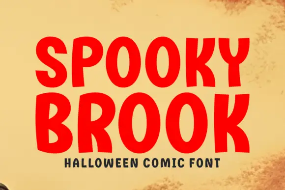
Bold comic caps
Spooky Brook is a bold comic display in red on aged yellow paper: heavy rounded caps with flat tops, a slight bounce, an R with a straight leg and a K whose arm meets the stem at a sharp angle, with a tracked caption beneath in a small bold sans.
Ideas for this font
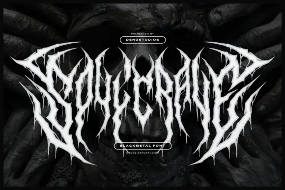
Thorn-spiked black-metal display
Soulcrave is a white black-metal display over a dark mirrored photograph: thorn-like letterforms with long spikes at the terminals, ragged drips below the shapes, mirrored halves and near-symmetrical composition, set as one word with a small presenting line above and two badges at the foot.
Ideas for this font
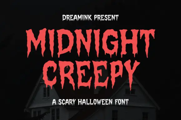
Display
Midnight Creepy is a horror display face in which every stroke melts: the caps are heavy and irregular, and the bottoms of the letters run down into long drips that end in rounded drops.
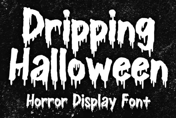
Rough horror lettering with hanging drips and uneven outlines
Dripping Halloween is rough display lettering in which every stroke ends in a hanging drip, the outlines are uneven and the letters vary in height, so a phrase reads as painted on a wall.
Ideas for this font
Same independent foundry
Allow optional Google Analytics to measure visits and catalogue actions. Your search words and notes are not included. Privacy & storage