Neutral Sans Workhorse

Spooky Brook + Hermano
Lets Spooky Brook own the focal silhouette while handling secondary copy, sizing and subheads cleanly.
Inspect Hermano specimenDisclosure: MakerFileHub may earn a commission from qualifying purchases via paid links on this page. How our links work.
Bold comic caps
Spooky Brook is a bold comic display in red on aged yellow paper: heavy rounded caps with flat tops, a slight bounce, an R with a straight leg and a K whose arm meets the stem at a sharp angle, with a tracked caption beneath in a small bold sans.
Paid link
Get this fontProject & layout blueprintsAt-a-glance maker compatibility
Sturdy stroke walls and open counters weed cleanly on adhesive vinyl, HTV apparel film, and cut cardstock.
Visual anatomy & craft review
The two words are stacked and the drawing is a comic display: the strokes are heavy and even, the corners are rounded, and the letters are wide enough to fill the line without stretching, which is what gives the block its poster presence. A few letters break the pattern — the K's arm meets the stem at a sharp angle and the R's leg is straight — and those exceptions are what keep a simple face from looking mechanical. Because the forms are simple and heavy, the face holds at small sizes and on fabric, and the specimen sets it large on an aged paper ground so the ink reads as printed rather than drawn. The caption beneath is a small bold sans, tracked wide, which is the only neutral voice on the plate.
Comic, bold, rounded, seasonal
Two-font hierarchy recipes
Tested contrast partners — pairing Spooky Brook with grounded secondary typography.
Spooky Brook + Hermano
Lets Spooky Brook own the focal silhouette while handling secondary copy, sizing and subheads cleanly.
Inspect Hermano specimen
Spooky Brook + Vanielst Elegant Serif Display Stylistic
Grounds bold display lettering with classic typographic authority on posters, badges and apparel.
Inspect Vanielst Elegant Serif Display Stylistic specimenPractical applications
Concrete hierarchy, scale and production guidance tailored to Spooky Brook’s stroke geometry.
A bold comic face prints as one screen and reads across a crowd at a seasonal event, and the simple forms survive repeated washing on a dark cotton garment.
Hierarchy & layout recipe
Print a 260 mm chest graphic: the event at 55 mm cap height, the year at 20 mm, and one ink on a dark shirt. Keep the thinnest stroke at 4 mm so the screen holds and place the graphic 80 mm below the collar.
Pre-production check
Check the screen at actual mesh, where a 4 mm stroke can lose its edge; keep the ink solid. Wash-test one shirt and confirm the year stays legible after five cycles.
A simple comic face reproduces well on a school copier, and the heavy letters read from the far end of a corridor where a textured display would turn to noise.
Hierarchy & layout recipe
A3 print: the headline at 90 mm cap height, the stalls in a 14 mm sans, and the times at 18 mm. Keep 25 mm margins and print one colour on a coloured stock so the poster stands out among plain sheets.
Pre-production check
Check the A3 at two metres, where a heavy face can look blunt; keep the letter spacing even. Confirm the 14 mm stalls read at arm's length and that the headline fits the sheet.
A bold comic face sets a seasonal tone for a child without the fright of a drippy display, and the heavy letters read at card size.
Hierarchy & layout recipe
A6 card: the name at 30 pt, the details in a 9 pt sans, and a 3 mm border. Keep 12 mm margins and print one ink on a pale card so the red stays warm rather than alarm-like.
Pre-production check
Check the 30 pt name, where a rounded corner can close a counter; keep the counters open. Confirm the 9 pt details keep a 4.5:1 contrast and that the border clears the descenders.
Technical & licence verification
Confirm included OTF/TTF/WOFF formats, full glyph tables and licence coverage on the live store page before batch production.
Closest visual alternatives
Matched across letterform anatomy, stroke behaviour and craft applications.
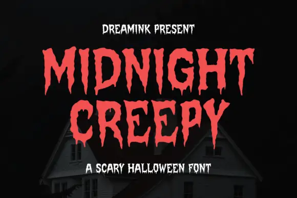
Display
Midnight Creepy is a horror display face in which every stroke melts: the caps are heavy and irregular, and the bottoms of the letters run down into long drips that end in rounded drops.
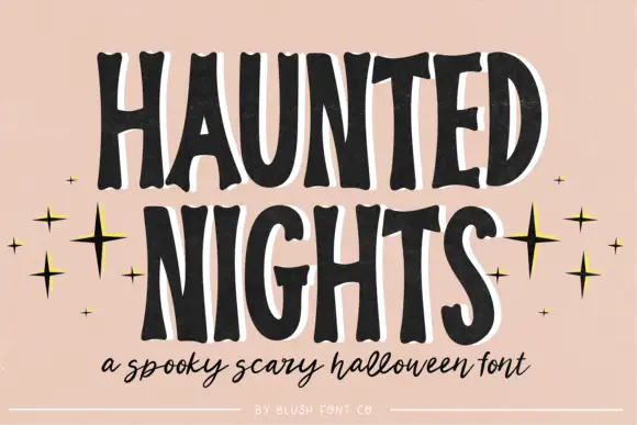
Tall irregular spooky capitals with wobbly contours
Haunted Nights is a tall irregular capital alphabet in which the stems wobble, the counters sag and the outline breaks unevenly, so a two-word greeting reads as lettering cut quickly for a porch sign.
Ideas for this font
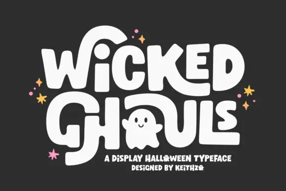
Round Halloween blocks with oversized sweeping strokes
Wicked Ghouls builds heavy softly rounded capitals and then lets one counter become a ghost, with oversized strokes sweeping away from the word.
Ideas for this font
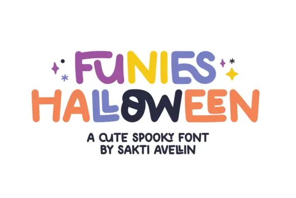
Loose rounded lettering with varied heights and uneven crossbars
Funies Halloween is a loose rounded display alphabet in which the letters bounce above and below the baseline, the heights vary and the crossbars sit at different levels, so a word reads as something cut out and taped down.
Ideas for this font
Same independent foundry
Allow optional Google Analytics to measure visits and catalogue actions. Your search words and notes are not included. Privacy & storage