Modern Grotesque Body

Vintage Glory + Headline
Creates crisp high-hierarchy contrast beneath Vintage Glory headlines across menus, websites and labels.
Inspect Headline specimenDisclosure: MakerFileHub may earn a commission from qualifying purchases via paid links on this page. How our links work.
Layered varsity slab with depth
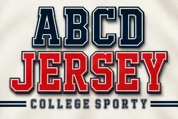
Vintage Glory is a layered varsity slab in red and navy on cream: heavy square serifs, notched corners, a solid extrusion behind every letter that steps down and right, and a round badge with a ball seam, so the two words read as a printed sports pennant rather than a flat headline.
Paid link
Get this fontProject & layout blueprintsAt-a-glance maker compatibility
Cut solid base, outline, and shadow layers in separate vinyl colors and align on registration marks.
Visual anatomy & craft review
The two lines are stacked and the drawing is a college slab adapted for print: the serifs are blocks, the corners are notched, and the letters carry a two-step extrusion in a second colour, which builds depth without a gradient or a shadow blur. The extrusion is consistent across both lines and across every letter, which is what makes the block read as one printed plate rather than as a stack of effects. Spacing is tight and the letters are wide, so the pair fills the plate and needs the frame to hold it. The frame is a period composition: a red brush stroke along the top, a baseball badge at the top right, a player silhouette at the left and a ribbon banner beneath, all in the same two inks on an aged cream ground.
Varsity, layered, sporty, retro
Two-font hierarchy recipes
Tested contrast partners — pairing Vintage Glory with grounded secondary typography.
Vintage Glory + Headline
Creates crisp high-hierarchy contrast beneath Vintage Glory headlines across menus, websites and labels.
Inspect Headline specimen
Vintage Glory + Hello Honey
Adds a warm human signature touch for 1-to-3-word callouts without competing against structured serif capitals.
Inspect Hello Honey specimenPractical applications
Concrete hierarchy, scale and production guidance tailored to Vintage Glory’s stroke geometry.
A layered varsity slab gives a school final the look of a period pennant, and the two-colour extrusion prints by screen or press without a halftone, which keeps a small run affordable.
Hierarchy & layout recipe
A2 portrait: the teams at 70 mm cap height, the fixture in a 20 mm sans, and a badge at the top corner. Keep 25 mm margins and print two flat inks on a cream stock so the extrusion reads as a solid step.
Pre-production check
Check the A2 at full size, where the extrusion can thin at the letter joins; keep it at least 4 mm. Confirm the 20 mm fixture reads at three metres and that the badge does not crowd the top line.
A layered varsity mark reads from a window and looks hand-printed on a mirror or a sign, and the two-ink build means the shop can repaint it as signage without a designer.
Hierarchy & layout recipe
Fabricate a 900 by 400 mm window sign: the name at 140 mm cap height, the extrusion at 5 mm, the services in a 24 mm sans. Keep the two inks separate and specify a matte vinyl so the notch detail stays visible against the glass.
Pre-production check
Check the extrusion at 5 mm in vinyl, where a narrower step weeding failure occurs; keep it above 4 mm. Confirm the 24 mm services read through the glass and that the sign is legible in daylight from across the street.
A layered slab gives a party shirt the look of licensed merchandise, and the flat colours mean one screen and one underlay covers the whole graphic on a coloured shirt.
Hierarchy & layout recipe
Print a 260 mm chest graphic: the team name at 55 mm cap height, the year at 30 mm, and two inks with a white underlay. Keep the thinnest extrusion at 3 mm so the screen holds and place the graphic 80 mm below the collar.
Pre-production check
Check the screen at actual mesh, where a 3 mm step fills on a dark shirt; add the underlay. Wash-test one shirt and confirm the year stays legible after five cycles.
Technical & licence verification
Confirm included OTF/TTF/WOFF formats, full glyph tables and licence coverage on the live store page before batch production.
Closest visual alternatives
Matched across letterform anatomy, stroke behaviour and craft applications.
Solid athletic blocks with clipped bowls
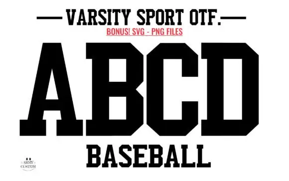
Varsity Sport Army is a solid athletic block in black on white: wide slab-serifed capitals with clipped corners, a flat top and foot, and squared counters, shown as an alphabet specimen above the word Baseball.
Ideas for this font
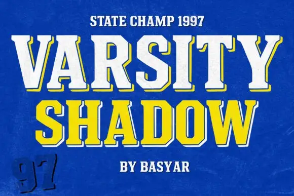
Varsity slab with shadow
Varsity Shadow is an angular varsity slab in white and yellow on a blue ground: a top line of white caps with a yellow keyline and a dark offset shadow, and a second line in yellow with a white keyline, plus a small line above and a credit beneath and a hand-drawn number at the corner.
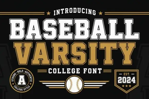
Layered varsity slab capitals with an arc
Baseball Varsity builds its two words out of heavy slab capitals with a dark offset shadow and a white inline, stacking them on a shallow arc above a ruled band and a round badge.
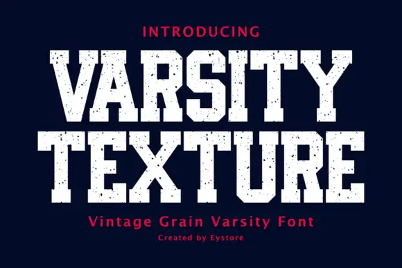
Display
Varsity Texture is a collegiate block face: heavy slab-serifed capitals with a flat top and foot, tight spacing and a grain texture that leaves the letters looking stamped on fabric.
Ideas for this font
Same independent foundry
Allow optional Google Analytics to measure visits and catalogue actions. Your search words and notes are not included. Privacy & storage