Neutral Sans Workhorse

Petal + Borsen
Lets Petal own the focal silhouette while handling secondary copy, sizing and subheads cleanly.
Inspect Borsen specimenDisclosure: MakerFileHub may earn a commission from qualifying purchases via paid links on this page. How our links work.
Vintage serif with rose ornament
Petal is a vintage serif in black on a pale rose ground: very heavy caps with bracketed serifs and a high waist, set on one line inside an ornamental frame with painted roses, ribbons, a postmark and a script line above and beneath naming the category and its uses.
Paid link
Get this fontProject & layout blueprintsAt-a-glance maker compatibility
Sturdy stroke walls and open counters weed cleanly on adhesive vinyl, HTV apparel film, and cut cardstock.
Visual anatomy & craft review
The plate is a wedding-stationery sample rather than a type specimen, and that is the honest setting for a face sold on its period warmth: the roses, the ribbon and the postmark show how the letters behave inside a decorated card, which is where most buyers will use them. The drawing is a heavy old-style serif with bracketed serifs and a high waist, and the weight is enough to hold against the ornaments without looking crowded. The script line above and the tracked caps beneath belong to the layout, and the palette is two inks on a pale printed ground. Because the letters are heavy and the counters open, the face reads at a small size as well as at display size, which the frame composition demonstrates.
Serif, vintage, romantic, ornamental
Two-font hierarchy recipes
Tested contrast partners — pairing Petal with grounded secondary typography.
Petal + Borsen
Lets Petal own the focal silhouette while handling secondary copy, sizing and subheads cleanly.
Inspect Borsen specimen
Petal + Flowsky Editorial
Grounds bold display lettering with classic typographic authority on posters, badges and apparel.
Inspect Flowsky Editorial specimenPractical applications
Concrete hierarchy, scale and production guidance tailored to Petal’s stroke geometry.
A heavy vintage serif holds its weight inside a decorated card, and the open counters keep the names readable at a size where a fine serif would disappear among the florals.
Hierarchy & layout recipe
A5 invitation: the names at 26 pt, the request in a 9.5 pt serif, and the date at 9 pt caps. Keep 22 mm margins, keep the florals outside the type block, and print two colours on a cream card.
Pre-production check
Check the 26 pt names against the floral ground, where a busy area can swallow a serif; move the ornament away from the letters. Confirm the 9.5 pt request reads at arm's length and that the date clears the trim.
A vintage serif reads as a florist's label, and the heavy letters stay legible at a small size where a script would be too decorative.
Hierarchy & layout recipe
Print a 60 by 80 mm label: the shop at 15 pt, the product in a 7 pt serif, and the price at 6 pt. Keep 4 mm inside the die and print two colours on a cream stock so the serifs read cleanly.
Pre-production check
Check the 15 pt shop name, where a bracket can fill at the die edge; keep the size above 12 pt. Confirm the 6 pt price reads on the shelf and that the label survives a damp wipe.
A vintage serif frames a gardening title as a period plate, and the heavy letterforms hold at thumbnail size where a light serif would fade into the illustration.
Hierarchy & layout recipe
Set the title at 85 mm cap height across 200 mm, the subtitle in a 12 pt serif, and the author at 9 pt. Print two colours on a cream stock and keep the rose ornament at one corner only.
Pre-production check
Check the title at thumbnail size, where the ornament can crowd the letters; keep a clear zone around the block. Confirm the 9 pt author survives lamination and that the title clears the trim by 12 mm.
Technical & licence verification
Confirm included OTF/TTF/WOFF formats, full glyph tables and licence coverage on the live store page before batch production.
Closest visual alternatives
Matched across letterform anatomy, stroke behaviour and craft applications.
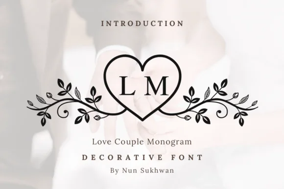
Line-art heart monogram with vine flourishes
Love Couple Monogram is a line-art monogram in black on a blurred wedding photograph: a heart drawn as a single outline, two serif initials set inside it, and vines with leaves and berries curling out to both sides.
Ideas for this font
Circle-pair monogram with scrolls
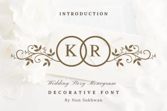
Wedding Story Monogram is a two-initial monogram in bronze on a white still life: two serif capitals set inside two overlapping circles, with mirrored leafy scrolls extending sideways from the rings, staged on an envelope among white roses with a small line above and two lines beneath.
Ideas for this font
Ring-and-rose monogram
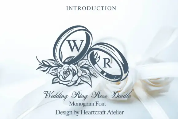
Wedding Ring Rose Doodle is a monogram design in slate on white: two tilted ring outlines holding a serif W and R, with a fine rose and leaf cluster at the lower left, staged over white ribbons with a small line above and three lines beneath.
Ideas for this font
Serif capitals individually held inside overlapping fine heart outlines
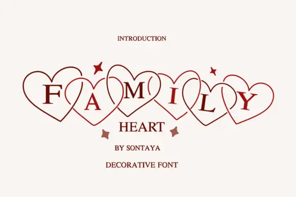
Family Heart sets each capital inside its own outlined heart and overlaps the hearts in a row, so a short word reads as a garland of hearts with one letter in each.
Ideas for this font
Same independent foundry
Allow optional Google Analytics to measure visits and catalogue actions. Your search words and notes are not included. Privacy & storage