Editorial Serif Anchor

Teknova + Cervelique
Anchors Teknova's fluid strokes with crisp Roman proportions on wedding suites, headers and packaging.
Inspect Cervelique specimenDisclosure: MakerFileHub may earn a commission from qualifying purchases via paid links on this page. How our links work.
Raw condensed drawn sans
Teknova is a tall condensed sans in navy on a warm off-white sheet: narrow capitals with uneven straight stems, polygonal O corners and slightly irregular edges, set as one large word with a small line above and four tracked notes at the corners.
Paid link
Get this fontProject & layout blueprintsAt-a-glance maker compatibility
Weld or Unite overlapping script joins into one continuous vector path before sending to the blade.
Visual anatomy & craft review
The word spans the plate and the drawing is a condensed capital face with deliberately uneven stems: the edges are slightly irregular, the O is polygonal rather than round, and the spacing is tight, which gives the face a drawn, industrial character rather than a machined one. That construction sets a moderate size floor, because the irregularities read as texture only above a certain size and as damage below it. The four corner notes are tiny tracked caps that carry the style, the intent, the proportions and the language support, which is the practical information a buyer checks. Because the letters are narrow and raw, the face suits a poster, a label and a sign, and the plate sets the word large enough that the uneven edges can be judged honestly.
Handwritten, condensed, raw, industrial
Two-font hierarchy recipes
Tested contrast partners — pairing Teknova with grounded secondary typography.
Teknova + Cervelique
Anchors Teknova's fluid strokes with crisp Roman proportions on wedding suites, headers and packaging.
Inspect Cervelique specimen
Teknova + Inkora
Keeps small-scale dates, URLs, nutrition facts and care instructions crisp and legible below script titles.
Inspect Inkora specimenPractical applications
Concrete hierarchy, scale and production guidance tailored to Teknova’s stroke geometry.
A raw condensed face reads as printed rather than typeset, which suits a night with a rough-edged identity. A drawn face reads as handmade in print.
Hierarchy & layout recipe
A1 poster: the night at 200 mm cap height, the date in a 24 mm sans, and the venue at 12 mm. Keep 30 mm margins and print one colour on a light stock.
Pre-production check
Check the A1 at five metres, where an irregular edge can look like damage; keep the unevenness even. Confirm the 12 mm venue reads at two metres and that the date clears the block.
A raw condensed sans signals making rather than retail, and the narrow letters fit a long workshop name on a small die. It wears well at label size.
Hierarchy & layout recipe
Print a 60 by 90 mm label: the workshop at 14 pt, the service at 8 pt, and the phone at 7 pt. Keep 5 mm inside the die and keep the stem irregularity above 0.4 mm.
Pre-production check
Check the 14 pt name on a small label, where the irregular edge can fill; simplify at that size. Confirm the 7 pt phone reads at arm's length and that the label survives handling.
A condensed raw face sets a journal apart from a neutral grotesque, and the narrow letters hold a long word on a narrow cover.
Hierarchy & layout recipe
Set the title at 110 mm cap height across 150 mm, the issue in a 9 pt sans, and the price at 8 pt. Print one ink on a matte stock and keep 20 mm margins.
Pre-production check
Check the title at 110 mm, where a polygonal corner can look like a fault; keep it deliberate. Confirm the 8 pt price survives lamination and that the title clears the trim.
Technical & licence verification
Confirm included OTF/TTF/WOFF formats, full glyph tables and licence coverage on the live store page before batch production.
Closest visual alternatives
Matched across letterform anatomy, stroke behaviour and craft applications.
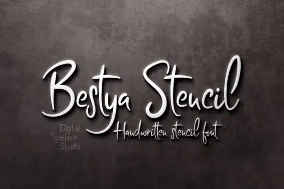
Narrow upright handwritten script with stencil bridges and fine joins
Bestya Stencil is narrow upright handwriting in which the letters stay slim, the joins stay fine and small bridges interrupt the strokes, so the word reads as a stencil cut from a written hand.
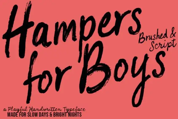
Loose brushed handwriting with slanted bodies and dry swept ends
Hampers for Boys is loose brushed handwriting in which the letters lean forward, the strokes sweep through each letter and the ends lift dry off the page.
Ideas for this font
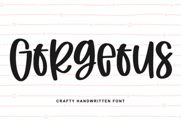
Heavy narrow handwriting with tight counters
Gorgeous is a heavy narrow handwriting that keeps a tall x-height and nearly closed counters, so a single word reads as a dense band with a lively, uneven baseline running under it.
Ideas for this font
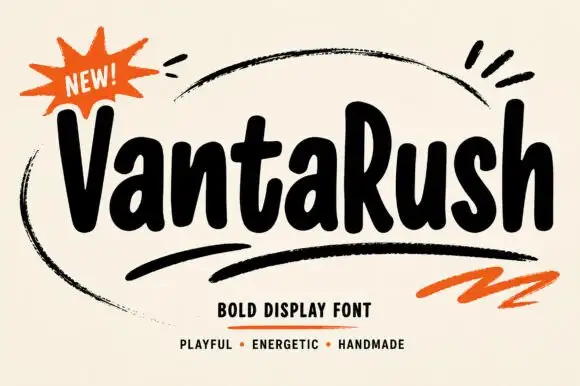
Bold playful hand display
Vanta Rush is a bold playful display in black on cream: fat rounded letters with uneven widths, a bouncy baseline, brush swooshes around the lockup and an orange burst badge, so the plate reads as a hand-painted market poster rather than a geometric face.
Ideas for this font
Same independent foundry
Allow optional Google Analytics to measure visits and catalogue actions. Your search words and notes are not included. Privacy & storage