High-Contrast Display Serif

Tranquilo Monoline Boho + Bulgary
Pairs sculptural editorial warmth with Tranquilo Monoline Boho's clean modern geometry.
Inspect Bulgary specimenDisclosure: MakerFileHub may earn a commission from qualifying purchases via paid links on this page. How our links work.
Light geometric capitals and fine script
Tranquilo Monoline Boho is a duo: very light geometric capitals with wide tracking, and a fine monoline script that is set across them, both in white on a warm nude ground.
Paid link
Get this fontProject & layout blueprintsAt-a-glance maker compatibility
Weld or Unite overlapping script joins into one continuous vector path before sending to the blade.
Visual anatomy & craft review
TRANQUILO fills the card in light capitals, and the letters are geometric and widely tracked: the T, R and A are drawn with a single even stroke, the Q carries a straight tail and the O is a perfect circle, so the word reads as a quiet horizon rather than a headline. Across the middle of it Monoline Boho is written in a fine script that overlaps the capitals, with a light even weight and no contrast at all, which is what makes the two voices sit together instead of fighting. The ground is a warm nude surface with a soft shadow, and two captions at the top and foot name the pair and the studio. The pair is an elegant packaging and editorial combination: the tracked capitals carry a long word, the script carries a personal line, and both are so light that the pair needs a dark or a mid-tone ground.
A thin sans with a fine script overlay
Two-font hierarchy recipes
Tested contrast partners — pairing Tranquilo Monoline Boho with grounded secondary typography.
Tranquilo Monoline Boho + Bulgary
Pairs sculptural editorial warmth with Tranquilo Monoline Boho's clean modern geometry.
Inspect Bulgary specimen
Tranquilo Monoline Boho + Handmade Calligraphy
Introduces organic movement on pull-quotes, signatures and gift tags.
Inspect Handmade Calligraphy specimenPractical applications
Concrete hierarchy, scale and production guidance tailored to Tranquilo Monoline Boho’s stroke geometry.
A tracked light sans with a fine script over it is a contemporary invitation layout, and the pair supplies both voices in one purchase.
Hierarchy & layout recipe
Print a 130 by 180 mm invitation: set the names at 30 pt in the sans with wide tracking, set the script line at 16 pt across them, and hold 16 mm of clear ground beneath before the details at 9 pt.
Pre-production check
An overlay script on wide capitals needs a light ground; print one invitation on the intended card and check the contrast before the suite.
A light geometric sans with a script crossing it gives a cover a contemporary look without a photograph, and the tracking fills the width.
Hierarchy & layout recipe
Print a 230 by 300 mm cover: set the cover title at 80 pt in the sans with wide tracking, set the script at 44 pt across it, keep 26 mm of clear ground beneath, and hold 22 mm of margin.
Pre-production check
Hairline geometric strokes can break on newsprint; print one cover on the actual stock and check a letter before the run.
The pair gives a quiet studio a mark in two light voices, which suits an object that should not be shouted about on a shelf.
Hierarchy & layout recipe
Print a 55 by 40 mm label: set the studio name at 12 pt in the sans with tracking, set the line at 7 pt in the script, and hold 5 mm of clear ground around the pair.
Pre-production check
Fine strokes at a small label size vanish on kraft; print one on the real stock and check the sans before the order.
Technical & licence verification
Confirm included OTF/TTF/WOFF formats, full glyph tables and licence coverage on the live store page before batch production.
Closest visual alternatives
Matched across letterform anatomy, stroke behaviour and craft applications.
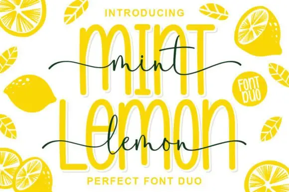
Outlined tall caps with a thin script crossing
Mint Lemon is a duo in bright yellow: tall outline capitals with a thick white cut-out, and a thin handwriting script that crosses them at the waist, with drawn lemon halves around the card.
Ideas for this font
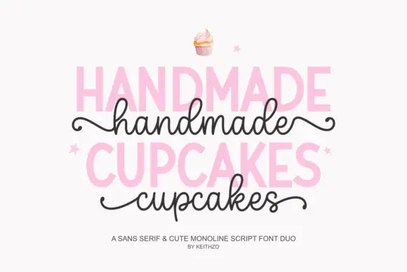
Bold sans serif paired with a monoline script with curled outer tails
Handmade Cupcakes pairs a bold sans serif in capitals with a light monoline script whose tails curl at both ends, so a label can carry a firm product word and a soft handwritten line.
Ideas for this font
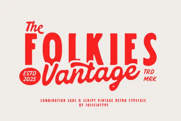
Vintage combination pairing condensed sans caps with a swash script
Folkies Vantage is a combination family in which tall condensed capital sans letters stack above a swash script word, so a shop name reads as a painted mid-century sign rather than as a modern lockup.
Ideas for this font
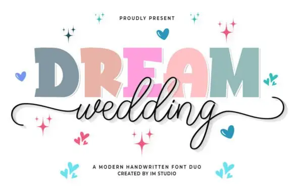
Chunky slab capitals paired with a fine flowing wedding script
Dream Wedding Duo pairs a heavy slab capital alphabet, drawn with flat tops and no contrast, against a fine flowing script whose entry and exit swashes stretch across a whole card.
Ideas for this font
Same independent foundry
Allow optional Google Analytics to measure visits and catalogue actions. Your search words and notes are not included. Privacy & storage