High-Contrast Display Serif

Organic Hand + Things
Pairs sculptural editorial warmth with Organic Hand's clean modern geometry.
Inspect Things specimenDisclosure: MakerFileHub may earn a commission from qualifying purchases via paid links on this page. How our links work.
Monoline handwritten caps
Organic Hand is a monoline handwritten display in off-white over a still life: tall caps with only the first letters capitalised, an even stroke, a slight bounce and open counters, set above a paragraph of small capitals, so the plate reads as a maker's label rather than a script.
Paid link
Get this fontProject & layout blueprintsAt-a-glance maker compatibility
Fine grain and micro-texture excel in 300 DPI print, sublimation, and screen print rather than small vinyl weeding.
Visual anatomy & craft review
The two words are set in a small-caps rhythm with the initials raised, which keeps the lockup quiet and gives the plate its editorial tone. The drawing is a monoline hand: the stroke is even, the letters are narrow, and the terminals are blunt, so the face reads as written with a technical pen rather than a brush. The bounce is mild and the spacing is generous, which makes the pair comfortable rather than decorative, and the open counters keep the face readable at label size. The ground is a photograph of three unglazed vases on a plain wall, and the small caps paragraph beneath describes the face in a second voice, which is the layout of a craft product page rather than a type specimen.
Handwritten, monoline, tall, casual
Two-font hierarchy recipes
Tested contrast partners — pairing Organic Hand with grounded secondary typography.
Organic Hand + Things
Pairs sculptural editorial warmth with Organic Hand's clean modern geometry.
Inspect Things specimen
Organic Hand + Hailey
Introduces organic movement on pull-quotes, signatures and gift tags.
Inspect Hailey specimenPractical applications
Concrete hierarchy, scale and production guidance tailored to Organic Hand’s stroke geometry.
A monoline hand reads as written on the piece, and the even stroke prints on a small label where a brush script would blur.
Hierarchy & layout recipe
Print a 60 by 80 mm label: the studio at 15 pt, the clay in a 6 pt sans, and the date at 5 pt. Keep 4 mm inside the die and print one ink on a kraft stock so the writing reads as pen on fibre.
Pre-production check
Check the 15 pt studio on kraft, where an even stroke can look flat; keep the ink dark. Confirm the 5 pt date reads on the base and that the label survives a damp wipe.
A handwritten face suits a relaxed menu, and the monoline stroke keeps a long dish list readable at table distance where a script would tangle.
Hierarchy & layout recipe
A5 menu: the heading at 24 pt, the courses at 10 pt with 15 pt leading, and the date at 8 pt. Keep 20 mm margins and print one ink on a cream card so the light strokes stay crisp.
Pre-production check
Check the 10 pt courses at table distance, where a monoline can grey out; deepen the ink. Confirm the heading reads across the table and that the date clears the trim by 10 mm.
A handwritten face is easy for children to read, and the even stroke stays clear when a label is printed small and laminated.
Hierarchy & layout recipe
A4 label sheet: each subject at 18 pt, the drawer number in a 7 pt sans, and 6 mm between labels. Keep 8 mm margins and print one ink on a matte label so the strokes stay clean.
Pre-production check
Check the 18 pt subjects, where the bounce can make two labels sit unevenly; align the baselines. Confirm the labels survive a term of handling and that the print does not lift when wiped.
Technical & licence verification
Confirm included OTF/TTF/WOFF formats, full glyph tables and licence coverage on the live store page before batch production.
Closest visual alternatives
Matched across letterform anatomy, stroke behaviour and craft applications.

Heavy geometric condensed display grotesk
Helina is a clean, heavy-weight condensed sans serif with flat-cut terminals, tight vertical rhythm, and bold magazine-masthead authority.
Ideas for this font
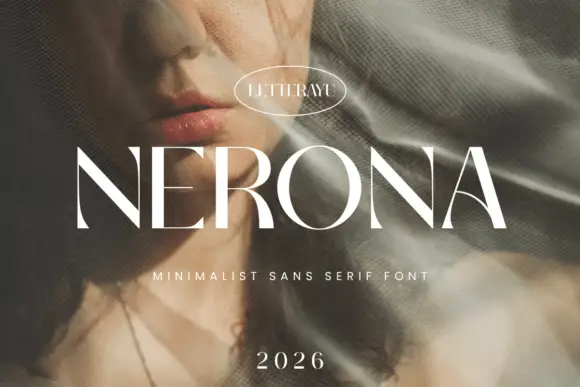
Minimal contrast capital sans
Nerona is a minimal contrast capital sans in white over a portrait veiled by netting: wide capitals with a broad round O, thin diagonal joins, flat terminals and slight contrast, set as one word with an oval maker's badge above, a tracked line beneath and a year at the foot.
Ideas for this font
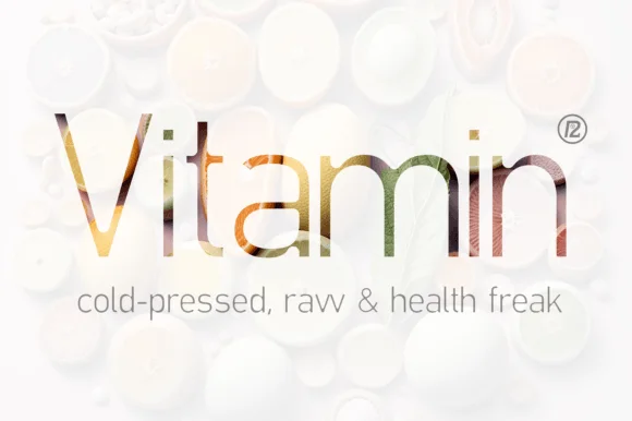
Light serif filled with a photograph
Vitamin is a light serif set as a photograph-filled headline over white pills: thin stems with fine serifs, the letters carrying an image inside, with a light sans subtitle beneath and a small registered mark at the side.

Contrasting mixed case with broad e bowl and plain tall B stem
Bareum shows muted terracotta title-case lettering on a pale flat field, where more substantial vertical and curved sides meet fine joins, the B carries a broad bowl, the u opens widely and the m keeps two narrow curved shoulders without projecting feet.
Ideas for this font
Same independent foundry
Allow optional Google Analytics to measure visits and catalogue actions. Your search words and notes are not included. Privacy & storage