High-Contrast Display Serif

Folkies Vantage + Marquis - Elegant Modern Serif
Pairs sculptural editorial warmth with Folkies Vantage's clean modern geometry.
Inspect Marquis - Elegant Modern Serif specimenDisclosure: MakerFileHub may earn a commission from qualifying purchases via paid links on this page. How our links work.
Vintage combination pairing condensed sans caps with a swash script
Folkies Vantage is a combination family in which tall condensed capital sans letters stack above a swash script word, so a shop name reads as a painted mid-century sign rather than as a modern lockup.
Paid link
Get this fontProject & layout blueprintsAt-a-glance maker compatibility
Fine grain and micro-texture excel in 300 DPI print, sublimation, and screen print rather than small vinyl weeding.
Visual anatomy & craft review
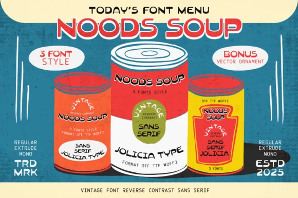
The F sets a narrow stem with short arms, the O squeezes into a tall ring, the L turns a sharp corner, the K splays two diagonals and the S holds a flat spine, all at a condensed weight with flat terminals; the script cut under it swells a fat connected line with a long tail on the final letter. The pairing is the character: a condensed upright line over a heavy script is the classic American sign structure, which is why the sample stacks one over the other with a small round badge alongside. The caps hold at 30 pt and the script at 28 pt, and both print in one flat colour. The cream ground, the round badge, the small trade marks and the credit line are presentation; the red caps and script are the family.
Vintage · Combination · Swash
Two-font hierarchy recipes
Tested contrast partners — pairing Folkies Vantage with grounded secondary typography.
Folkies Vantage + Marquis - Elegant Modern Serif
Pairs sculptural editorial warmth with Folkies Vantage's clean modern geometry.
Inspect Marquis - Elegant Modern Serif specimen
Folkies Vantage + Hello Honey
Introduces organic movement on pull-quotes, signatures and gift tags.
Inspect Hello Honey specimenPractical applications
Concrete hierarchy, scale and production guidance tailored to Folkies Vantage’s stroke geometry.
The stacked structure gives a shopfront the look of a painted sign, and the condensed caps fit a long name on one line at 70 mm.
Hierarchy & layout recipe
Paint a 900 by 300 mm fascia: set the caps at 70 mm, set the script word at 60 mm beneath so it overlaps the cap feet by 5 mm, and keep 35 mm of border all round.
Pre-production check
A script crossing a condensed cap line can crowd the tail; check the fascia and keep a clear tonal gap between the two cuts.
The combination reads as a mid-century fair poster, and the two cuts give a headline and a date line at 80 mm and 50 mm.
Hierarchy & layout recipe
Print an A2 poster: set the caps at 80 mm, set the script at 50 mm beneath, and set the smaller details in a 16 pt condensed caps in the bottom band with 25 mm of clearance.
Pre-production check
A heavy script under a condensed line can dominate it; check the poster at two metres and keep the caps at least a third larger.
The pair fits a soda bottle label in two cuts, and the condensed caps keep a long flavour name on one line at 16 pt flat.
Hierarchy & layout recipe
Print a 70 by 60 mm label: set the brand word at 32 mm in the script, set the flavour at 16 pt in the condensed caps above it, and keep 5 mm from the die so the tail stays whole.
Pre-production check
A script tail running into a die edge looks cut; check the label and move the block 2 mm inward.
Technical & licence verification
Confirm included OTF/TTF/WOFF formats, full glyph tables and licence coverage on the live store page before batch production.
Closest visual alternatives
Matched across letterform anatomy, stroke behaviour and craft applications.
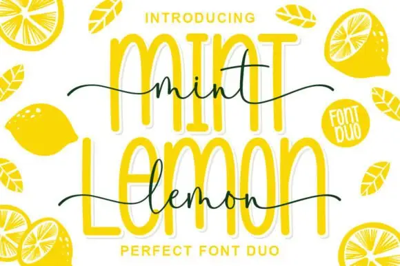
Outlined tall caps with a thin script crossing
Mint Lemon is a duo in bright yellow: tall outline capitals with a thick white cut-out, and a thin handwriting script that crosses them at the waist, with drawn lemon halves around the card.
Ideas for this font
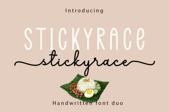
Tall monoline capitals with a thin script
Stickyrace is a duo on a warm sand ground: very tall thin monoline capitals with rounded ends, and a fine script of the same word beneath whose tails run in from the left margin and out to the right.
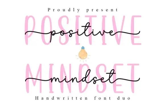
Tall narrow printed forms behind a fine lowercase script
Positive Mindset is a duo in which tall narrow separate capitals stand behind a fine lowercase script line, with the script carrying long side tails and small t and d loops while the print keeps tiny terminal projections.
Ideas for this font
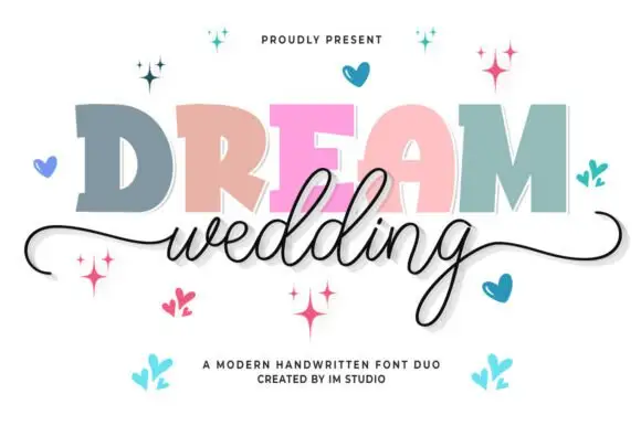
Chunky slab capitals paired with a fine flowing wedding script
Dream Wedding Duo pairs a heavy slab capital alphabet, drawn with flat tops and no contrast, against a fine flowing script whose entry and exit swashes stretch across a whole card.
Ideas for this font
Same independent foundry
Allow optional Google Analytics to measure visits and catalogue actions. Your search words and notes are not included. Privacy & storage