High-Contrast Display Serif

Dream Wedding Duo + Worldstar
Pairs sculptural editorial warmth with Dream Wedding Duo's clean modern geometry.
Inspect Worldstar specimenDisclosure: MakerFileHub may earn a commission from qualifying purchases via paid links on this page. How our links work.
Chunky slab capitals paired with a fine flowing wedding script
Dream Wedding Duo pairs a heavy slab capital alphabet, drawn with flat tops and no contrast, against a fine flowing script whose entry and exit swashes stretch across a whole card.
Paid link
Get this fontProject & layout blueprintsAt-a-glance maker compatibility
Weld or Unite overlapping script joins into one continuous vector path before sending to the blade.
Visual anatomy & craft review
The capitals are the loud half: each letter is a solid slab of even weight, the D and the R close into rectangular bowls, the E keeps three bars of identical thickness, and there is no serif or taper anywhere, so a word set in caps fills a strict block. The script is the opposite: a fine even line that enters from the far left, loops through the letters and exits at the far right, with wide open ascenders and a level baseline. The two halves have nothing in common except their width and the air around them, which is why they work as a pair: the slab carries the noun and the script carries the promise. The pastel fills, hearts and stars are presentation; the duo is the two words.
Chunky · Paired · Contrasting
Two-font hierarchy recipes
Tested contrast partners — pairing Dream Wedding Duo with grounded secondary typography.
Dream Wedding Duo + Worldstar
Pairs sculptural editorial warmth with Dream Wedding Duo's clean modern geometry.
Inspect Worldstar specimen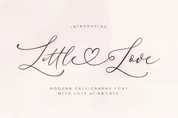
Dream Wedding Duo + Little Love
Introduces organic movement on pull-quotes, signatures and gift tags.
Inspect Little Love specimenPractical applications
Concrete hierarchy, scale and production guidance tailored to Dream Wedding Duo’s stroke geometry.
The slab capitals name the event and the fine script carries the sentiment, so a single invitation holds two voices without a third typeface or a rule system.
Hierarchy & layout recipe
Set the caps line at 60 pt on a 120 by 180 mm card, set the script line at 30 pt immediately beneath so it overlaps the caps' baseline by a third, and keep the details in a serif at 8 pt at the foot.
Pre-production check
Overlapping a fine script and a heavy slab needs a clean plate; check the proof at final size and keep the script's thin joins off the slab's slab terminal.
The chunky caps work as a graphic block at poster size while the script adds a personal line, which is the split a birthday poster needs when it carries a name and a number.
Hierarchy & layout recipe
Set the name in the caps at 120 pt on an A3 poster, set the date in the script at 40 pt, and hold 30 mm of margin so the script's exit swash stays on the sheet.
Pre-production check
A fine swash at 40 pt on a poster can look weak beside a 120 pt slab; check the proof at final size and thicken the script's weight by printing it in a second colour.
The pair lets a favour label carry a firm brand line and a soft product line, and both read at the small size a favour box allows.
Hierarchy & layout recipe
Set the brand in the caps at 15 pt on a 45 by 45 mm box, set the product in the script at 11 pt beneath, and leave 5 mm so the script's exit does not run to the box edge.
Pre-production check
Small favour boxes are assembled by hand and crease along the lid; check the artwork against the lid fold before production.
Technical & licence verification
Confirm included OTF/TTF/WOFF formats, full glyph tables and licence coverage on the live store page before batch production.
Closest visual alternatives
Matched across letterform anatomy, stroke behaviour and craft applications.

Casual script with a sans companion
Malley Jacklist is a duo: a heavy casual script in cream with wide loops and a light sans companion, presented as a hand-lettered pair on a deep green photograph of leaves.
Ideas for this font
Rough brush script with a fine companion
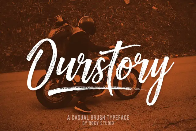
Ourstory is a duo on a warm-toned photograph: a rough brush script in white with dry, split strokes and a long underline swash, plus a fine companion hand for smaller lines.
Tall narrow print and fine script
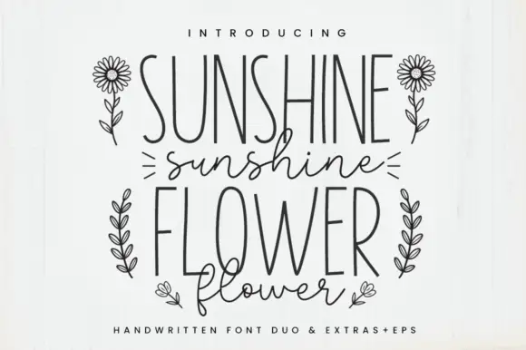
Sunshine Flower is a hand-drawn duo: a tall thin monoline capital face and a loose thin script, supplied with line-art flowers and shown in black on white.
Ideas for this font
Outlined tall caps with a thin script crossing
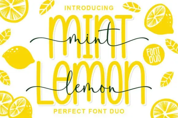
Mint Lemon is a duo in bright yellow: tall outline capitals with a thick white cut-out, and a thin handwriting script that crosses them at the waist, with drawn lemon halves around the card.
Ideas for this font
Same independent foundry
Allow optional Google Analytics to measure visits and catalogue actions. Your search words and notes are not included. Privacy & storage