Editorial Serif Anchor

Seawashed + Bulgary
Anchors Seawashed's fluid strokes with crisp Roman proportions on wedding suites, headers and packaging.
Inspect Bulgary specimenDisclosure: MakerFileHub may earn a commission from qualifying purchases via paid links on this page. How our links work.
Thin open handwritten capitals
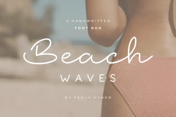
Seawashed is a thin handwritten capital face in white over a beach photographed from above: tall open letters with slightly irregular curves, generous tracking and a light even stroke, with a category line beneath and two tracked lines at the foot naming the weights and the designer.
Paid link
Get this fontProject & layout blueprintsAt-a-glance maker compatibility
Weld or Unite overlapping script joins into one continuous vector path before sending to the blade.
Visual anatomy & craft review
The word is set across the sand with wide tracking and the drawing is a thin handwritten capital: the strokes are light, the curves are slightly uneven, and the letters stand open, which is what makes a hand-drawn capital legible at a distance. That construction sets a size floor on a photograph, because a fine white stroke can drop out against a busy surface, and the plate is honest about the risk by setting the line over a smooth patch. The beach behind it is staging that names the register, and the line beneath lists the categories, which is where a buyer learns that the family includes a bold rather than a single weight. Because the strokes are fine, the face suits a cover, a label and a large heading rather than small print.
Handwritten, thin, open, organic
Two-font hierarchy recipes
Tested contrast partners — pairing Seawashed with grounded secondary typography.
Seawashed + Bulgary
Anchors Seawashed's fluid strokes with crisp Roman proportions on wedding suites, headers and packaging.
Inspect Bulgary specimen
Seawashed + Cultivo
Keeps small-scale dates, URLs, nutrition facts and care instructions crisp and legible below script titles.
Inspect Cultivo specimenPractical applications
Concrete hierarchy, scale and production guidance tailored to Seawashed’s stroke geometry.
A thin handwritten capital sets a coastal tone, and the open letters keep a long couple's name readable in one row. The tone stays light.
Hierarchy & layout recipe
A5 invitation: the names at 22 pt, the request in a 9.5 pt serif, and the date at 8.5 pt caps. Keep 24 mm margins and print one ink on a cream card. Proof it on the card stock first.
Pre-production check
Check the 22 pt names on cream card, where a thin stroke can fade; keep the ink dark enough for 4.5:1. Confirm the names read at arm's length and that the request stays legible.
A thin handmade capital gives a small label a crafted register, and the tracking keeps a long brand name calm on a narrow die.
Hierarchy & layout recipe
Print a 55 by 80 mm label: the brand at 13 pt, the scent at 8 pt, and the weight at 7 pt. Keep 5 mm inside the die and keep the stroke above 0.2 mm in print.
Pre-production check
Check the 13 pt brand on a small die, where a thin stroke can break up; keep it above 0.25 mm. Confirm the 7 pt weight reads at arm's length and that the label survives a damp shelf.
A thin handwritten capital gives a travel cover air, and the wide tracking lets a short title hold a wide measure without a heavier face.
Hierarchy & layout recipe
Set the title at 65 mm cap height across 190 mm, the author in a 10 pt serif, and the imprint at 8 pt. Print one ink on a matte stock and keep 25 mm margins.
Pre-production check
Check the title at 65 mm, where a thin stroke can fill on a matte sheet; keep it above 0.4 mm. Confirm the 8 pt imprint survives and that the tracking stays even across the line.
Technical & licence verification
Confirm included OTF/TTF/WOFF formats, full glyph tables and licence coverage on the live store page before batch production.
Closest visual alternatives
Matched across letterform anatomy, stroke behaviour and craft applications.
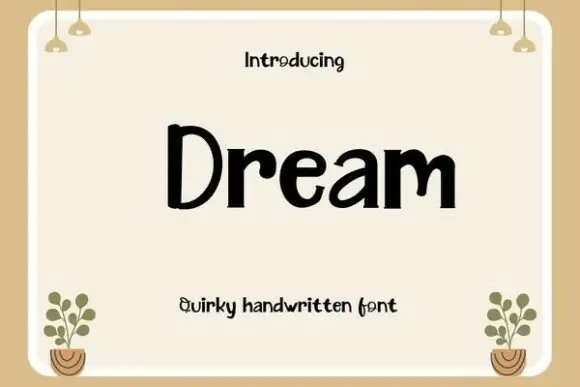
Broad upright lettering with separate rounded strokes
Dream is a broad upright handwriting with blunt strokes and a small bounce: the letters stand separately on the line and the lowercase keeps nearly the same height as the capital.
Ideas for this font
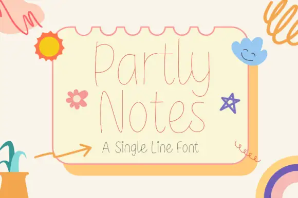
Very fine tall rounded single-line lettering
Partly Notes is a very fine tall rounded single-line lettering in coral on cream: hairline monoline strokes, very tall narrow letters with fully rounded ends, and a spacing so open that a two-word phrase fills a card.
Ideas for this font
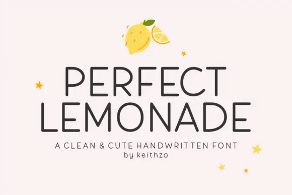
Clean cute handwritten caps
Perfect Lemonade is a clean handwritten display in charcoal on pink: light even strokes, tall open caps with rounded corners, a slightly irregular rhythm and a small star or lemon ornament, set in two lines with a tracked caption beneath, so the plate reads as a cheerful label rather than a script.
Ideas for this font
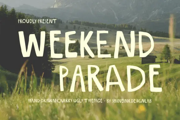
Narrow hand-drawn upright capitals
Weekend Parade is a set of tall narrow hand-drawn capitals with uneven stems, open counters and a baseline that drifts across the length of the line.
Ideas for this font
Same independent foundry
Allow optional Google Analytics to measure visits and catalogue actions. Your search words and notes are not included. Privacy & storage