Modern Grotesque Body

Beadcharm + Kohilo
Creates crisp high-hierarchy contrast beneath Beadcharm headlines across menus, websites and labels.
Inspect Kohilo specimenDisclosure: MakerFileHub may earn a commission from qualifying purchases via paid links on this page. How our links work.
Whimsical beaded ball-terminal cottagecore serif
Beadcharm is an endearing hand-drawn serif tipping slender stems and arches with round, bead-like ball terminals!
Paid link
Get this fontProject & layout blueprintsAt-a-glance maker compatibility
Sturdy stroke walls and open counters weed cleanly on adhesive vinyl, HTV apparel film, and cut cardstock.
Visual anatomy & craft review
Beadcharm is a hand-drawn serif in which slender stems and arches end in round bead-like ball terminals, so a word reads as strung rather than set. The arches are slightly uneven, the contrast is low, and the beads sit at the top of ascenders and at the ends of the crossbar, which gives the face a cottagecore delicacy without a script's connections. It needs roughly 14 mm for the beads to read as beads rather than as rounded stops, and it is best in a warm dark brown or ink on a deckle-edged stock. It is a card, label and heading face.
Bead-terminal · Cottagecore · Quirky-bookish
Two-font hierarchy recipes
Tested contrast partners — pairing Beadcharm with grounded secondary typography.
Beadcharm + Kohilo
Creates crisp high-hierarchy contrast beneath Beadcharm headlines across menus, websites and labels.
Inspect Kohilo specimen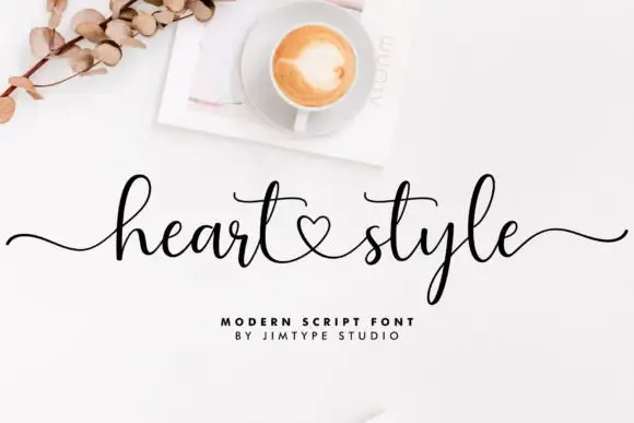
Beadcharm + Heart Style
Adds a warm human signature touch for 1-to-3-word callouts without competing against structured serif capitals.
Inspect Heart Style specimenPractical applications
Concrete hierarchy, scale and production guidance tailored to Beadcharm’s stroke geometry.
Beaded terminals echo wire and pearl work, which is what a jewellery maker is selling, and the low contrast prints cleanly on a small card where a Didone would sparkle. Uneven arches keep it looking hand-set.
Hierarchy & layout recipe
Card 50 x 90 mm with a 30 mm jewellery window, word 8 mm, 3 mm border, 4 mm clear of the window. Frame print 200 x 250 mm, word 34 mm, 25 mm margins. Pouch 80 x 120 mm, word 12 mm, 8 mm margins.
Pre-production check
A 30 mm window leaves little card around an 8 mm word, and the beads can be punched out with the window. Keep the word 6 mm from the window edge and check one assembled card with a piece in place.
Beaded serifs read as storybook ornament that sits inside the letterform, so a chapter opener gains character without a decorative border. The face holds a title at 24 pt on a small format.
Hierarchy & layout recipe
Chapter header 22 pt on a 10 mm baseline from the head, body 10/15 pt, 18 mm margins. Cover 130 x 198 mm, title 34 pt, author 13 pt, spine 8 pt. Bookplate 90 x 60 mm, owner line 8 pt, 1 pt rule beneath.
Pre-production check
Bookplate owners write their name immediately below the printed line, and a bead terminal hanging into that area collides with the handwriting. Keep 10 mm clear beneath the rule before approving the plate.
Bead terminals read as seed and blossom detail rather than as decoration applied over the design, which suits a garden theme. Low contrast survives a home printer better than a high-contrast serif.
Hierarchy & layout recipe
Card 105 x 148 mm, heading 16 mm, list 7/10 pt, 12 mm margins. Label 60 x 40 mm, word 8 mm, 4 mm die margin. Tag 45 x 80 mm, word 8 mm, 5 mm hole clearance.
Pre-production check
Home-printed cards on textured stock break a 0.2 mm terminal into dots. Print one sheet on the intended paper, and if the beads speckle, move the heading to a smoother card stock rather than thickening the face.
Technical & licence verification
Confirm included OTF/TTF/WOFF formats, full glyph tables and licence coverage on the live store page before batch production.
Closest visual alternatives
Matched across letterform anatomy, stroke behaviour and craft applications.
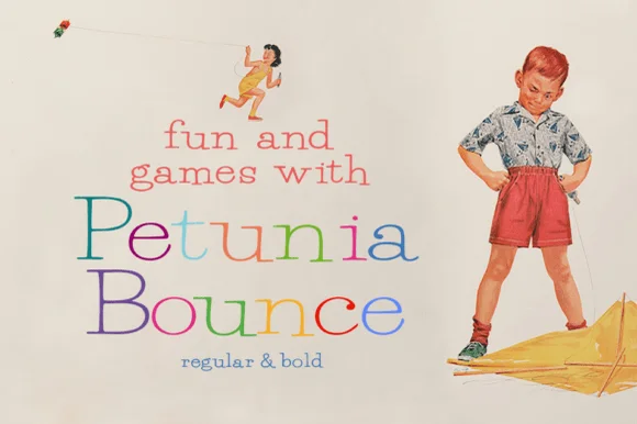
Quirky playful serif with a bounce and hand-drawn alternates
Petunia Bounce is a quirky serif in which the letters step up and down, the serifs stay soft and the alternates swap in rounder forms, so a two-word title reads as a children's book headline rather than as a text face.
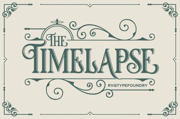
Swashed Victorian storybook & apothecary display serif
Timelapse is an ornate Victorian display serif crowned with spiraling vine swashes, teardrop terminals, and vintage apothecary charm.
Ideas for this font
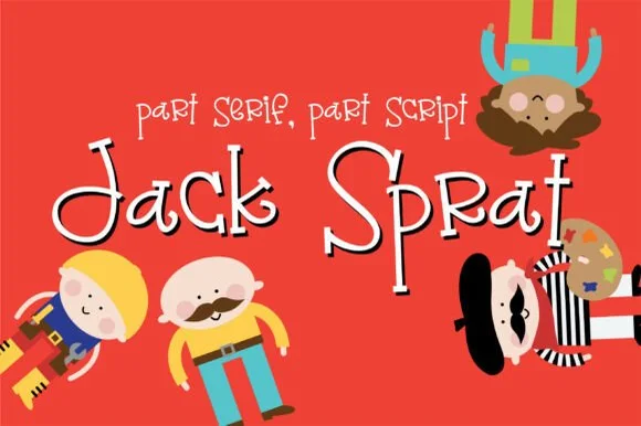
Quirky mixed-rule storybook font (part serif, part script)
Jack Sprat is a charmingly eccentric hand-drawn storybook font mixing slab-serif hooks, print bowls, and playful cursive links in one alphabet.
Ideas for this font
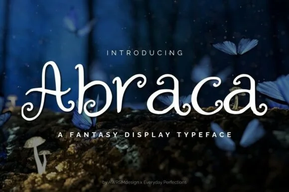
Whimsical spiral-curled enchanted fairytale display serif (OTF & TTF)
Abraca is an enchanted storybook display serif curling delicate fairytale spirals into the bowls and terminals of 'A', 'b', 'r', 'a', and 'c' (OTF & TTF)!
Ideas for this font
Same independent foundry
Allow optional Google Analytics to measure visits and catalogue actions. Your search words and notes are not included. Privacy & storage