Modern Grotesque Body

Vanilla Cream + Cultivo
Creates crisp high-hierarchy contrast beneath Vanilla Cream headlines across menus, websites and labels.
Inspect Cultivo specimenDisclosure: MakerFileHub may earn a commission from qualifying purchases via paid links on this page. How our links work.
Playful narrow slab display
Vanilla Cream is a narrow playful slab in caramel on pale pink: tall condensed caps with curved serif tops, pointed waist bars on the A and E, thick outlines and a white keyline, set in two lines with a rounded caption bar beneath and a small credit under that.
Paid link
Get this fontProject & layout blueprintsAt-a-glance maker compatibility
Cut solid base, outline, and shadow layers in separate vinyl colors and align on registration marks.
Visual anatomy & craft review
The two words are stacked and the drawing is a condensed slab with soft anatomy: the serifs curve at the top, the A and E carry pointed waist bars, and every letter has a heavy outline with a white keyline, so the block reads as a confectionery label. That construction sets a size floor, because the outlines and the keyline close when the letters shrink, and the plate sets the block large enough that both lines are visible. The pale pink ground and the rounded caption bar are staging and product furniture. Because the letters are narrow and decorative, the face suits a package, a menu header and a sign, and the outlined construction means it needs a print check at the intended size rather than a judgement from the plate.
Slab, playful, narrow, sweet
Two-font hierarchy recipes
Tested contrast partners — pairing Vanilla Cream with grounded secondary typography.
Vanilla Cream + Cultivo
Creates crisp high-hierarchy contrast beneath Vanilla Cream headlines across menus, websites and labels.
Inspect Cultivo specimen
Vanilla Cream + Rebel Marks
Adds a warm human signature touch for 1-to-3-word callouts without competing against structured serif capitals.
Inspect Rebel Marks specimenPractical applications
Concrete hierarchy, scale and production guidance tailored to Vanilla Cream’s stroke geometry.
A playful narrow slab reads as a flavour label, and the condensed width fits a long shop name on a small tub lid. The sweet register reads on a lid at a glance.
Hierarchy & layout recipe
Print a 70 mm round label: the shop at 14 pt, the flavour at 8 pt, and the price at 7 pt. Keep 6 mm inside the die and keep the keyline above 1 mm. Leave 8 mm under the price for the maker line.
Pre-production check
Check the 14 pt name on a lid, where a keyline can close; keep it above 1 mm. Confirm the 7 pt price reads at arm's length and that the label survives a freezer.
A caramel slab sets a sweet theme in the lettering, and the two inks print cleanly on a home card at 300 dpi. A party card can afford a decorative face.
Hierarchy & layout recipe
A6 card: the greeting at 26 pt, the details in a 9.5 pt sans, and the time at 8.5 pt. Keep 15 mm margins and print two colours on a cream card. Leave 12 mm at the foot for the address.
Pre-production check
Check the 26 pt greeting at home-print resolution, where a keyline can fill; keep it above 1 mm. Confirm the 9.5 pt details keep a 4.5:1 contrast and that the card folds flat.
A sweet display header frames a dessert menu, and the condensed letters hold a long item name across a narrow page. A header has to sell the item below it.
Hierarchy & layout recipe
A4 menu: the header at 45 mm cap height, the sections in a 10 pt sans, and the prices at 9 pt. Keep 18 mm margins and print two colours on a cream card.
Pre-production check
Check the 45 mm header, where the white keyline can disappear on cream; keep 1.5 mm at that size. Confirm the 9 pt prices keep a 4.5:1 contrast and that the menu lies flat.
Technical & licence verification
Confirm included OTF/TTF/WOFF formats, full glyph tables and licence coverage on the live store page before batch production.
Closest visual alternatives
Matched across letterform anatomy, stroke behaviour and craft applications.
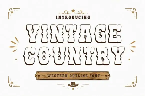
Hollow western outline slab
Vintage Country is a hollow western slab in sepia on cream: fat capitals drawn as outlines with deep inward waist cuts, a small white inline, pointed corner spurs and an even contour, set in two lines above a wooden plaque and beneath a small line with a star, with corner ornaments.
Rounded slab with curled terminals
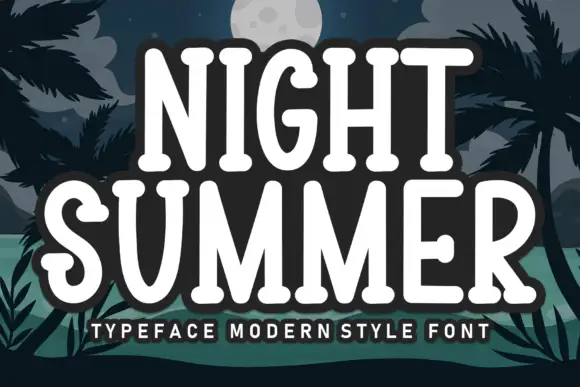
Night Summer is a tall rounded slab in white with a heavy dark outline on a night beach illustration: capitals with slab ends, curled S and G terminals and soft corners, set in two lines with a tracked line beneath and a thick outline that separates the words from the palms behind.
Soft narrow western slab
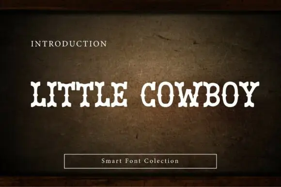
Little Cowboy is a soft narrow western slab in cream on a worn leather ground: capitals with bifurcated slab ends, waist spurs and slight swelling at the joins, set as one line with a small plain line above and a boxed label beneath.
Condensed athletic slab with edging
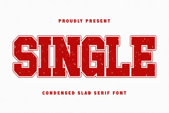
Single is a condensed athletic slab in red on an off-white sheet: broad heavy capitals with square serifs, a light inner outline that gives a double edge, chamfered corners and sparse white flecks, with a tracked line above and a plain caption beneath.
Ideas for this font
Same independent foundry
Allow optional Google Analytics to measure visits and catalogue actions. Your search words and notes are not included. Privacy & storage