High-Contrast Display Serif

Sunday Lunch + Kernova
Pairs sculptural editorial warmth with Sunday Lunch's clean modern geometry.
Inspect Kernova specimenDisclosure: MakerFileHub may earn a commission from qualifying purchases via paid links on this page. How our links work.
Retro condensed sans
Sunday Lunch is a retro condensed sans in dusty rose on cream: very tall narrow caps with flat terminals, a high waist and thin counters, set edge to edge on two lines with tracked lines above and below naming the category and the file formats.
Paid link
Get this fontProject & layout blueprintsAt-a-glance maker compatibility
Sturdy stroke walls and open counters weed cleanly on adhesive vinyl, HTV apparel film, and cut cardstock.
Visual anatomy & craft review
The two words are stacked and the drawing is a condensed grotesque: the stems are tall, the terminals are flat, and the counters are thin slivers, which lets two long words fill the plate without a third line. The setting is flush to both margins, so the spacing becomes part of the composition, and the small tracked lines above and below are set in a wide-spaced grotesque that contrasts with the block. Because the counters are narrow, the face needs a large size and a plain ground, and the plate keeps the cream empty so the rose reads as ink. The palette is two tones, and the tracking of the supporting lines is the only other decision on the sheet.
Retro, condensed, bold, warm
Two-font hierarchy recipes
Tested contrast partners — pairing Sunday Lunch with grounded secondary typography.
Sunday Lunch + Kernova
Pairs sculptural editorial warmth with Sunday Lunch's clean modern geometry.
Inspect Kernova specimen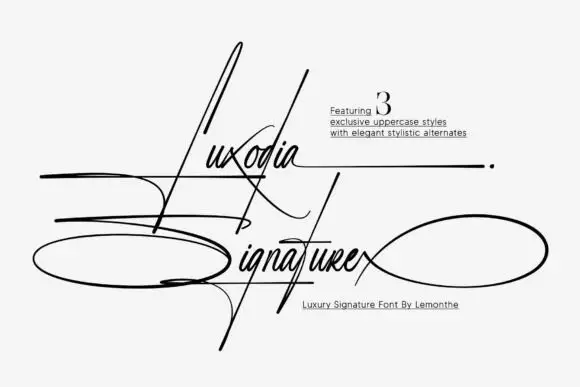
Sunday Lunch + Luxodia Signature
Introduces organic movement on pull-quotes, signatures and gift tags.
Inspect Luxodia Signature specimenPractical applications
Concrete hierarchy, scale and production guidance tailored to Sunday Lunch’s stroke geometry.
A retro condensed face fits a long cafe name on a narrow fascia, and the heavy block reads at pavement distance where a normal width would lose its height.
Hierarchy & layout recipe
Paint a 1,400 by 350 mm fascia: the name at 120 mm cap height, the menu line in a 26 mm condensed face, and a 5 mm rule. Keep 30 mm margins and paint two colours on a light board.
Pre-production check
Check the fascia at 120 mm, where the thin counters can fill with paint; keep them above 4 mm. Confirm the 26 mm menu line reads at four metres and that the rule clears the fixings.
A condensed retro face lets a two-word title fill a cover width at full height, which keeps a food annual looking like a period poster rather than a catalogue.
Hierarchy & layout recipe
Set the title at 110 mm cap height across 240 mm, flush to the margins, the subtitle in a 12 pt sans, and the year at 8 pt. Print two colours on a cream stock and keep the title in the upper half.
Pre-production check
Check the title at thumbnail size, where the slivers can clot; open the spacing slightly. Confirm the 8 pt year survives lamination and that the flush setting holds on both edges.
A condensed face fits a long stall name on a narrow banner, and the retro weight reads across a market where a light face would be lost among the produce.
Hierarchy & layout recipe
Print 900 by 400 mm: the stall at 130 mm cap height, the prices in a 22 mm sans, and a 6 mm rule. Keep 25 mm margins and print two colours on a light ground.
Pre-production check
Check the banner at four metres, where a thin counter can close; keep them above 3 mm. Confirm the 22 mm prices read at two metres and that the rule clears the eyelets.
Technical & licence verification
Confirm included OTF/TTF/WOFF formats, full glyph tables and licence coverage on the live store page before batch production.
Closest visual alternatives
Matched across letterform anatomy, stroke behaviour and craft applications.
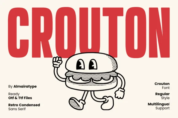
Friendly rounded 1970s burger-joint & mascot condensed sans (OTF/TTF)
Crouton is a cheerful, rounded-terminal condensed sans channeling vintage burger-shack menus and rubber-hose cartoon packaging (OTF, TTF & Multilingual)!
Ideas for this font
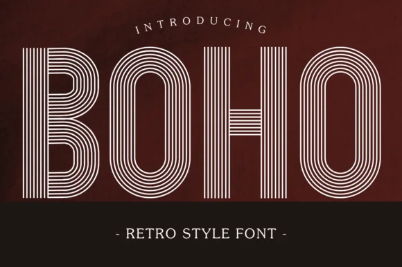
7-line concentric 1970s disco & roller-rink multiline sans
Boho (by Eystore) is a nostalgic 1970s multiline geometric display font built from seven crisp concentric parallel stripes.
Ideas for this font
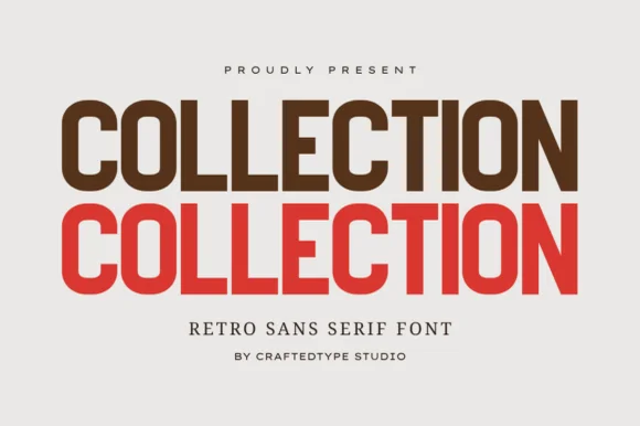
Clean 1970s athletic & editorial condensed grotesk (PUA, OTF & TTF)
Collection is a crisp, medium-condensed retro grotesk (PUA, OTF & TTF) with clean flat terminals and balanced open counters.
Ideas for this font
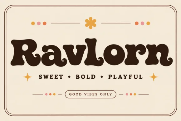
Fat retro serif with psychedelic curls
Ravlorn is a fat retro serif in brown on cream: heavy rounded strokes, ball terminals that curl into the counters, a swash tail on the final n, and an even weight that reads as a 1970s soft serif rather than a sharp display.
Ideas for this font
Same independent foundry
Allow optional Google Analytics to measure visits and catalogue actions. Your search words and notes are not included. Privacy & storage