High-Contrast Display Serif

Almost Forty + The Bilstein Editorial
Pairs sculptural editorial warmth with Almost Forty's clean modern geometry.
Inspect The Bilstein Editorial specimenDisclosure: MakerFileHub may earn a commission from qualifying purchases via paid links on this page. How our links work.
Light hand-drawn serif with curled crossbars paired with a plain companion cut
Almost Forty pairs a light hand-drawn serif whose crossbars curl at the ends with a plainer companion cut, so a title can be drawn and a supporting line can stay quiet in the same family.
Paid link
Get this fontProject & layout blueprintsAt-a-glance maker compatibility
Sturdy stroke walls and open counters weed cleanly on adhesive vinyl, HTV apparel film, and cut cardstock.
Visual anatomy & craft review
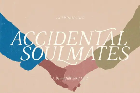
The display cut is drawn with a fine even stroke: the A carries a curled crossbar that overhangs both sides, the m keeps three plain arches, the t crosses with a curl and the y drops a fine tail, all at a light weight with slightly wavering paths. That waver is what makes the word look drawn rather than set, and the curled bars are what it is remembered for. The companion cut strips the curls back to plain terminals so a longer line, a date or a place name can sit beneath without competing. Together they read as one design decision rather than two fonts. The light weight needs a smooth stock and 18 pt minimum on print. The teal ground, the car photograph, the cream ink and the two caption lines are presentation; the duo is the two lines.
Drawn · Curled · Paired
Two-font hierarchy recipes
Tested contrast partners — pairing Almost Forty with grounded secondary typography.
Almost Forty + The Bilstein Editorial
Pairs sculptural editorial warmth with Almost Forty's clean modern geometry.
Inspect The Bilstein Editorial specimen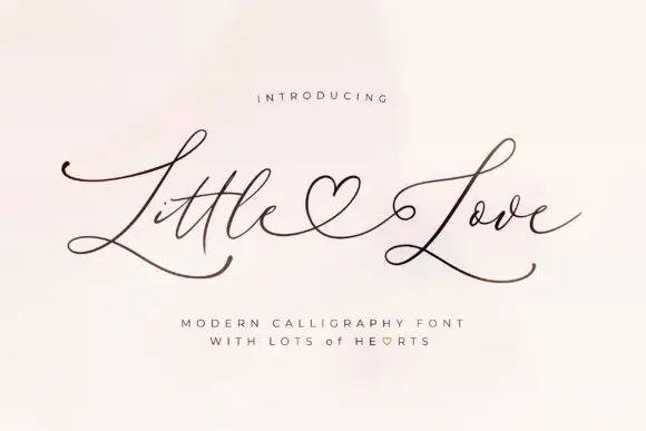
Almost Forty + Little Love
Introduces organic movement on pull-quotes, signatures and gift tags.
Inspect Little Love specimenPractical applications
Concrete hierarchy, scale and production guidance tailored to Almost Forty’s stroke geometry.
The drawn serif gives the sign its character while the plain cut carries the details, and the light weight keeps a kraft board from looking heavy.
Hierarchy & layout recipe
Print a 600 by 400 mm board: set the greeting in the display cut at 9 cm, set the names and date in the companion cut at 3 cm beneath, and leave 8 cm of border so the curled bars stay clear of the frame.
Pre-production check
A fine drawn stroke on kraft can look like a pencil sketch; check the board in daylight and choose a lighter panel if the line disappears.
The curled bars give a quiet cover its one gesture, and the companion cut lets the subtitle sit beneath without a second typeface decision.
Hierarchy & layout recipe
Print an A5 cover: set the title in the display cut at 54 pt, set the subtitle in the companion cut at 14 pt, and hold 14 mm between the two so the curled crossbar does not touch the subtitle line.
Pre-production check
A curling bar over a printed rule reads as damage; check the cover with the rules in place and move the title rather than shortening the curl.
The drawn serif gives a bag label a hand-finished voice, and the companion cut keeps the roast and weight lines legible at 8 pt.
Hierarchy & layout recipe
Print a 70 by 90 mm bag label: set the roastery in the display cut at 16 pt, set the roast in the companion cut at 8 pt beneath, and keep 6 mm of margin so the fine strokes are not cut by the label edge.
Pre-production check
Fine strokes on a kraft bag fill in quickly; check a printed label on the actual stock and keep the display cut above 14 pt.
Technical & licence verification
Confirm included OTF/TTF/WOFF formats, full glyph tables and licence coverage on the live store page before batch production.
Closest visual alternatives
Matched across letterform anatomy, stroke behaviour and craft applications.
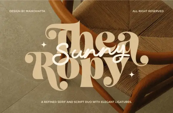
Refined serif paired with an elegant script
Thea Ropy is a duo in cream and white over a warm photograph: a refined high-contrast serif with long ligatures for the two large words, and an elegant script set across them, sold as a serif and script pair.
Ideas for this font
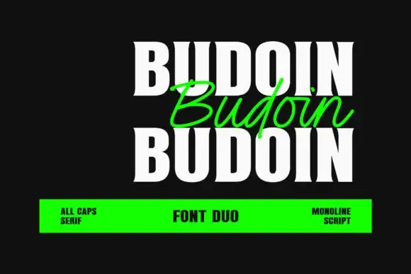
Heavy condensed serif capitals paired with a light slanted monoline script
Budoin repeats a white uppercase word above and below a green connected script version on black, where the capitals carry thick vertical stems, narrow bowls and short flared serif ends, and the script crosses between the two cap rows with a single even stroke.
Ideas for this font
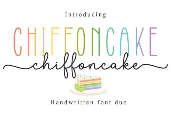
Tall narrow sans and fine looping script duo
Chiffoncake Duo pairs very tall narrow capitals, each in a different pastel tone, with a low connected script whose deep f loops drop below the baseline, and long tails extend from both sides of the lower word above a small cake illustration.
Ideas for this font
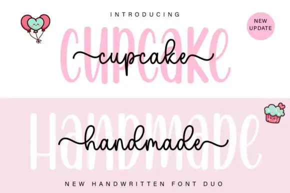
Tall rounded sans with fine extended script
Cupcake Handmade Duo places tall narrow rounded letters in pale pink behind a smaller connected script line in black, twice on one cover, where the script carries long outer tails and looped k and h forms while a balloon pair, a cupcake drawing and an update badge sit in the corners.
Ideas for this font
Same independent foundry
Allow optional Google Analytics to measure visits and catalogue actions. Your search words and notes are not included. Privacy & storage