High-Contrast Display Serif

Indigo Font Duo + Stanza
Pairs sculptural editorial warmth with Indigo Font Duo's clean modern geometry.
Inspect Stanza specimenDisclosure: MakerFileHub may earn a commission from qualifying purchases via paid links on this page. How our links work.
Very heavy geometric lowercase sans paired with a matching outline cut
Indigo is a two-cut duo in which a very heavy lowercase sans leaves small round counters and its outline twin keeps the same skeleton, so a header can be set solid, hollow, or stacked as a two-layer block.
Paid link
Get this fontProject & layout blueprintsAt-a-glance maker compatibility
Cut solid base, outline, and shadow layers in separate vinyl colors and align on registration marks.
Visual anatomy & craft review
The a closes a small circular counter, the i dots a large round disc, the g descends into a broad curved bowl and the o holds a near-perfect ring, all at a maximal lowercase weight with tight spacing. The outline twin is the character: it is drawn from the same skeleton, so layering the two gives a solid letter inside a hollow case without redrawing anything. Because the counters are small, the face wants 30 pt before they stay open, and stacking needs 1.25 inches of height in vinyl with the two cuts welded separately. The white ground, the pink field and the small spaced subtitle are presentation; the heavy name is the regular cut.
Heavy · Geometric · Layered
Two-font hierarchy recipes
Tested contrast partners — pairing Indigo Font Duo with grounded secondary typography.
Indigo Font Duo + Stanza
Pairs sculptural editorial warmth with Indigo Font Duo's clean modern geometry.
Inspect Stanza specimen
Indigo Font Duo + Honey
Introduces organic movement on pull-quotes, signatures and gift tags.
Inspect Honey specimenPractical applications
Concrete hierarchy, scale and production guidance tailored to Indigo Font Duo’s stroke geometry.
The heavy lowercase reads as a wordmark rather than a title, and the solid cut keeps a short name crisp at 44 pt on a screen or a printed cover.
Hierarchy & layout recipe
Set a 1440 px header: place the name at 44 pt in the solid cut, keep 24 px of clear space around it, and set the navigation in a 13 pt neutral sans at the right.
Pre-production check
A near-geometric weight set at 18 pt closes its round counters; check the layout and keep the name at 30 pt or above in any size.
The heavy rounded lowercase suits a bright banner, and the outline cut gives a second colour without a second motif at 70 mm on printed vinyl.
Hierarchy & layout recipe
Print an A3 banner: set the name at 70 mm in the solid cut, place the outline cut 4 mm behind it as a shadow layer, and keep 25 mm of border so the outline stays inside the sheet.
Pre-production check
An outline layer offset by more than 5 mm reads as a printing misregistration; check the proof and hold the offset to 4 mm.
The heavy lowercase makes a short thank-you feel warm, and the solid cut stays readable at 28 mm on a round die-cut sticker.
Hierarchy & layout recipe
Print a 50 mm round sticker: set the word at 28 mm, keep 6 mm inside the die so the round counters stay whole, and print in one flat colour on white stock.
Pre-production check
Small round counters fill in on a laminated sticker; check the finished sheet and keep the counter at 2 mm or wider.
Technical & licence verification
Confirm included OTF/TTF/WOFF formats, full glyph tables and licence coverage on the live store page before batch production.
Closest visual alternatives
Matched across letterform anatomy, stroke behaviour and craft applications.
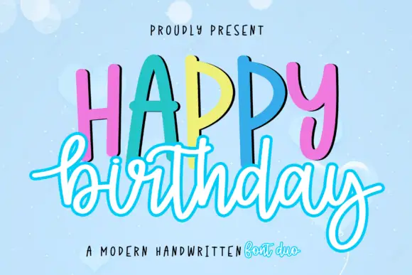
Duo pairing tall hand-lettered caps with an outlined script
Happy Birthday is a two-cut family in which tall hand-lettered capitals stand in a bouncing row and an outlined script writes the second word beneath, so a greeting reads as a decorated card from a stationery shop.
Ideas for this font
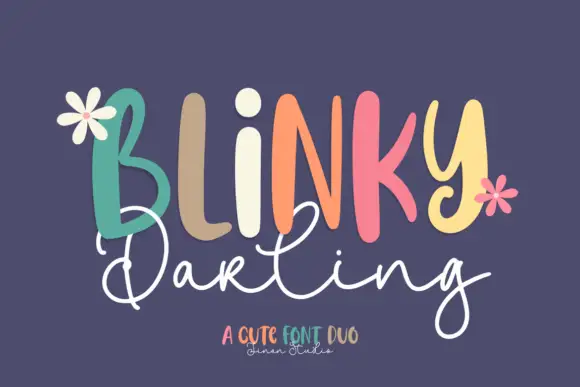
Duo
Blinky Darling Duo shows tall uneven printed forms with rounded ends, each capital in a different pastel tone across a plum ground, above a fine white script line whose D and g carry large open loops and whose tails extend well past the caps.
Ideas for this font
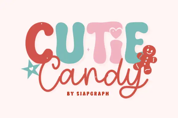
Playful duo pairing puffy candy capitals with a loose monoline script
Cutie Candy is a two-cut family in which puffy pastel capitals bounce along a wavy baseline and a loose monoline script writes the second word, so a short greeting reads as something decorated on a gingerbread tile.
Ideas for this font
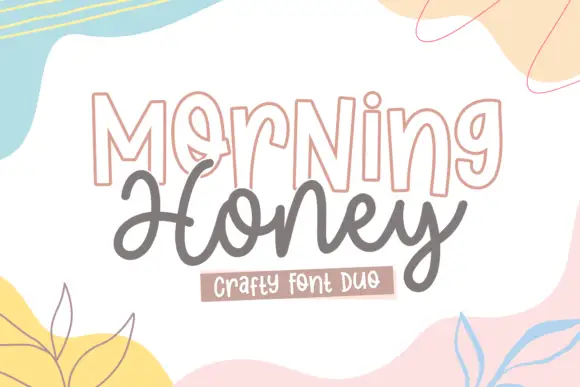
Outlined display and rounded script
Morning Honey Duo is a craft pair on white: outlined tall capitals with a thin double contour, and a rounded joined script beneath, framed by soft painted shapes in pastel yellow, pink and blue.
Ideas for this font
Same independent foundry
Allow optional Google Analytics to measure visits and catalogue actions. Your search words and notes are not included. Privacy & storage