High-Contrast Display Serif

Pretty Cupcake + Orvelia
Pairs sculptural editorial warmth with Pretty Cupcake's clean modern geometry.
Inspect Orvelia specimenDisclosure: MakerFileHub may earn a commission from qualifying purchases via paid links on this page. How our links work.
Tall monoline capitals with a flowing script
Pretty Cupcake is a monoline duo in pink and black: very tall condensed capitals with rounded stems, and a thin flowing script that runs across them at the waist, crossing the cap line on purpose.
Paid link
Get this fontProject & layout blueprintsAt-a-glance maker compatibility
Cut solid base, outline, and shadow layers in separate vinyl colors and align on registration marks.
Visual anatomy & craft review
The word CUPCAKE fills the sheet in tall pink capitals, and each letter is a narrow monoline form with rounded ends, a large height and a small width, so eight letters travel the whole width without any weight. The second face is a thin black script set at the waist and allowed to overlap, its letters running straight across the capitals and crossing their stems, which is what turns two plain faces into one design. The contrast between a geometric cap line and a relaxed script is the whole point of the duo, and both faces are monoline, which keeps the pairing coherent rather than busy. The ground is a soft pink sheet with drawn cupcakes, rainbows and sparkles at low contrast, and a tracked caption at the foot names the pair. The duo is built for packaging and party goods: the caps carry a product name and the script carries a flavour or a line.
A tall cap line crossed by a thin script
Two-font hierarchy recipes
Tested contrast partners — pairing Pretty Cupcake with grounded secondary typography.
Pretty Cupcake + Orvelia
Pairs sculptural editorial warmth with Pretty Cupcake's clean modern geometry.
Inspect Orvelia specimen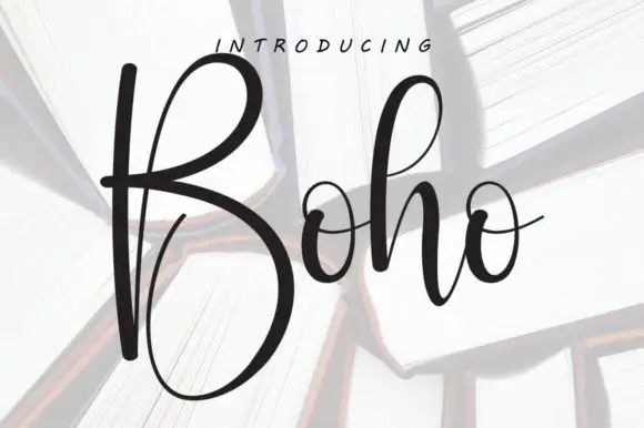
Pretty Cupcake + Boho
Introduces organic movement on pull-quotes, signatures and gift tags.
Inspect Boho specimenPractical applications
Concrete hierarchy, scale and production guidance tailored to Pretty Cupcake’s stroke geometry.
The overlap of a tall cap line and a thin script is a design in itself, so a box needs no second graphic, and both faces hold at label size.
Hierarchy & layout recipe
Print a 90 by 60 mm label: set the cap line at 22 pt and the script at 16 pt across it, keep 6 mm of clear ground beneath before the weight at 5.5 pt, and hold 5 mm of margin on all sides.
Pre-production check
The script crossing the caps can look like an error if it lands on a stem; print one label at the real size and check the crossing point before the order.
Two monoline faces in different colours give a party card its whole look, and the crossing script keeps a simple design from feeling like a template.
Hierarchy & layout recipe
Print a 120 by 120 mm square card: set the cap line at 30 pt across the width and the script at 24 pt across the middle, keep 14 mm of clear ground beneath before the details at 9 pt, and hold 13 mm of margin.
Pre-production check
On a square card the crossed line can run into the trim; print one at the finished size and check both ends before the batch.
A pink cap line with a black script across it is a label a customer will notice on a display case, and the monoline forms cut cleanly.
Hierarchy & layout recipe
Print a 50 mm round sticker: set the cap word at 15 pt and the script at 11 pt across it, keep 6 mm of clear ground to the die line, and keep the thinnest script stroke inside the circle.
Pre-production check
A thin script tail can run past the die; print one sticker sheet and cut it before running the rest.
Technical & licence verification
Confirm included OTF/TTF/WOFF formats, full glyph tables and licence coverage on the live store page before batch production.
Closest visual alternatives
Matched across letterform anatomy, stroke behaviour and craft applications.
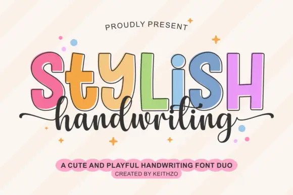
Colourful outlined capitals above a thin script
Stylish Handwriting is a duo on cream: fat outlined capitals with a black contour, each in a different pastel, and a thin joined script that runs beneath them with long tails.
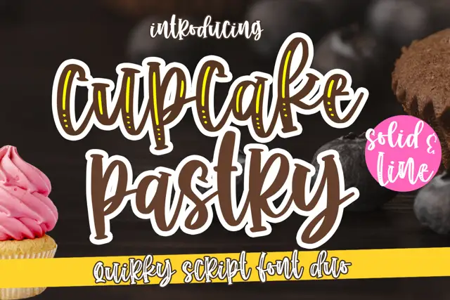
Chunky outlined script paired with a slim line script
Cupcake Pastry is a duo: a heavy rounded script with an outlined variant that stacks a light inline inside each stroke, paired with a thin monoline script that carries the second line of a title without competing with the first.
Ideas for this font
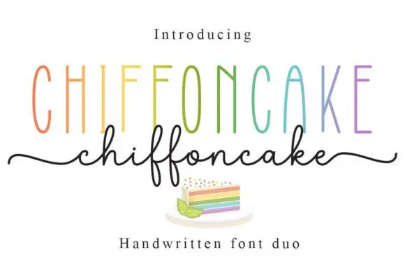
Tall narrow sans and fine looping script duo
Chiffoncake Duo pairs very tall narrow capitals, each in a different pastel tone, with a low connected script whose deep f loops drop below the baseline, and long tails extend from both sides of the lower word above a small cake illustration.
Ideas for this font
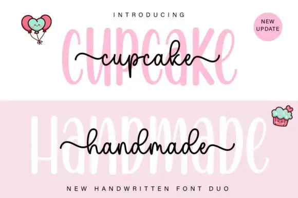
Tall rounded sans with fine extended script
Cupcake Handmade Duo places tall narrow rounded letters in pale pink behind a smaller connected script line in black, twice on one cover, where the script carries long outer tails and looped k and h forms while a balloon pair, a cupcake drawing and an update badge sit in the corners.
Ideas for this font
Same independent foundry
Allow optional Google Analytics to measure visits and catalogue actions. Your search words and notes are not included. Privacy & storage