Modern Grotesque Body

Love Jokes + Base Edge
Creates crisp high-hierarchy contrast beneath Love Jokes headlines across menus, websites and labels.
Inspect Base Edge specimenDisclosure: MakerFileHub may earn a commission from qualifying purchases via paid links on this page. How our links work.
College slab display
Love Jokes is a college slab in cream on a rust-red ground: heavy caps with wide block serifs, a low waist and closed counters, set on two lines between two oval badges that read ESTD and 2026, with a tracked line beneath.
Paid link
Get this fontProject & layout blueprintsAt-a-glance maker compatibility
Sturdy stroke walls and open counters weed cleanly on adhesive vinyl, HTV apparel film, and cut cardstock.
Visual anatomy & craft review
The two words are stacked and the drawing is a college slab at a heavy weight: the serifs are wide blocks, the waist is low, and the counters are generous, which keeps the face legible at a distance and on fabric. The plate is styled as a period athletic badge — two oval stamps flank the block and a tracked line sits beneath — which is how a college design is usually sold, and the rust ground gives the cream something to fight. Because the letters are wide, a long word needs a large size and short lines, and the specimen sets two short words that fill the width. The tracked line beneath is set in the same family at a fraction of the size, which shows the range within one style.
Slab, athletic, bold, retro
Two-font hierarchy recipes
Tested contrast partners — pairing Love Jokes with grounded secondary typography.
Love Jokes + Base Edge
Creates crisp high-hierarchy contrast beneath Love Jokes headlines across menus, websites and labels.
Inspect Base Edge specimen
Love Jokes + Hello Honey
Adds a warm human signature touch for 1-to-3-word callouts without competing against structured serif capitals.
Inspect Hello Honey specimenPractical applications
Concrete hierarchy, scale and production guidance tailored to Love Jokes’s stroke geometry.
A college slab reads at distance on a jersey, and the wide serifs hold in embroidery where a bracketed serif loses shape at small size.
Hierarchy & layout recipe
Set the team name at 90 mm on a banner, 55 mm on a jersey back and 20 mm on a pocket, keeping the serifs uncut. Place the jersey number at 130 mm and allow 12 mm between letters.
Pre-production check
Check the 20 mm pocket mark in stitch, where a wide serif can close the counter; simplify the initials. Confirm the jersey back reads at eight metres and that the number stays centred.
A college slab gives a small shop an instant badge, and the closed counters read at speed from a passing car, which matters for a business on a busy road.
Hierarchy & layout recipe
Print a 90 mm round badge: the name at 22 mm cap height, the year in a 6 mm oval, and a 2 mm ring. Keep 6 mm inside the die and print two colours on a matte stock.
Pre-production check
Check the 22 mm name inside the ring, where the outer letters can crowd the edge; reduce the width. Confirm the badge reads at three metres and that the ring stays registered.
A college slab marks a class year as official, and the heavy strokes print as one screen with no fine detail to clog the mesh.
Hierarchy & layout recipe
Print a 240 mm chest graphic: the class year at 70 mm, the name at 34 mm, and two inks on a light shirt. Keep the thinnest serif at 4 mm and place the graphic 80 mm below the collar.
Pre-production check
Check the screen at actual mesh, where a 4 mm serif can fill; thicken it. Wash-test one shirt and confirm the year stays legible after five cycles.
Technical & licence verification
Confirm included OTF/TTF/WOFF formats, full glyph tables and licence coverage on the live store page before batch production.
Closest visual alternatives
Matched across letterform anatomy, stroke behaviour and craft applications.
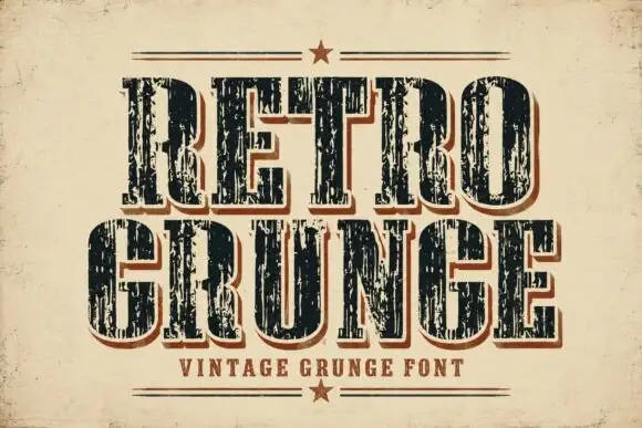
Tall worn slabs with vertical scrape texture
Retro Grunge shows tall closely spaced slab capitals with rounded bowls and deep vertical scratches, where the E and R keep heavy stems even as the surface breaks and a red-brown offset edge sits behind the black letters on aged paper.
Ideas for this font
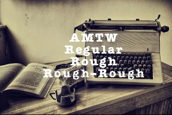
Heavy typed-looking forms shown in clean and increasingly broken treatments
AMTW is a heavy typewriter-style slab in which rounded feet and broad bowls appear in three treatments: a fairly clean regular row, a broken rough row and a much more eroded third row beneath the main initials.
Ideas for this font
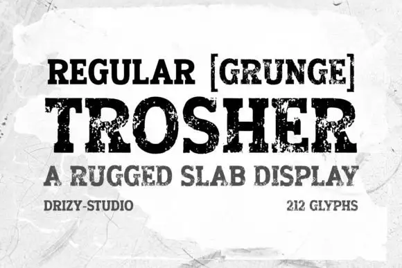
Rugged eroded slab display
Trosher is a rugged slab display in black on a mottled white ground: broad bracketed slabs with clean and heavily eroded fills, mixed case with tall ascenders and a full-width setting, with a bracketed note above, a plain line beneath and two small notes at the foot.
Ideas for this font
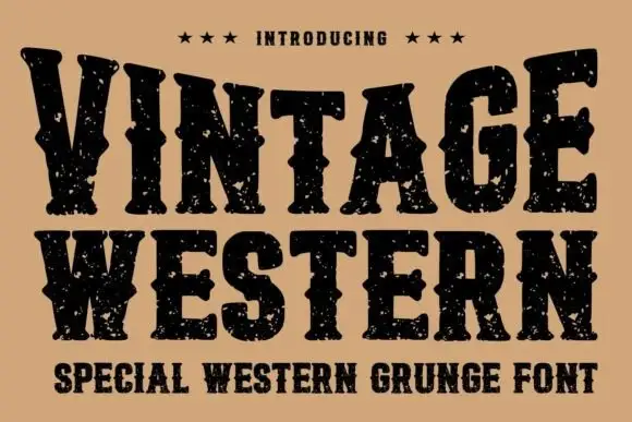
Grunge western slab
Vintage Western is a grunge western slab in black on tan: heavy bracketed serifs with deep notches, a swollen waist and thick stems, the whole surface eaten by a speckled wear, with three stars above and a tracked subtitle beneath in the same face.
Same independent foundry
Allow optional Google Analytics to measure visits and catalogue actions. Your search words and notes are not included. Privacy & storage