Neutral Sans Workhorse

Spooky Raven + Prime Nordic
Lets Spooky Raven own the focal silhouette while handling secondary copy, sizing and subheads cleanly.
Inspect Prime Nordic specimenDisclosure: MakerFileHub may earn a commission from qualifying purchases via paid links on this page. How our links work.
Whimsical wonky seasonal display
Spooky Raven is a whimsical seasonal display in purple with a pink offset shadow on a pale ground: broad letters with uneven edges, a leaning S and a hooked R, soft corners, and a tracked subtitle beneath in the same voice, with bare branches and ravens in the corners.
Paid link
Get this fontProject & layout blueprintsAt-a-glance maker compatibility
Sturdy stroke walls and open counters weed cleanly on adhesive vinyl, HTV apparel film, and cut cardstock.
Visual anatomy & craft review
The two words are stacked and the drawing is a display face with an intentionally uneven hand: the strokes are broad, the outlines wobble, and the letters lean at slightly different angles, which keeps the plate playful rather than frightening. The pink offset sits behind the purple at a fixed distance, which gives the block its cut-paper depth, and the tight spacing keeps the pair as one shape. Because the forms are broad and the counters open, the face reads at poster size and on fabric, and the specimen sets it large on a pale ground. The branches and ravens at the corners belong to the seasonal setting, and the caption beneath is tracked caps in a lighter weight of the same construction.
Whimsical, wonky, seasonal, playful
Two-font hierarchy recipes
Tested contrast partners — pairing Spooky Raven with grounded secondary typography.
Spooky Raven + Prime Nordic
Lets Spooky Raven own the focal silhouette while handling secondary copy, sizing and subheads cleanly.
Inspect Prime Nordic specimen
Spooky Raven + The Simple Editorial
Grounds bold display lettering with classic typographic authority on posters, badges and apparel.
Inspect The Simple Editorial specimenPractical applications
Concrete hierarchy, scale and production guidance tailored to Spooky Raven’s stroke geometry.
A whimsical display suits a family-friendly Halloween event where a horror face would be too much, and the broad letters screen cleanly.
Hierarchy & layout recipe
Print a 250 mm chest graphic: the event at 55 mm cap height, a 3 mm offset, and two inks on a light shirt. Keep the smallest counter at 4 mm and place the graphic 80 mm below the collar.
Pre-production check
Check the screen at actual mesh, where the 3 mm offset can merge with the fill; widen it. Wash-test one shirt and confirm the offset stays aligned after five cycles.
A playful seasonal face reads as fun rather than scary, and the offset shadow gives a home-printed card a decorated look without an illustration.
Hierarchy & layout recipe
A6 card: the name at 30 pt, the details in a 9 pt sans, and one raven. Keep 12 mm margins and print two colours on a pale card so the offset stays visible at home-print size.
Pre-production check
Check the 30 pt name, where a hooked letter can collide with its shadow; increase the gap. Confirm the 9 pt details keep a 4.5:1 contrast and that the raven clears the trim.
A whimsical display suits a school fair where the tone has to be friendly, and the broad strokes photocopy well in one colour.
Hierarchy & layout recipe
A4 print: the headline at 44 mm cap height, the times in a 10 mm sans, and the stalls in 9 mm. Keep 20 mm margins and print one colour on a light stock so the notice reads from a corridor.
Pre-production check
Check the A4 after a copier pass, where the offset shadow can fill in; use the solid cut. Confirm the 9 mm stalls read at arm's length and that the headline fits the sheet.
Technical & licence verification
Confirm included OTF/TTF/WOFF formats, full glyph tables and licence coverage on the live store page before batch production.
Closest visual alternatives
Matched across letterform anatomy, stroke behaviour and craft applications.
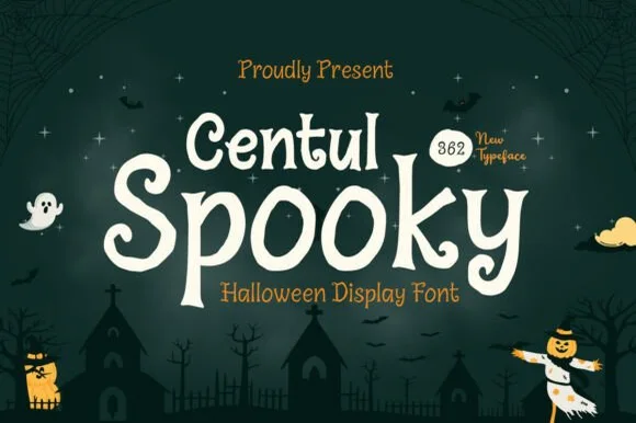
Curly Tim-Burton-style whimsical gothic serif display
Centul Spooky is a whimsical, spiral-curled storybook gothic display font channeling cozy Nightmare-Before-Christmas / Hocus-Pocus charm!
Ideas for this font
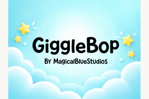
Clean rounded storybook & toddler toy-box sans
Giggle Bop is a clean, plump rounded display sans with bouncy textbook-clear lowercase and sunny children's-book readability.
Ideas for this font
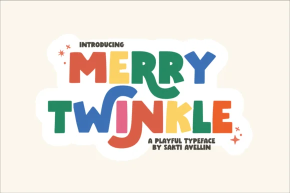
Playful cutout-star storybook block
Merry Twinkle bounces cheerful uneven paper-cut block capitals: the forms stay solid and chunky with no fragile hairlines, and the baseline shifts so a short title reads as if cut from coloured paper.
Ideas for this font
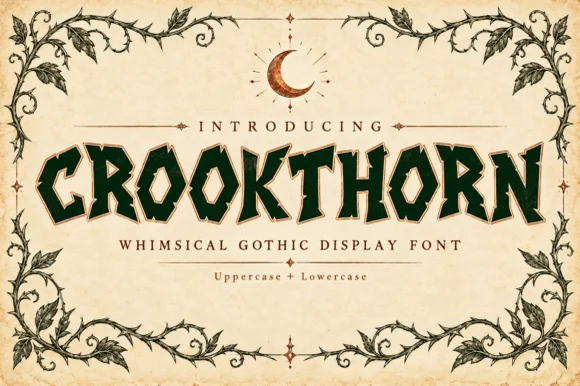
Jagged thorn-carved whimsical gothic woodcut serif (Upper + Lower)
Crookthorn is a hand-carved whimsical gothic display serif bristling with jagged briar-thorn notches across bold uppercase & lowercase letters!
Ideas for this font
Same independent foundry
Allow optional Google Analytics to measure visits and catalogue actions. Your search words and notes are not included. Privacy & storage