Neutral Sans Workhorse

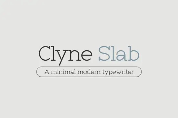
Autumn Parade + Clyne Sans
Lets Autumn Parade own the focal silhouette while handling secondary copy, sizing and subheads cleanly.
Inspect Clyne Sans specimenDisclosure: MakerFileHub may earn a commission from qualifying purchases via paid links on this page. How our links work.
Thin autumn dingbat drawings of seasonal objects and short decorative phrases
Autumn Parade is a dingbat set of autumn objects — a campfire, a pumpkin, an acorn, a knitted scarf, a coffee cup, a jam jar, a scarecrow, a fox, a mushroom — drawn in a single rust-brown line.
Paid link
Get this fontProject & layout blueprintsAt-a-glance maker compatibility
Sturdy stroke walls and open counters weed cleanly on adhesive vinyl, HTV apparel film, and cut cardstock.
Visual anatomy & craft review
The card scatters about forty drawings around a rust-coloured blob that carries the set name, and every drawing is a simple line study: a hearth with a fire, a slice of pie, a coat on a hanger, a sleeve of grapes, a log, a lantern, a bird, a wheelbarrow, a basket of apples, a bunch of wheat. The line weight is even throughout and nothing is filled, so the drawings sit beside a script or a serif without competing, and the set includes short word pieces such as Welcome Autumn and Give Thanks. Because the glyphs are typed, a border or a repeated pattern can be built in one line of keystrokes, and the whole set prints in one ink on cards, tags and market signage.
Thin autumn dingbat drawings of seasonal objects and short decorative phrases
Two-font hierarchy recipes
Tested contrast partners — pairing Autumn Parade with grounded secondary typography.
Autumn Parade + Clyne Sans
Lets Autumn Parade own the focal silhouette while handling secondary copy, sizing and subheads cleanly.
Inspect Clyne Sans specimen
Autumn Parade + Vanielst Elegant Serif Display Stylistic
Grounds bold display lettering with classic typographic authority on posters, badges and apparel.
Inspect Vanielst Elegant Serif Display Stylistic specimenPractical applications
Concrete hierarchy, scale and production guidance tailored to Autumn Parade’s stroke geometry.
The drawings label produce without photographs, and one rust ink on a kraft tag is exactly the look a small stall can afford to print.
Hierarchy & layout recipe
Print a 60 by 90 mm kraft tag: set the produce name at 14 pt with one glyph at 18 mm wide above it, keep 6 mm of clear ground between the drawing and the word, and hold 5 mm from the punch hole.
Pre-production check
Kraft board eats thin lines; print one tag on the real stock and check the pumpkin before the batch.
The set supplies the whole vocabulary of the season, so a card can be assembled from two glyphs and a handwritten line and still look finished.
Hierarchy & layout recipe
Print a 120 by 170 mm card: place three glyphs at 24 mm wide across the top, keep 12 mm of clear ground beneath before the message at 11 pt, and hold 14 mm of margin at both sides.
Pre-production check
Too many drawings turn a card into a pattern; print one card with three and check the balance before the family set.
A few line drawings give a printed menu the season without food photography, which keeps the cost of a weekly change low.
Hierarchy & layout recipe
Print an A4 insert: set the courses at 10.5 pt with a glyph at 14 mm beside each section head, keep 7 mm of clear ground between the drawing and the price column, and hold 16 mm of margin at both sides.
Pre-production check
Small drawings read as smudges in a cheap print; print one insert on the intended stock and check a leaf before the run.
Technical & licence verification
Confirm included OTF/TTF/WOFF formats, full glyph tables and licence coverage on the live store page before batch production.
Closest visual alternatives
Matched across letterform anatomy, stroke behaviour and craft applications.
Autumn outline doodles
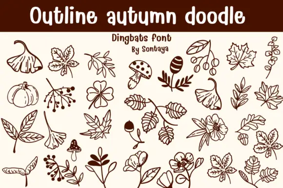
Outline Autumn Doodle is a dingbat sheet on a cream ground: brown outlines of fan leaves, ivy, small mushrooms, acorns, berry branches, pumpkins and open blossoms, arranged in rows beneath a solid title band with a lined note and a credit.
Ideas for this font
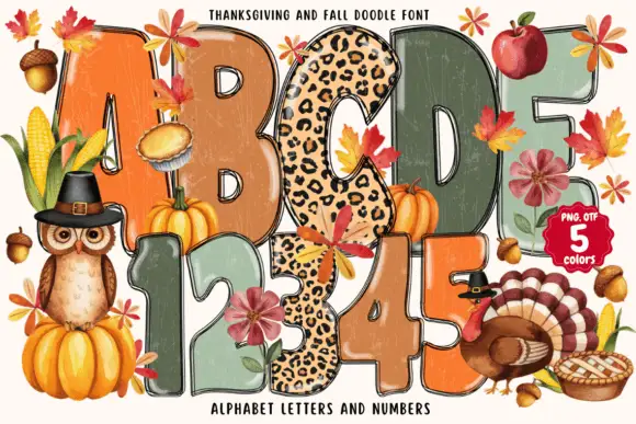
Tall rounded autumn blocks mixing weathered warm fills and spotted patterns
Thanksgiving and Fall Doodle draws fat autumn letters in five colours, fills them with knitted, plaid and leopard textures, and hangs leaves, pumpkins and a turkey around the shapes.
Ideas for this font
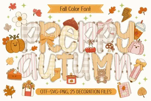
Patchwork colour display
Preppy Autumn is a tall patchwork display on a cream sheet: letters filled with checks, stripes and plaid in soft peach and cream tones, outlined in white with a warm shadow, surrounded by autumn accessories, with two ribbons that name the format list and the count of decoration files.
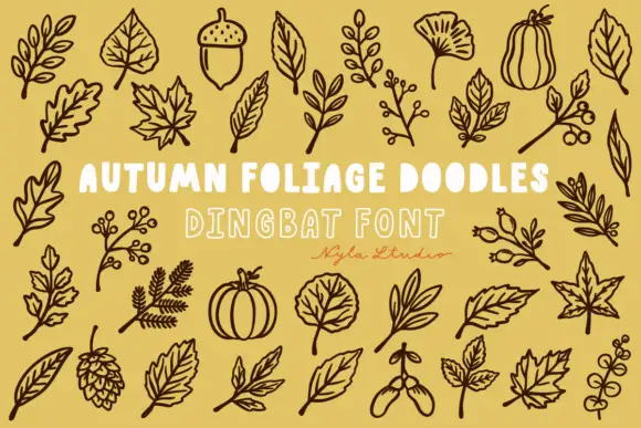
Brown autumn foliage outlines with veined leaves, acorns and a pinecone
Autumn Foliage Doodles is a typable set of botanical outlines — oak and maple leaves, a ginkgo, a sycamore, acorns, seed pods, berries, hops, a pumpkin and a squash — drawn as even outlines.
Ideas for this font
Same independent foundry
Allow optional Google Analytics to measure visits and catalogue actions. Your search words and notes are not included. Privacy & storage